# arte* — Style Reference
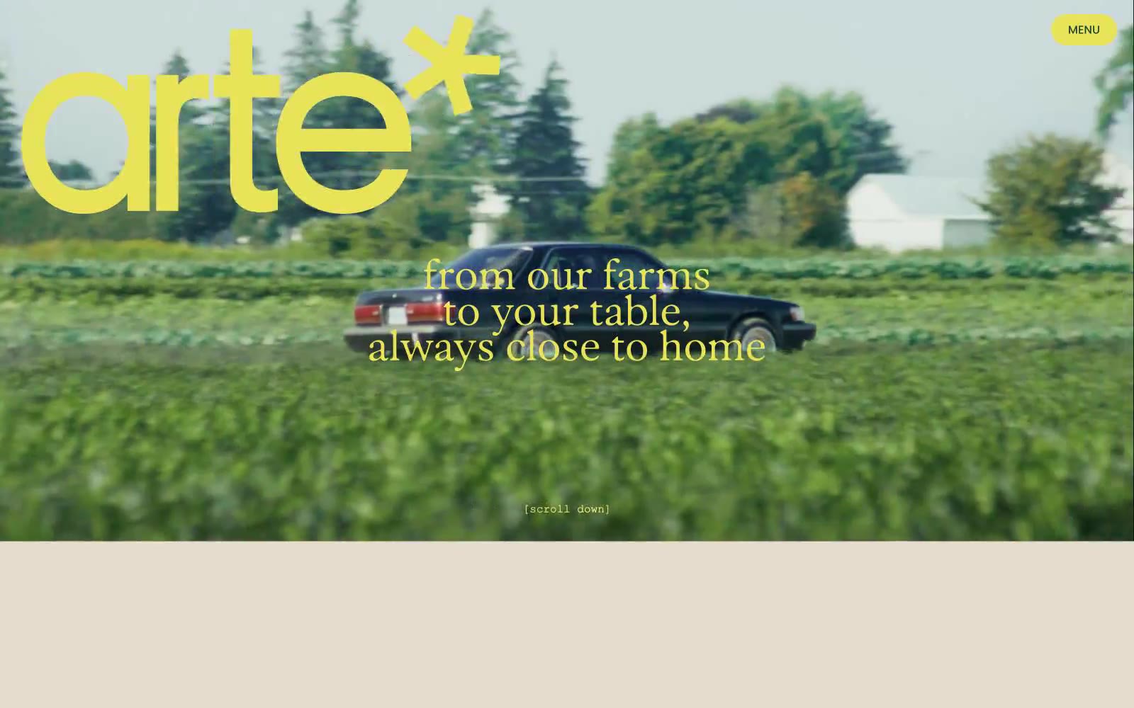
> Golden hour harvest editorial — a cream canvas where sun-dappled forest photos meet oversized rounded display type, electric chartreuse logo, and warm copper text that feels printed rather than rendered.

**Theme:** light

Source measurements are normalized; roles and recommendations are interpreted. Font summary lists are independent, not paired by position. HTML examples are reconstructions, not source components.

arte* is a sunlit harvest editorial: a warm cream canvas (#e5dccd) hosts oversized display headlines in Parafina — a soft, slightly retro rounded sans at extreme sizes (70–173px) with crushed line-heights near 0.8–0.9 — while Poppins handles all secondary copy at a tight 1.4. The palette is farm-garden: burnt harvest copper (#ab5700) for primary text, a shocking chartreuse (#e8e359) for the logo and hero overlays, and a periwinkle (#7997ff) that acts as a cool counterweight for inline highlights. Imagery is the other half of the system — full-bleed golden-hour photography of forests, food, and faces, layered with display type rather than separated from it. Components are few and soft: pill buttons at 31px radius, 20px card radii, hairline borders, almost no shadows. The overall impression is a printed cookbook or farmers' market poster digitized — confident display type, earth-toned with one electric yellow accent, and the brand name itself ends in an asterisk that signals playful editorial mischief.