# Home — Style Reference
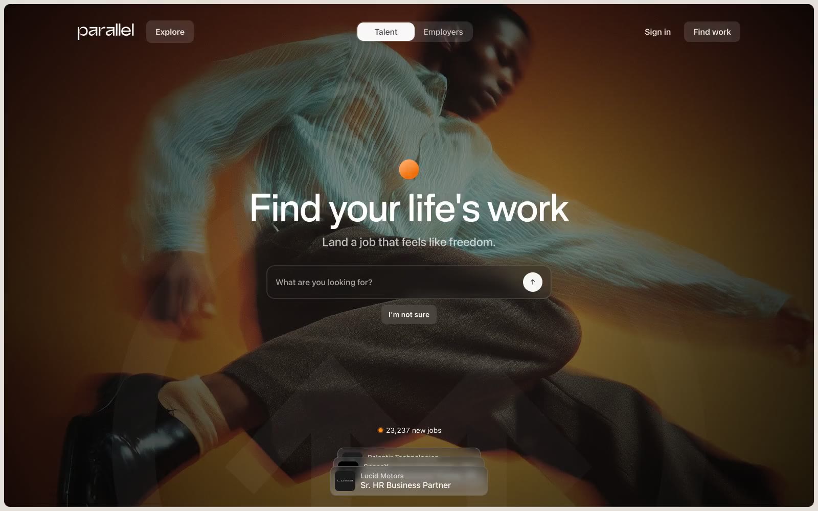
> Warm editorial atelier. Cream paper, charcoal ink, and one ember-orange period of emphasis — a job platform that feels like an art-book spread photographed under amber light.

**Theme:** light

Source measurements are normalized; roles and recommendations are interpreted. Font summary lists are independent, not paired by position. HTML examples are reconstructions, not source components.

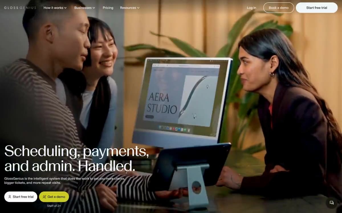
Parallel operates as a warm editorial atelier: a cream-paper canvas (#e4dfd9) hosts product surfaces in white, photography is presented in full-bleed cinematic crops with deep blacks and amber-warm lighting, and the only chromatic punctuation is a small ember-orange dot that marks emphasis. Typography carries a dual-register system — a weight-500 editorial display face (Rules Font) for headlines and a neutral system sans-serif for everything functional — letting headings feel hand-set while the UI stays quiet and utility-driven. Components are physically restrained: 20px card radii, 8-12px button radii, hairline #c7c7c7 dividers, a single soft shadow for elevation, and pill-shaped toggles. The design vocabulary is closer to a magazine layout than a SaaS dashboard — generous breathing room, aligned text blocks, and photography treated as the hero, not the accent.