# Loops — Style Reference
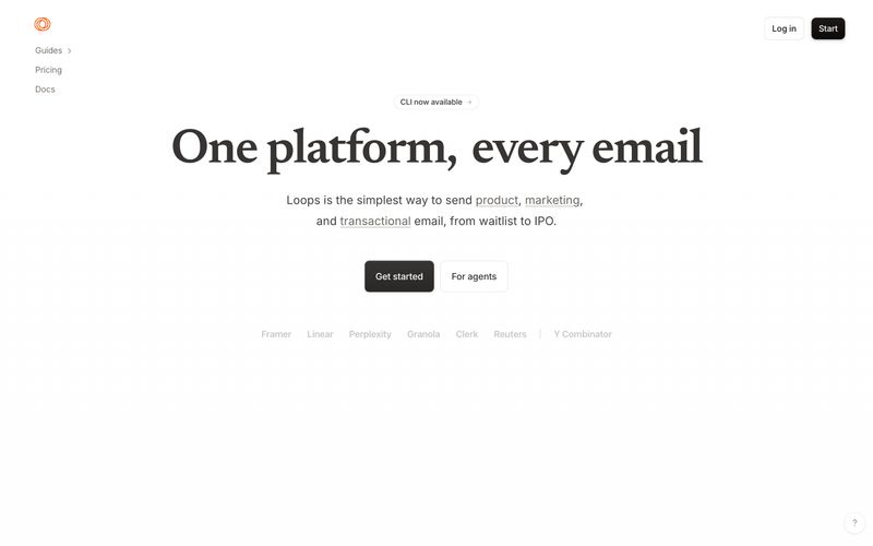
> Warm parchment behind a serif headline — like a stationer's print proof lit by afternoon sun.

**Theme:** light

Source measurements are normalized; roles and recommendations are interpreted. Font summary lists are independent, not paired by position. HTML examples are reconstructions, not source components.

Loops runs a warm, editorial light interface — cream paper (#faf9f7) instead of cold white, a serif display face (Newsreader) that gives marketing screens a magazine-cover gravity, and a single orange (#f97316) that barely appears, like a wax seal on an envelope. The product itself stays almost entirely achromatic: dark pill buttons, hairline stone-toned borders, and flat surfaces with no decorative gradients. Components feel like printed editorial stationery — generous line-height, tight tracking on display, small tags as 999px pills, and elevation reduced to a single hairline inset shadow. An AI agent should treat orange as a signal, not a chrome — it should only fire on the logo, status pips, and small icon accents — while the primary action is always the dark charcoal pill (#1c1917 fill, white text).