# Ditto — Style Reference
> marked-up manuscript on warm parchment

**Theme:** light

Source measurements are normalized; roles and recommendations are interpreted. Font summary lists are independent, not paired by position. HTML examples are reconstructions, not source components.

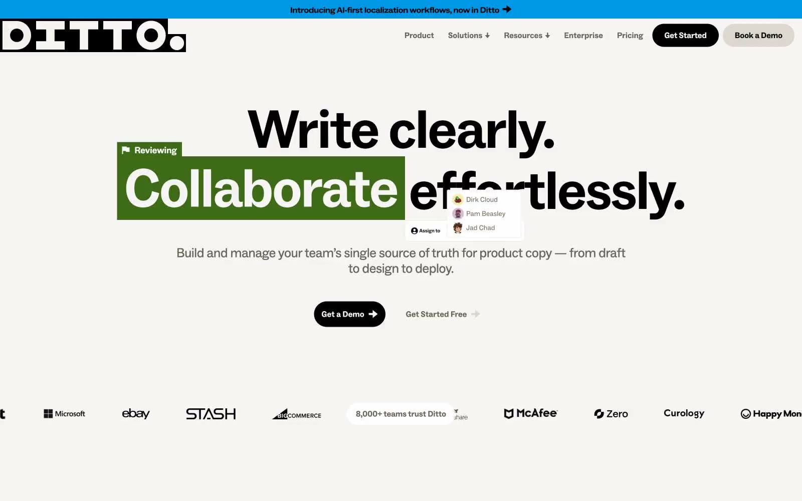
Ditto speaks the visual language of a copy editor's desk: warm parchment-cream canvases, confident black sans-serif type at near-poster scale, and a full crayon box of highlighter colors applied as if someone grabbed a marker. Every color in the palette is a tool — green, yellow, orange, purple, blue, pink all function as markup ink over running text, never as decorative fills. Components are stubby and rounded into pills — buttons, tags, and nav items all collapse into the same soft capsule shape, keeping the surface quiet so the annotated text can shout. There are no shadows, no gradients, no glassmorphism — the entire identity is built from flat color, heavy type, and the metaphor of someone reviewing a manuscript with a set of Sharpies.