# Lottielab — Style Reference
> Animation studio on bright paper

**Theme:** light

Source measurements are normalized; roles and recommendations are interpreted. Font summary lists are independent, not paired by position. HTML examples are reconstructions, not source components.

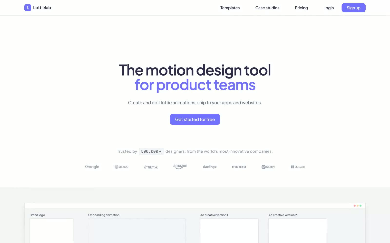
Lottielab's visual language is a quiet, generous workspace built for creators: a near-white canvas, hairline borders, and a single vivid violet accent that appears only where attention is needed. The interface favors restraint over decoration — deep indigo-tinted text reads as authoritative without shouting, and components sit flat on the surface with almost no shadow, letting the product UI itself carry visual weight. Typography is geometric and contemporary, with tight negative tracking on large headlines and slightly open tracking on small labels, creating a confident vertical rhythm. Color is used surgically: brand violet highlights a keyword in headlines, fills the primary CTA, and marks active states; everything else stays neutral. The overall feel is an animation studio's digital sketchpad — spacious, tool-first, and engineered for flow.