# Geniestudio — Style Reference
> soft daylight notebook — the kind with generous margins and a single bold pen stroke

**Theme:** light

Source measurements are normalized; roles and recommendations are interpreted. Font summary lists are independent, not paired by position. HTML examples are reconstructions, not source components.

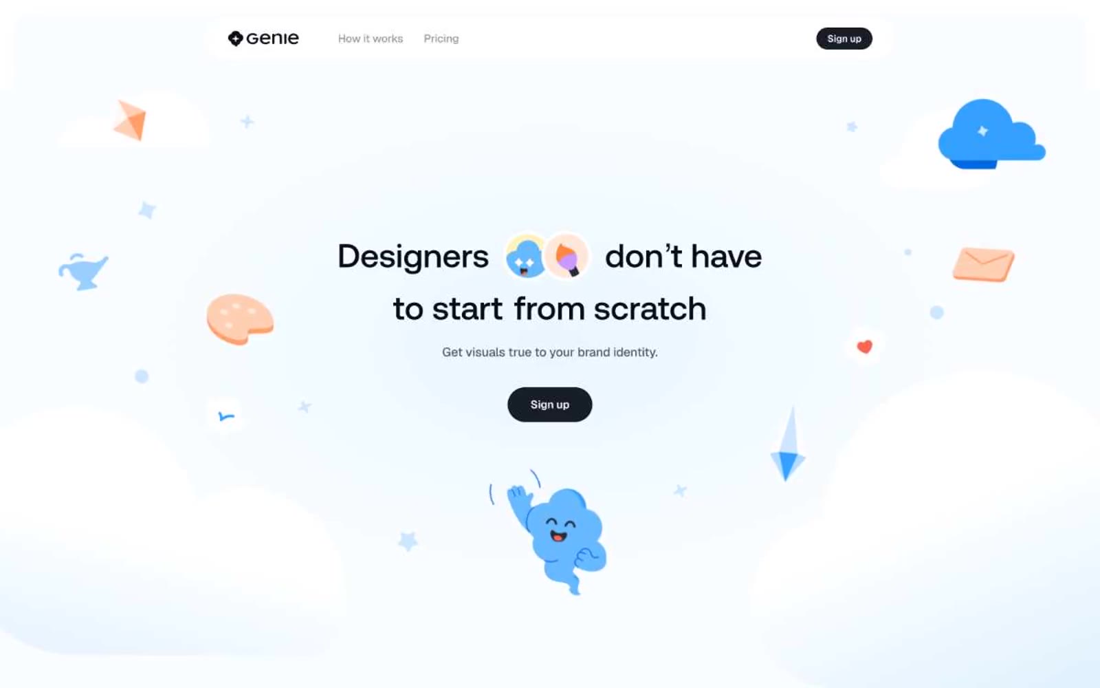
Genie uses an airy, daylight-studio language: a pale sky-blue canvas (#ebf5ff) hosts an almost-monochrome interface where near-black buttons provide the only dense visual weight. Display type runs enormous — up to 148px in Aeonik — with a fixed weight 500 that feels engraved rather than shouted, and tracking pulled tight (-0.02em) so headlines read as confident typography, not decorative type. Rounded shapes dominate: 32px cards, 9999px pills, and soft pastel washes (lavender, mint, peach, sky) become the only places color appears beyond a single vivid blue accent and the dark charcoal CTA fill. Whimsical 3D-rendered illustrations — clouds, crayons, smiling objects, floating envelopes — float in the whitespace and carry the brand's personality; the UI itself stays disciplined, almost architectural in its restraint.