# Dropbox.com — Style Reference
> warm cream workspace — editorial confidence on paper

**Theme:** light

Source measurements are normalized; roles and recommendations are interpreted. Font summary lists are independent, not paired by position. HTML examples are reconstructions, not source components.

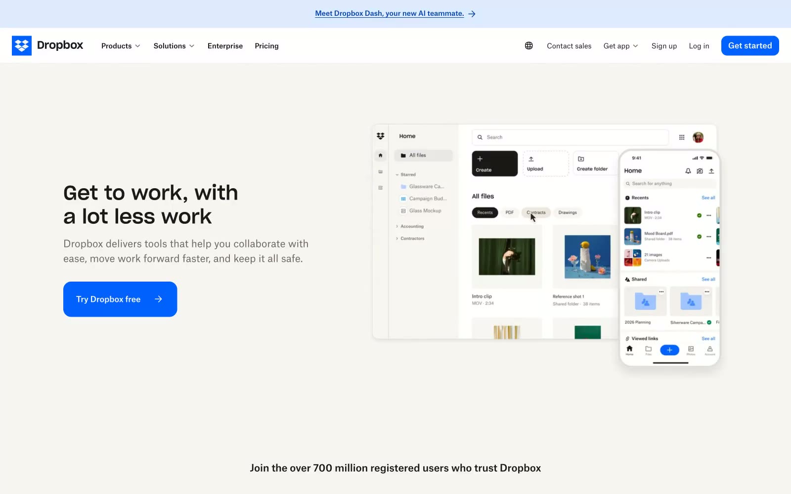
Dropbox reads as a warm editorial workspace rather than a cold productivity dashboard. The canvas is cream paper (#f7f5f2), not sterile white; text is a warm near-black (#1e1919), not pure ink. The brand speaks through one confident electric blue (#0061fe) that paints every action surface, paired with Sharp Grotesk headlines and Atlas Grotesk body copy — a custom Grotesk pairing that gives the system a proprietary, designed quality. Layouts are generous and breathing, built on a 6px base, with 2-column card grids, split text+visual heroes, and minimal elevation. Surfaces are flat with hairline borders; corners are soft (8–16px). The mood is approachable, considered, and quietly confident — the opposite of a sterile enterprise UI.