# Opennote — Style Reference
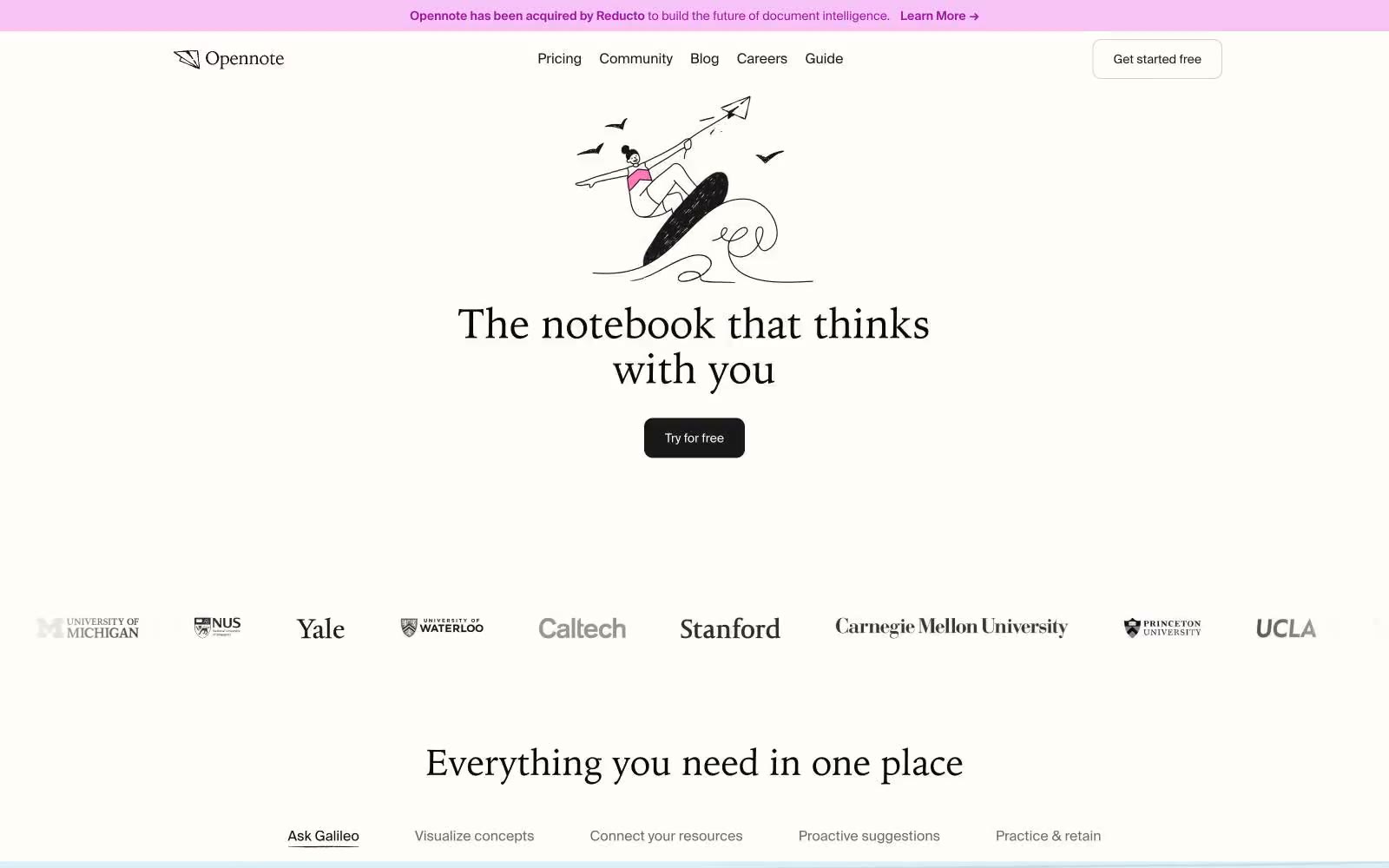
> warm leather journal on sunlit paper — the interface feels hand-bound, not engineered

**Theme:** light

Source measurements are normalized; roles and recommendations are interpreted. Font summary lists are independent, not paired by position. HTML examples are reconstructions, not source components.

Opennote speaks in the voice of a well-loved notebook: warm cream paper, serif headlines that feel hand-set, and a dark-sepia CTA that reads like a leather binding rather than a SaaS button. The palette is almost entirely achromatic — ivory canvas, charcoal ink, hairline graphite rules — with four dark chromatic accents (sepia, ink-violet, forest, oxblood) used sparingly as marginalia, never as fills. Chrome is minimal: a 10px radius, a single border tone, and almost no shadow. Whitespace carries the layout, broken up by hand-drawn line illustrations that float like doodles in a margin. The result is a product that looks like it was designed in a studio with good natural light, not a dashboard that was optimized in a sprint.