# pampam.city — Style Reference
> Old explorer's notebook on warm cream

**Theme:** light

Source measurements are normalized; roles and recommendations are interpreted. Font summary lists are independent, not paired by position. HTML examples are reconstructions, not source components.

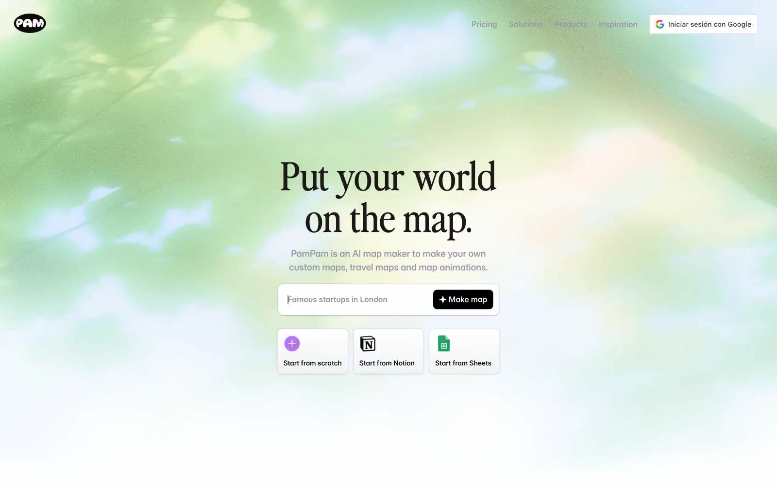
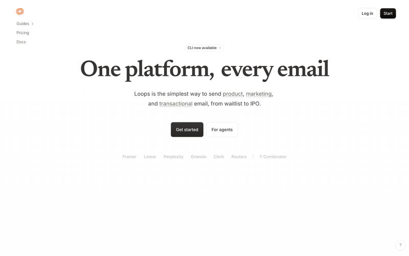
PamPam reads as a warm editorial travel journal translated into a modern app: a soft parchment-cream canvas (#faf2ec) carries the interface, with a custom display serif ('Nineties') giving headlines a vintage-magazine voice against a clean, workhorse Inter body. The palette is nearly monochromatic, leaning on a single muted lavender-gray (#9894a8) for borders, links, and hairlines, and reserving one vivid periwinkle blue (#4b72f3) for the one action that must feel switched on. Surfaces stay flat and paper-like — white cards float on cream, never the other way around, and shadows are whisper-quiet so the maps and illustrations can do the emotional work. Components are compact and confident: pill-ish buttons with generous 16px radii, 12px-radius cards, and tight 12–16px internal padding. Color and weight, not elevation, carry hierarchy.