

ElevenLabs
以轻声标题呈现的温暖奶油色编辑设计。一本包豪斯工作室笔记:蛋壳色纸张、黑色油墨,以及仅在产品展示场景中出现的紫色和橙色火花。
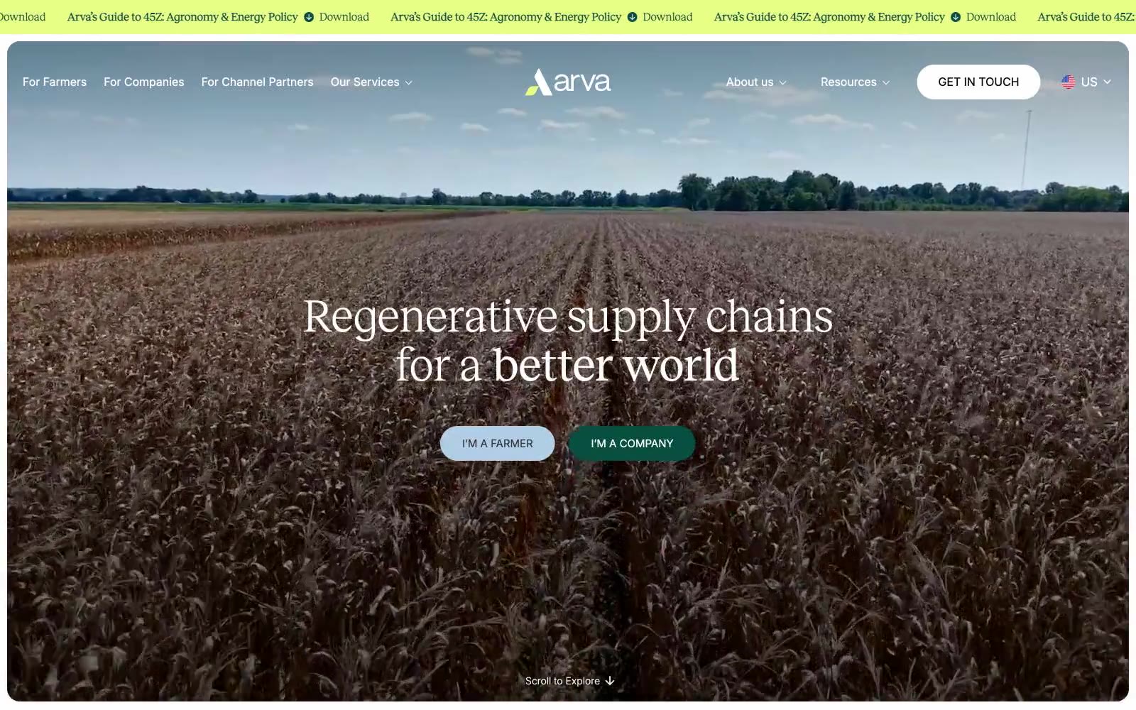

奶油色田野上的田园编辑式杂志跨页。
Arva采用田园编辑式语言:温暖奶油色画布取代纯白,深森林绿锚定品牌,拼被般的粉彩表面(天蓝、桃色、鼠尾草、骨白)在内容区块中平铺,像从高处看到的田野。排版将精致编辑式衬线Reckless与中性无衬线Inter配对,使网站像印刷杂志而非典型SaaS界面装饰。按钮具有戏剧性的胶囊形(100–110px圆角),铺满画面的摄影主导首屏;除品牌绿外,唯一饱和颜色是一条鲜亮青柠滚动条,在原本安静、泥土色调的系统中提供唯一高能强调。
查看原始网站以轻声标题呈现的温暖奶油色编辑设计。一本包豪斯工作室笔记:蛋壳色纸张、黑色油墨,以及仅在产品展示场景中出现的紫色和橙色火花。


温暖的编辑工坊。奶油色纸张、炭黑色墨水,以及一个琥珀橙色的强调点——这是一处像艺术书页在琥珀光下拍摄的求职平台。
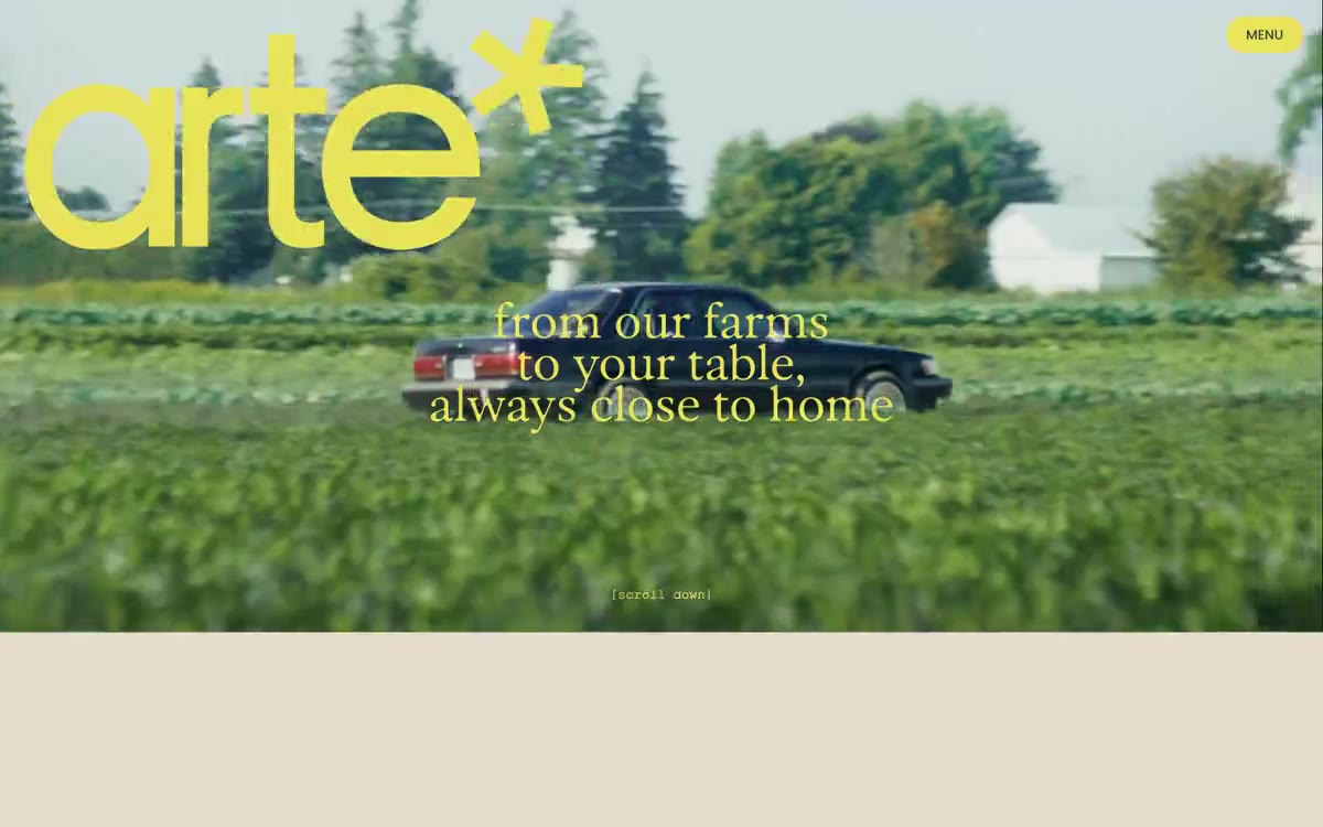

黄金时刻的收获季编辑设计:奶油色画布上,斑驳日光中的森林照片与超大圆润展示文字相遇,配以电光黄绿色标志和暖铜色文字,像印刷在纸上,而非屏幕渲染。
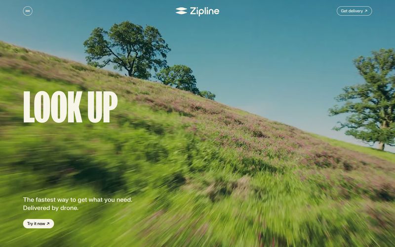

晨光中的开阔草甸。
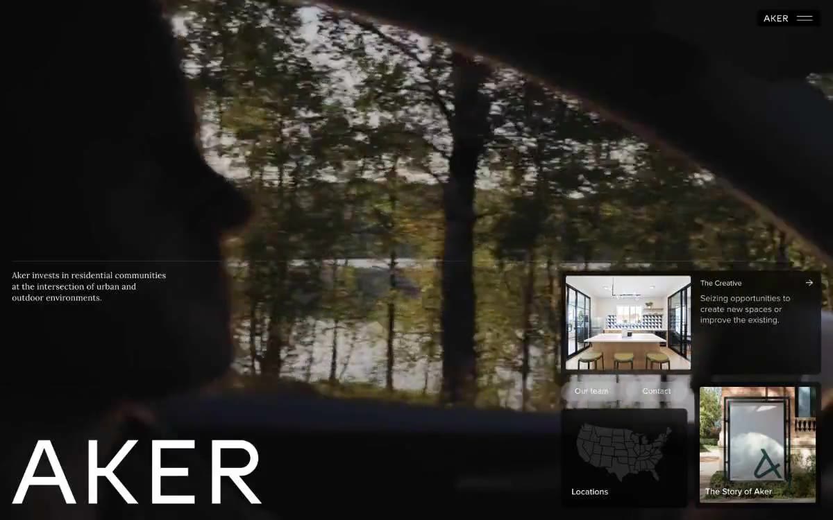

如同暗房画廊墙。纪念碑般的文字像高端建筑画廊展品标签一样,悬浮于低饱和风景摄影上方;白墙、温暖陶土聚光,其余全部退居幕后。

仿佛温暖石头上的鲜活苔藓:稳健而有机的调色板中,唯一的深森林青绿色支撑结构,黄绿色火花点缀宁静。