

ElevenLabs
以轻声标题呈现的温暖奶油色编辑设计。一本包豪斯工作室笔记:蛋壳色纸张、黑色油墨,以及仅在产品展示场景中出现的紫色和橙色火花。
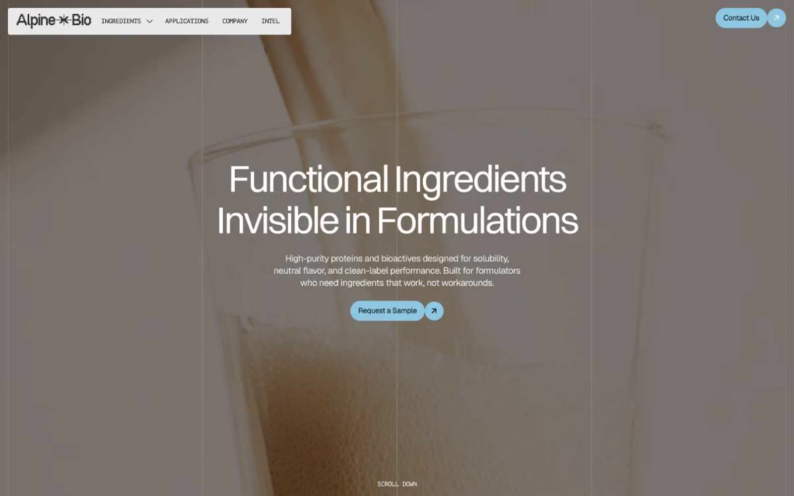

阳光洒落的植物药房,位于奶油羊皮纸上
Alpine Bio 读作一个温暖的药房编辑系统:奶油-羊皮纸画布,一个天蓝色胶囊的点缀,以及 Switzer 显示字体的尺寸如同植物学期刊。界面刻意保持色彩静默——几乎每个表面都属于温暖的米白色家族,仅用一种柔和的蓝色用于操作,一种花粉黄用于细微的排版高亮。组件为扁平、无阴影、胶囊形圆角;设计在很大程度上由其克制(无渐变、无阴影、无深色模式)决定,而非添加元素。全画面特写产品摄影承载了全部氛围的温暖,使 UI 保持平静和实验室感,而图像则显得可食用且生动。
查看原始网站以轻声标题呈现的温暖奶油色编辑设计。一本包豪斯工作室笔记:蛋壳色纸张、黑色油墨,以及仅在产品展示场景中出现的紫色和橙色火花。
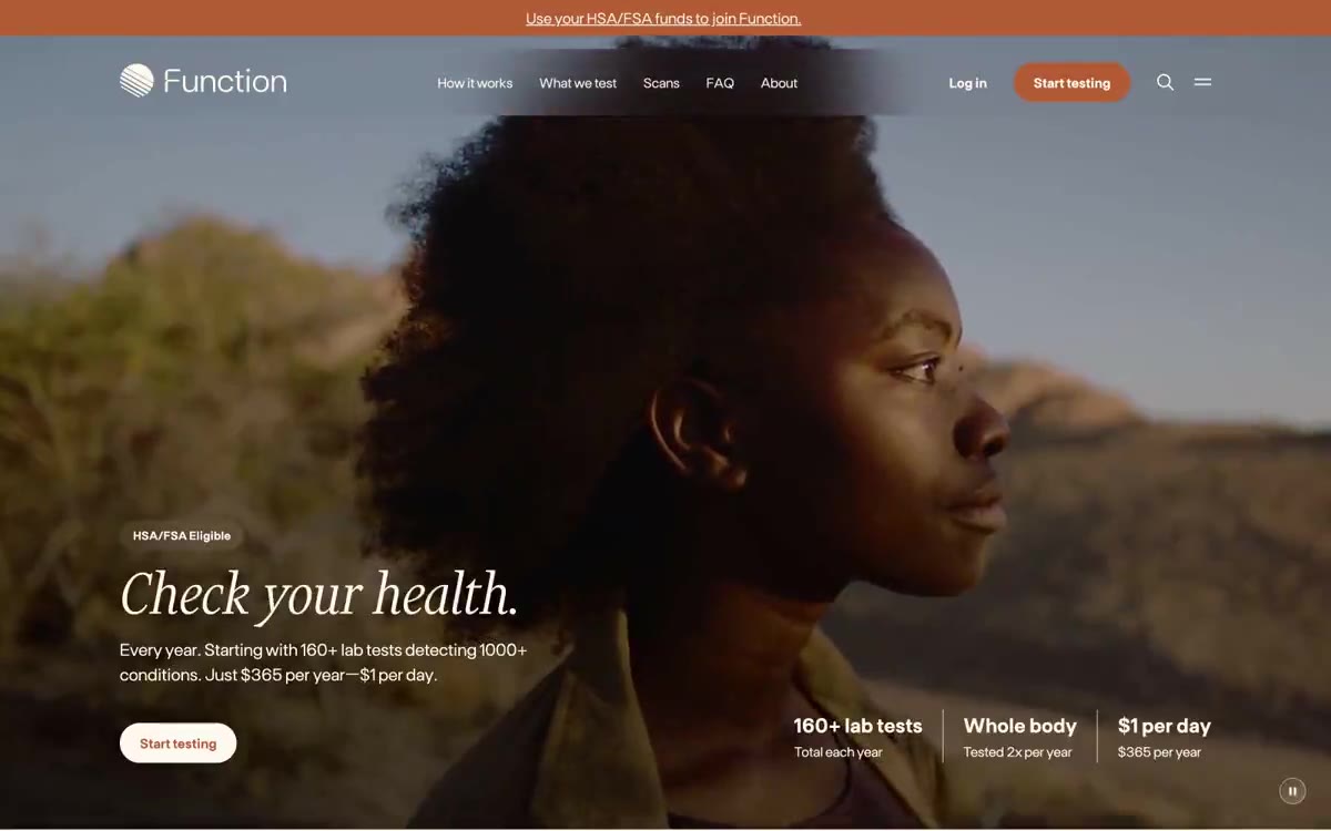

温暖的药房风格羊皮纸期刊


温暖的编辑工坊。奶油色纸张、炭黑色墨水,以及一个琥珀橙色的强调点——这是一处像艺术书页在琥珀光下拍摄的求职平台。
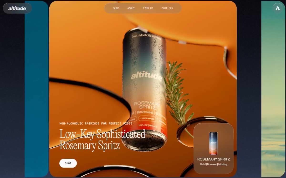

如同单色编辑式跨页。想象一张时尚杂志跨页,除产品摄影外去掉全部彩色,所有叙事都由文字和留白承担。
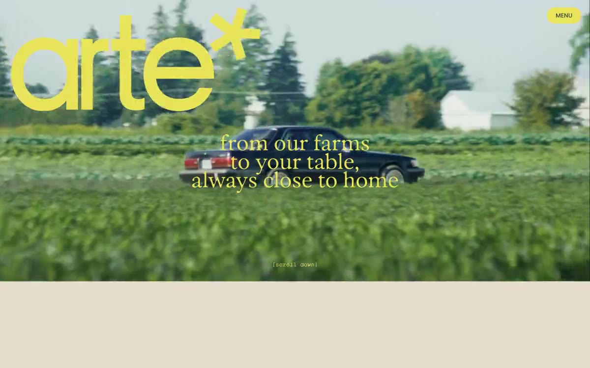

黄金时刻的收获季编辑设计:奶油色画布上,斑驳日光中的森林照片与超大圆润展示文字相遇,配以电光黄绿色标志和暖铜色文字,像印刷在纸上,而非屏幕渲染。

温暖奶油色实验室中的一颗黑色药丸