# Pa'lais — Style Reference
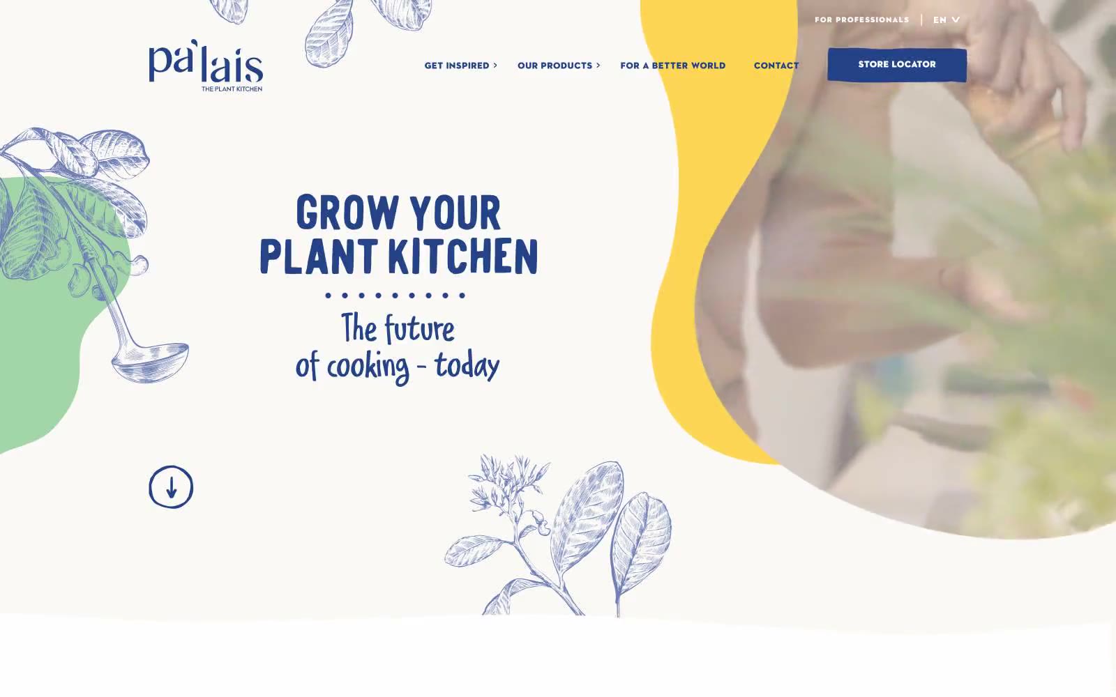
> Botanical sketchbook dipped in honey. The cream paper canvas, blue toile-style line illustrations, and warm color blobs recall a hand-bound recipe journal, while the bold condensed display type and generous whitespace give it modern editorial confidence.

**Theme:** light

Source measurements are normalized; roles and recommendations are interpreted. Font summary lists are independent, not paired by position. HTML examples are reconstructions, not source components.

Pa'lais reads like a hand-illustrated artisan cookbook dropped into a modern food-magazine layout. The canvas is a warm cream paper (#fbf9f6) with pure white cards layered on top, anchored by a single deep-indigo brand voice (#234386) that owns every headline, link, and primary button. That indigo is intentionally the only saturated cool in the system; everything else is warm and edible — honey-gold (#ffc400), burnt orange (#ed7328), warm sand (#d2b68c), mint sage (#a2d3a6) — and those warms appear almost exclusively as organic flowing blob shapes and botanical line-art, never as flat fills. Typography splits into two loud voices: bold condensed display fonts in all-caps navy for headlines, and widely-tracked geometric sans (Axiforma / ITC Avant Garde) for labels and UI chrome with letter-spacing up to 0.27em. A handwritten script carries emotional taglines ('The future of cooking – today'). Components stay lightweight — soft 8px cards, generous 32px-radius pill buttons, hairline borders — letting the illustrations and photography do the storytelling.