# Isla Beauty — Style Reference
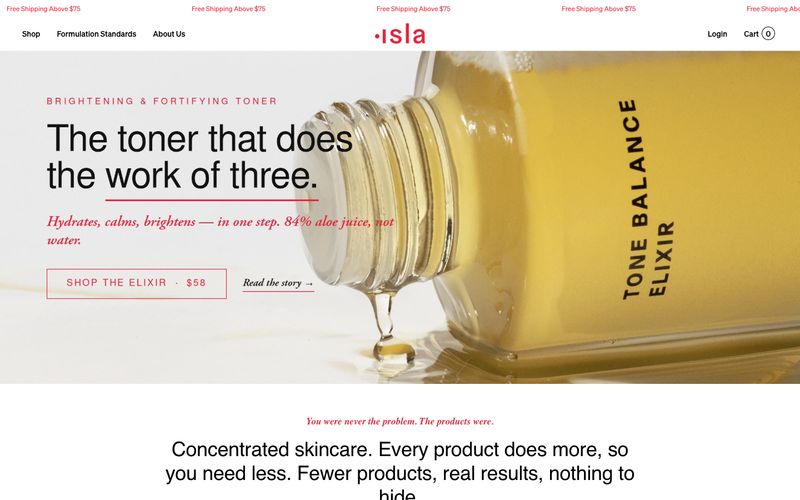
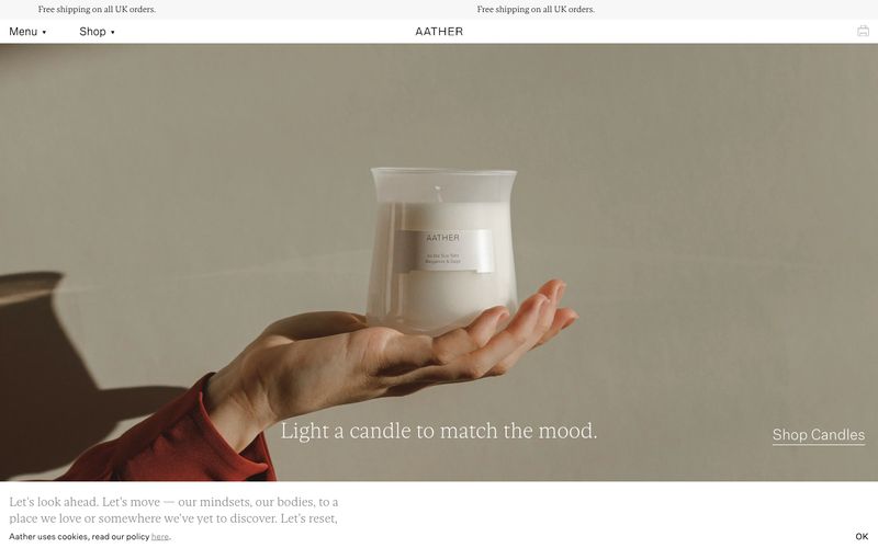
> Cream apothecary with surgical red accents — think warm parchment walls, amber bottles, and a single red seal on every label.

**Theme:** light

Source measurements are normalized; roles and recommendations are interpreted. Font summary lists are independent, not paired by position. HTML examples are reconstructions, not source components.

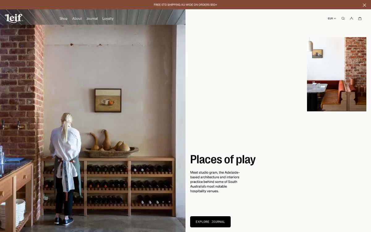
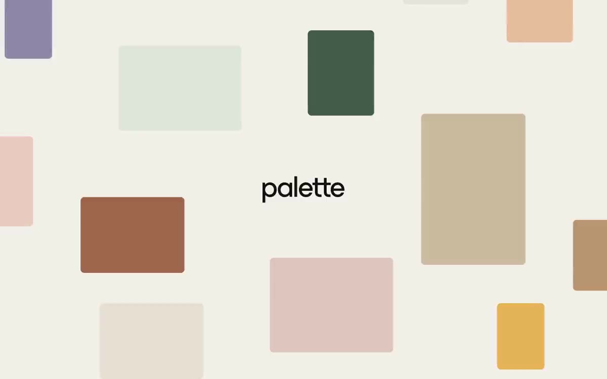
Isla is a warm editorial apothecary: a cream-paper canvas, a single vivid red that does the work of an alarm clock, and a typographic mix of geometric sans (Soehne/Nimbus) paired with Garamond italic for emotional moments. The palette stays close to skin and paper — off-white, warm sand, blush, deep ink — with red appearing only as a small functional burst: CTAs, section eyebrows, add-to-cart fills, inline accents. Components are flat and quiet: 3px corners, hairline borders, no shadows, no gradients. Layout breathes; product photography carries the visual weight while type remains a composed voice — uppercase tracked labels over serif italics over sans body.