# Emmalewisham — Style Reference
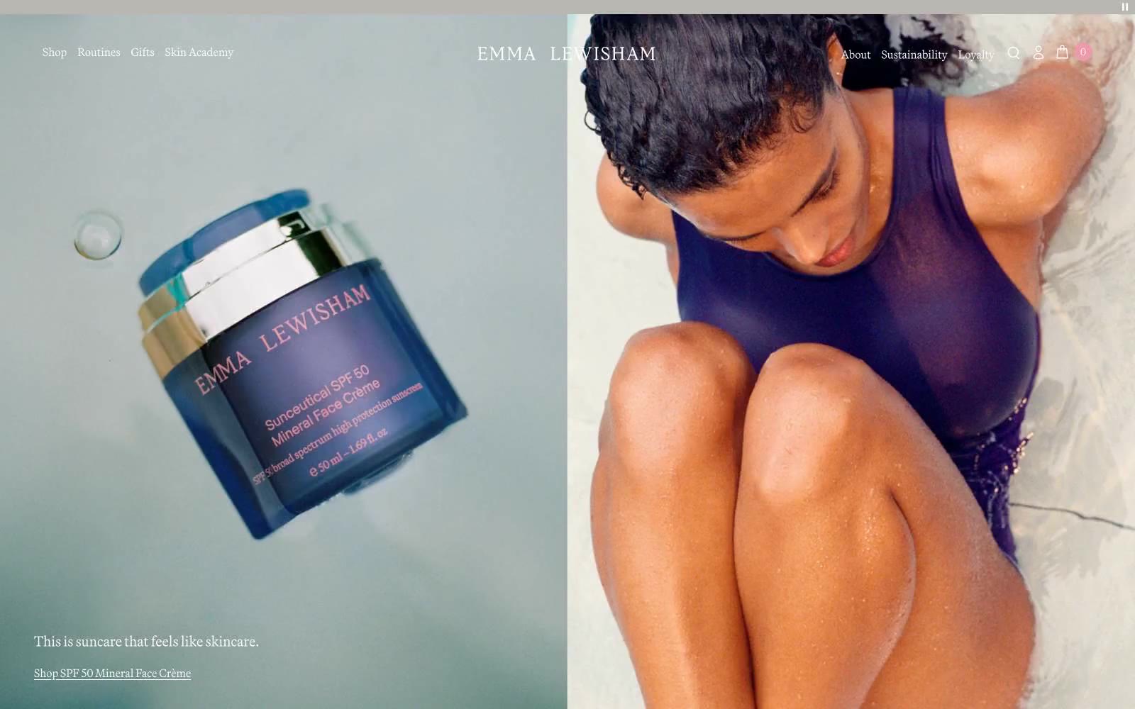
> porcelain apothecary at golden hour. Warm linen surfaces cradle jewel-toned glass vessels; the brand violet traces hairlines through the room; serif labels float over clean sans-serif UI like engraved pharmacy signs.

**Theme:** light

Source measurements are normalized; roles and recommendations are interpreted. Font summary lists are independent, not paired by position. HTML examples are reconstructions, not source components.

Emma Lewisham is a porcelain apothecary rendered in editorial photography: warm stone-linen canvases, full-bleed pastel product vignettes, and a single deep iris-violet accent that whispers through thin outlines and links rather than shouting from filled buttons. The system feels calm, considered, and almost analog — serif wordmarks float over sans-serif UI text, products are presented as still-life objects on color-drenched stages, and surfaces stay nearly weightless with hairline borders instead of shadows. Color is used as atmosphere (peach, blush, mauve washes) and as restraint (violet for emphasis only); density is sparse, whitespace is generous, and the only interactive surface style is a thin outlined border in the brand violet.