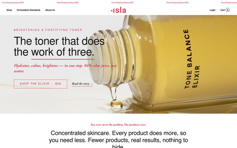

Isla Beauty
奶油色药剂铺,以手术般精确的红色点缀:温暖羊皮纸墙面、琥珀色瓶子,以及每张标签上唯一的红色印章。
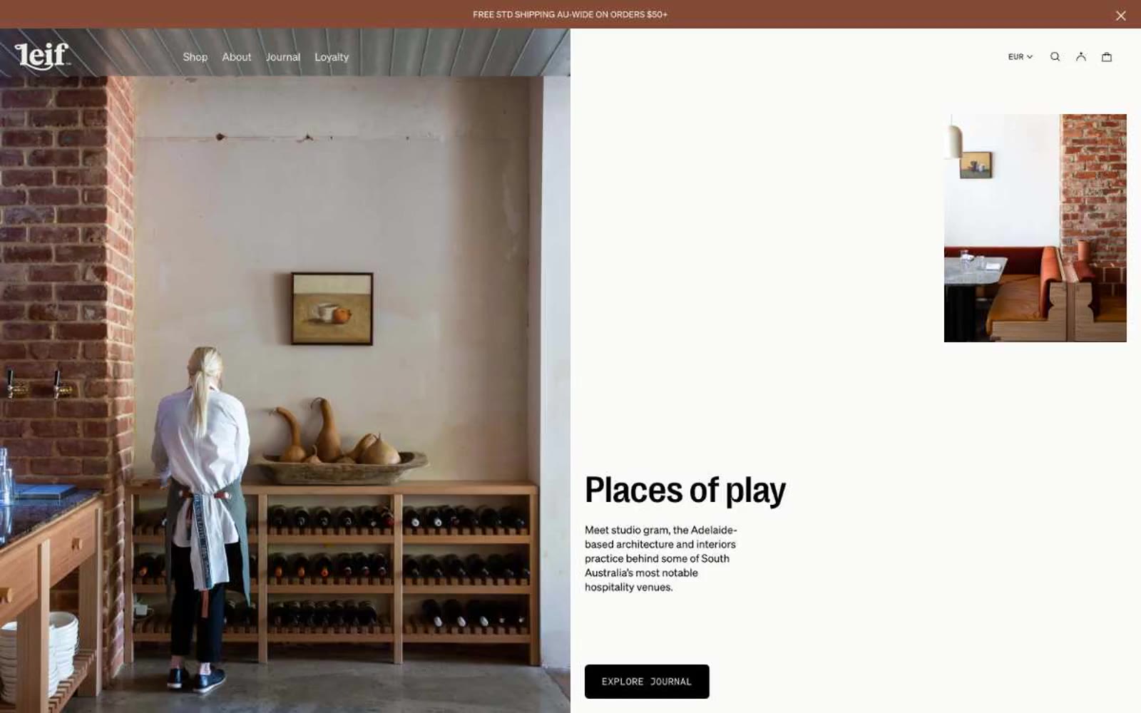

原色亚麻上的药房。温暖、手压印刷的编辑页面,墨黑文字落在骨奶油纸上,旁边是植物产品摄影。
Leif 是编辑式药房:暖奶油画布、植物产品摄影和低声纤细的展示文字,把身体护理当作时尚杂志跨页。色板几乎全是暖中性色:石色、骨色、墨色、灰玫瑰淡粉和用于强调的浅黄绿色,因此界面的色彩只来自产品与植物本身。布局通过充足产品摄影、分栏编辑构图与极简界面外框呼吸。排版承担主要表达:标题使用字重 200 的 PP Right Grotesk,产生商业网站少见的书法轻盈感;Söhne Mono 小型大写文字像博物馆标签一样标记香型。组件安静:细线边框、接近零的圆角、无阴影,让影像和排版承载品牌。
查看原始网站奶油色药剂铺,以手术般精确的红色点缀:温暖羊皮纸墙面、琥珀色瓶子,以及每张标签上唯一的红色印章。
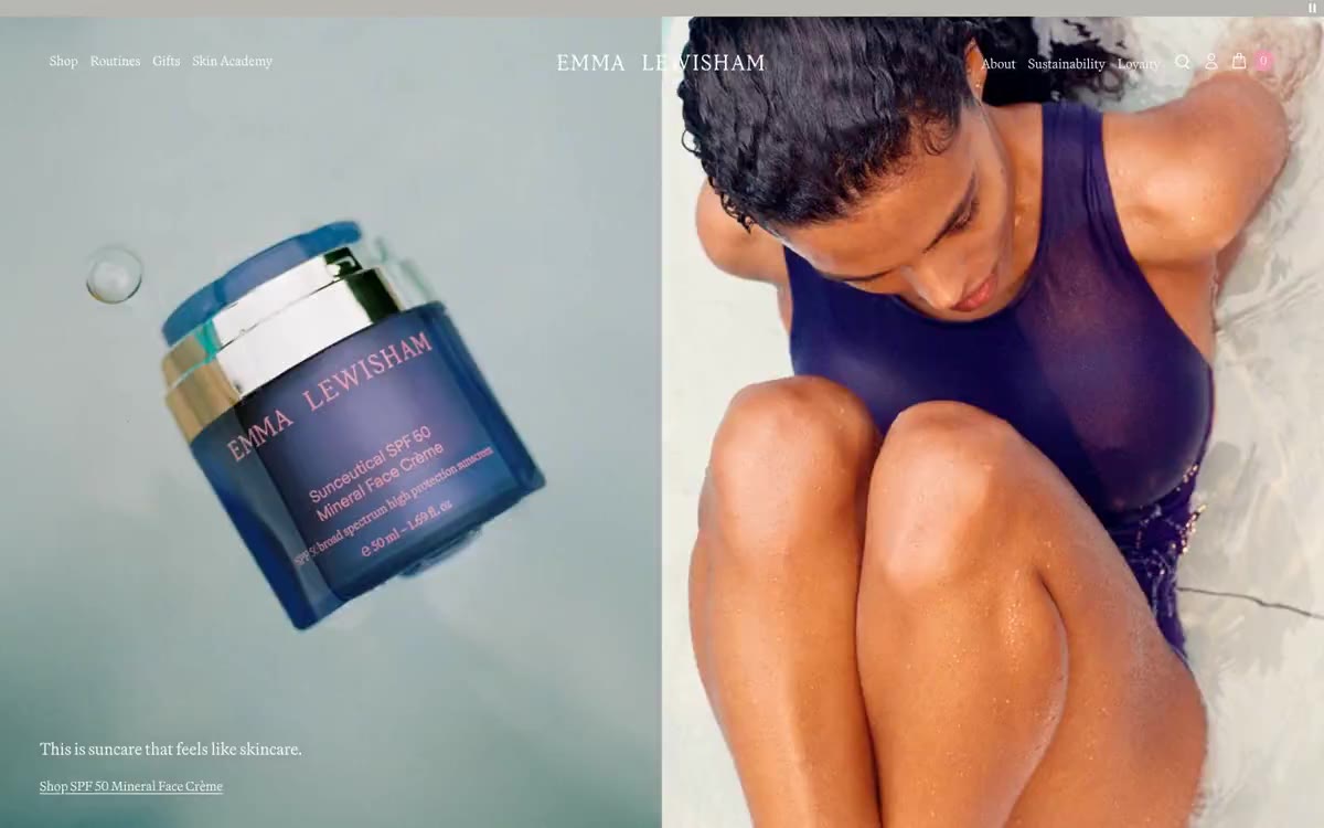

黄金时刻的瓷器药房。暖亚麻表面托着宝石色玻璃器皿,品牌紫在房间描出细线,衬线标签像雕刻药房招牌一样浮在洁净无衬线界面之上。
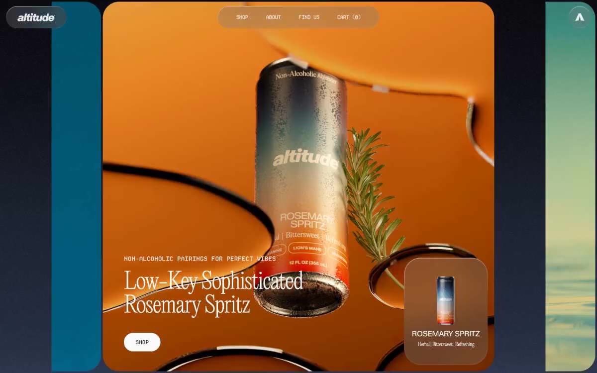

如同单色编辑式跨页。想象一张时尚杂志跨页,除产品摄影外去掉全部彩色,所有叙事都由文字和留白承担。
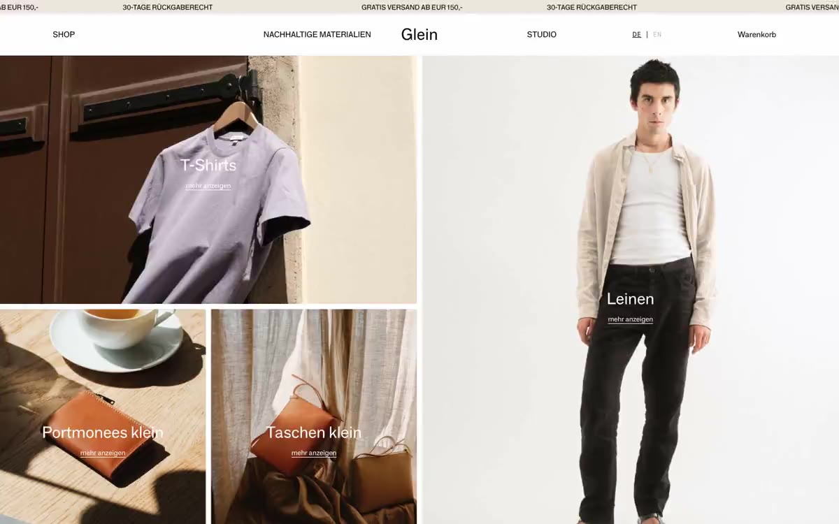
暖亚麻上的工作室造型册:满幅摄影、细线分割、一个低声字重的声音。
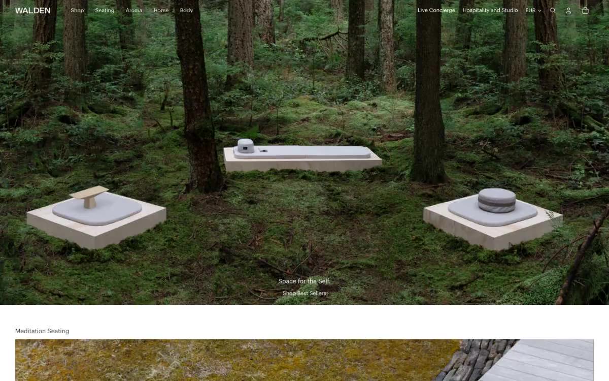

静止的林地:每个产品是石头,每个像素是苔藓与静默。
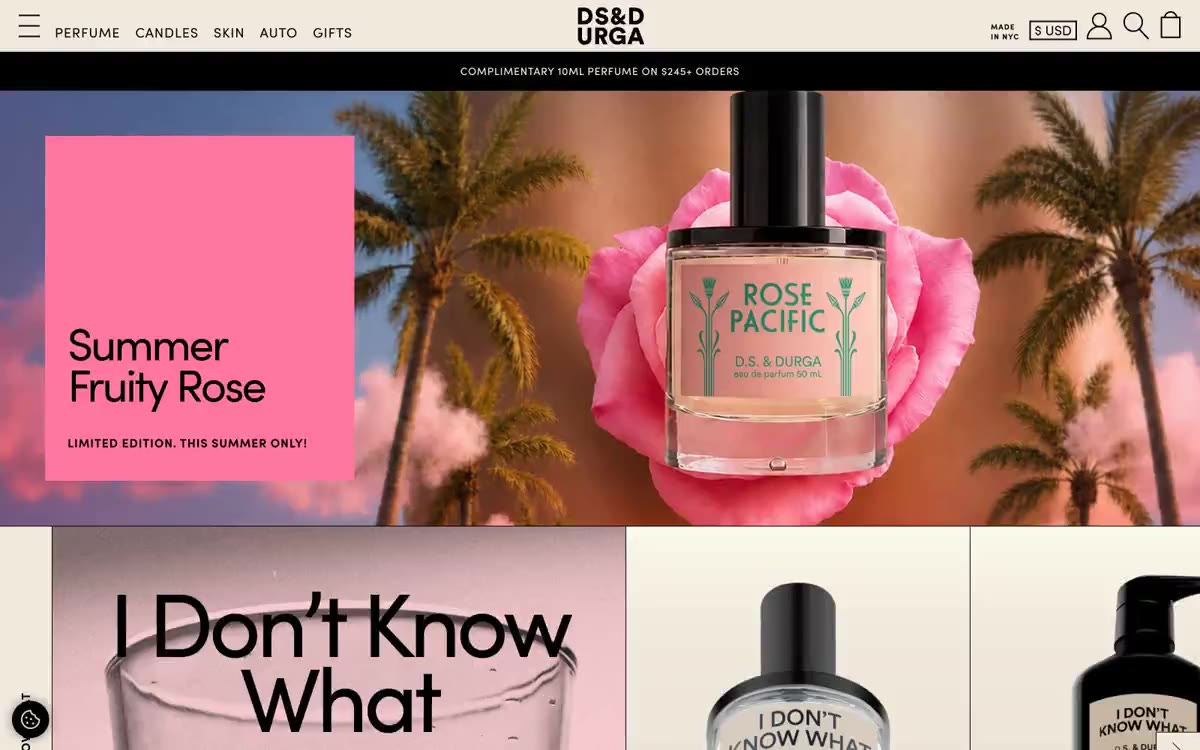

骨白纸上印刷的独立香氛杂志——一片温暖的奶油底色,黑色墨水与超大字号文字共同表达。