# Walden — Style Reference
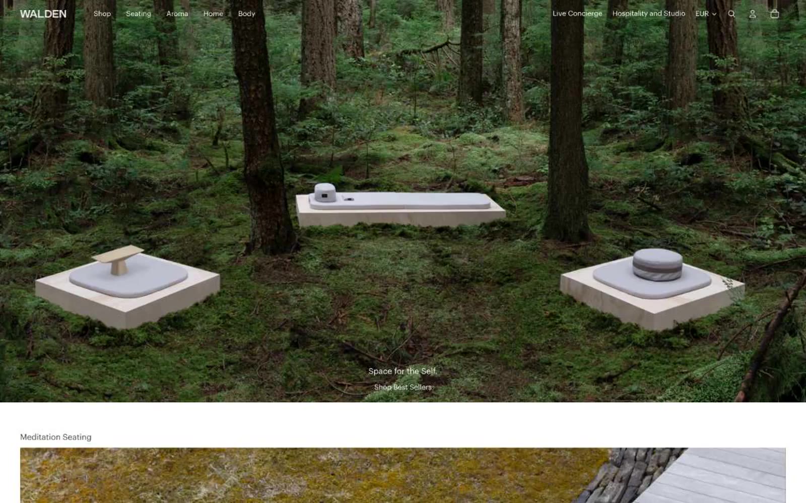
> A still forest floor — every product is a stone, every pixel is moss and silence.

**Theme:** light

Source measurements are normalized; roles and recommendations are interpreted. Font summary lists are independent, not paired by position. HTML examples are reconstructions, not source components.

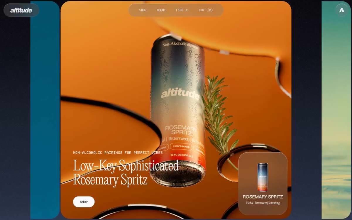
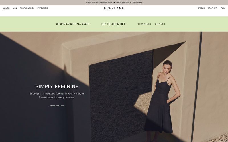
Walden is a meditation and ritual-object brand whose interface behaves like a quiet gallery wall. The canvas is pure white; nearly every surface, border, and control is rendered in warm grayscale, with no chromatic accent anywhere in the system. Type is small, tight, and lowercase-leaning, and the only structural cues are hairline strokes in stone-gray (#d3cec5) — no drop shadows, no elevation tricks, no gradients. Full-bleed nature and product photography carries the entire emotional load, so the chrome around it must stay almost invisible. Components feel handmade, not templated: a 2px button radius, a 16px max radius on cards, and 1px inset rings as the only shadows in the system.