# TWOTWO — Style Reference
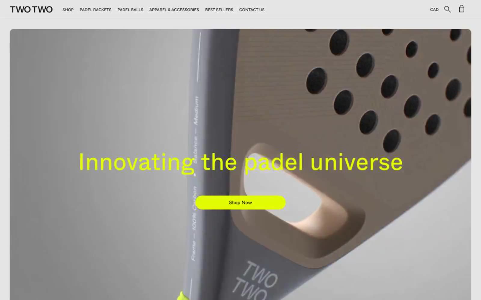
> voltage lime on monochrome concrete — a single neon punch inside a black-and-white editorial grid

**Theme:** light

Source measurements are normalized; roles and recommendations are interpreted. Font summary lists are independent, not paired by position. HTML examples are reconstructions, not source components.

TWOTWO operates on ruthless visual discipline: a near-pure black-and-white system interrupted by a single piercing voltage-lime accent. The brand reads like a sports-tech catalog stripped to its bones — generous white space, a Swiss-grotesque typeface (Whyte) that does all the tonal work, and absolutely no decorative gradients, shadows, or secondary hues. Product photography is the only color the page permits on its own terms: the rackets themselves bring in coral, blue, sage, and orange, but every UI surface, border, and label stays monochrome. The lime accent functions as functional punctuation — a filled pill button, a hover state, a small swatch tag — never as decoration. Everything is geometric, compact, and confident: 16px image radii, 50px pill buttons, 72px display headlines, uppercase tracked navigation, and tight 1.1 line heights that let type do the heavy lifting. The mood is less 'padel store' and more 'industrial design catalog on a white marble bench.'