# Glein — Style Reference
> Atelier lookbook on warm linen — full-bleed photography, hairline rules, one whisper-weight voice.

**Theme:** light

Source measurements are normalized; roles and recommendations are interpreted. Font summary lists are independent, not paired by position. HTML examples are reconstructions, not source components.

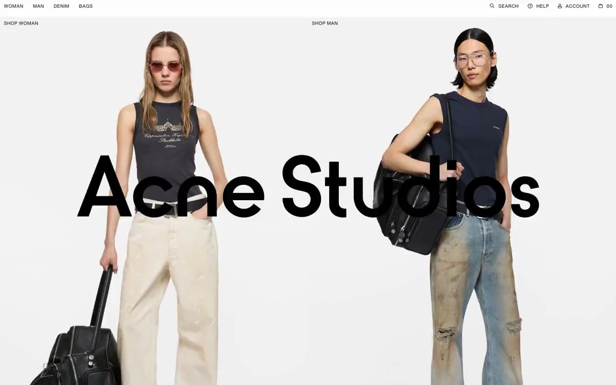
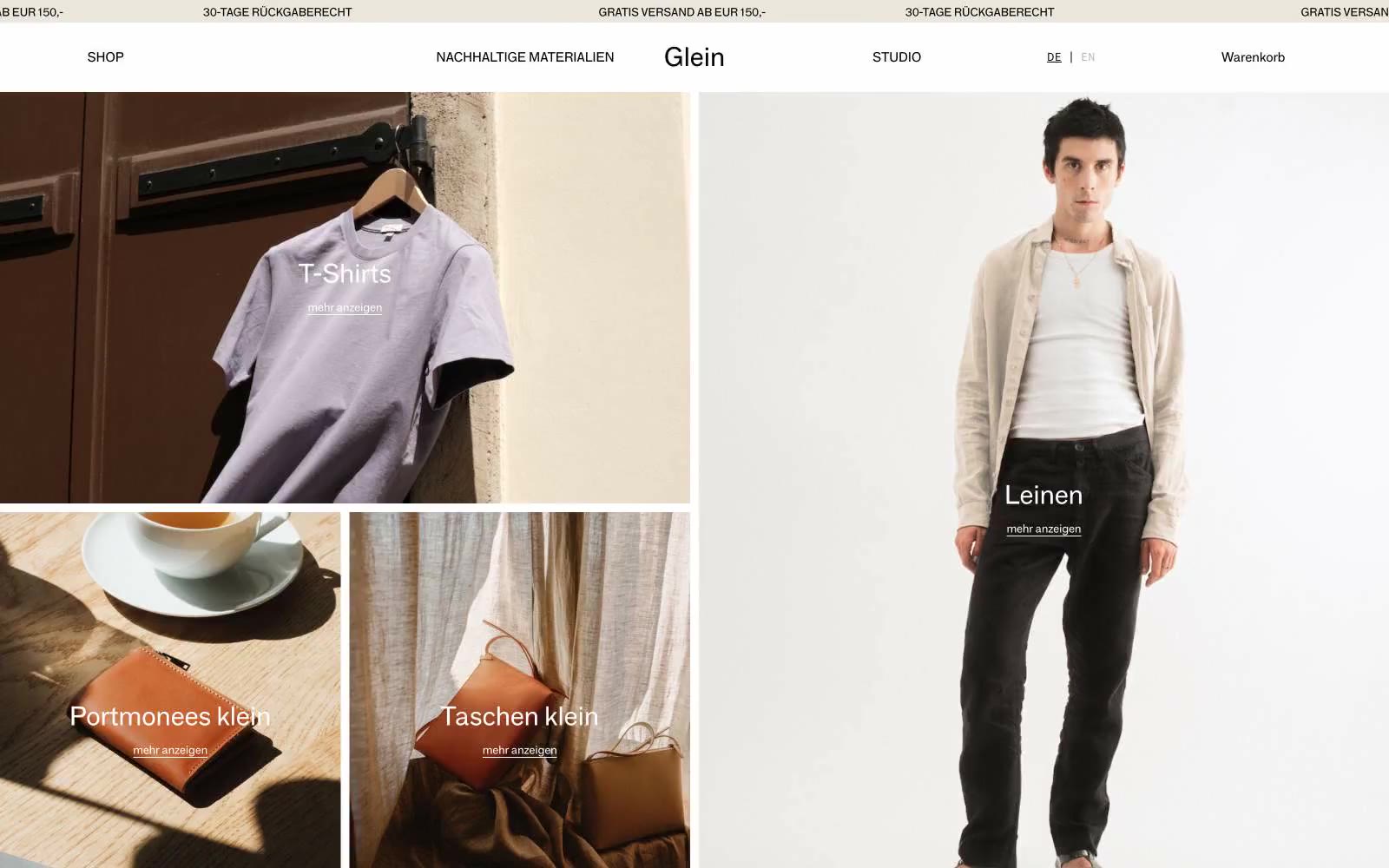
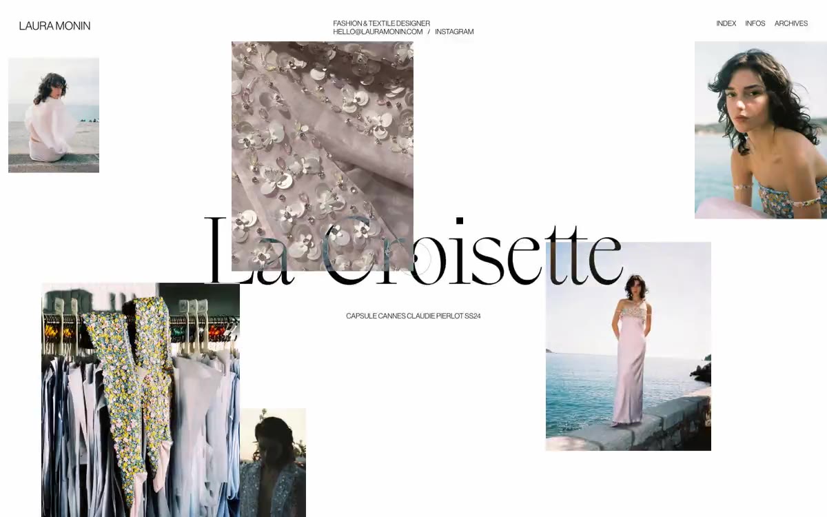
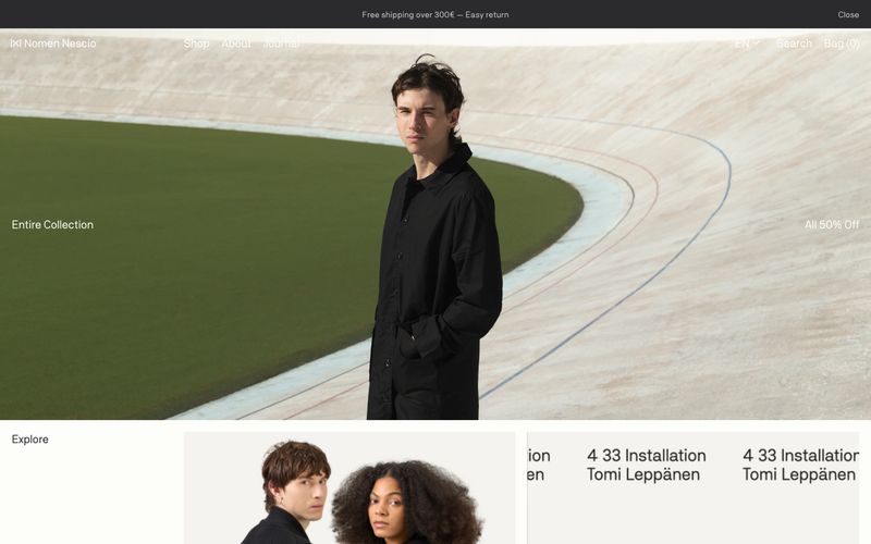
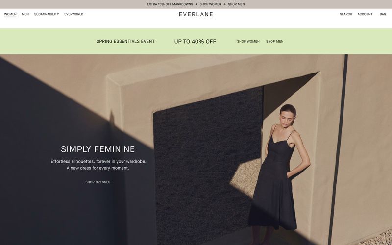
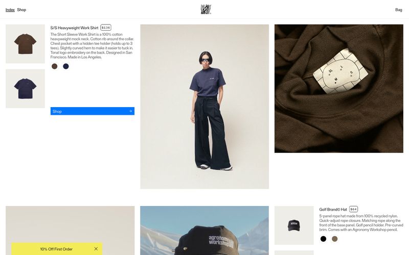
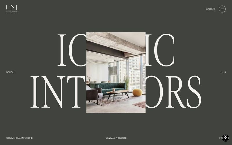
Glein operates as a monochromatic editorial canvas: oversized product and lifestyle photography fills nearly every viewport, with white sans-serif category labels floating directly on top of the imagery. The palette is a tight warm-achromatic system — Bone White, Midnight Black, a signature Warm Sand beige, and Concrete Gray — with zero chromatic accent, which forces the photography's natural tones (denim, linen, leather) to become the color story. Typography stays at weight 400 across both the grotesque and monospace companion; no bold weights exist, so hierarchy is built through size alone, culminating in a 111px display. Components are razor-thin: hairline black borders, zero radius, micro-padding, and no shadows. The result reads like an art-school lookbook — restrained, tactile, and quiet, where the absence of decoration is the signature.