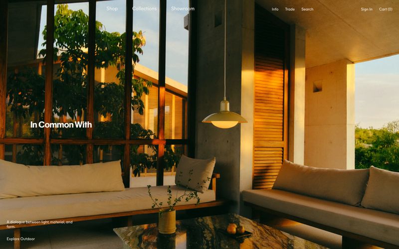

Incommonwith
牛血墨色的编辑工作室:暖奶油页面、阳光下的室内摄影,以及唯一深勃艮第墨色,像精细凸版印刷一样承担每个单词、边框和链接。
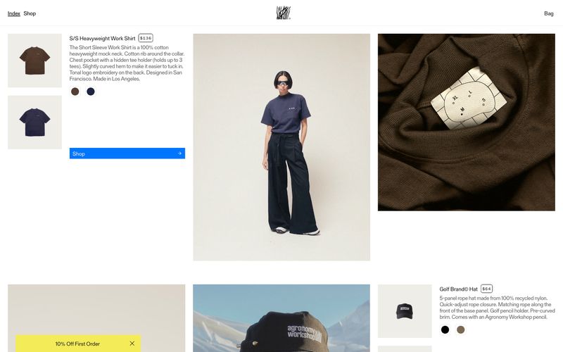
如同贴在工作室墙上的新闻纸独立小志。
Agronomy Workshop像一本印刷与产品相结合的目录:温暖、略微泛黄的白色画布、超大编辑式摄影,以及用古怪衬线字体排出的文案,感觉更像盖印而非排字。布局不对称且密集,产品元数据——名称、价格、描述和色样——挤在满幅造型画册图像旁的窄栏中,更像翻阅独立小志,而非浏览商店。唯一的饱和蓝色和芥末黄色促销色洗,是仅有的彩色音符;其余全部为黑、白和暖灰,使色样和蓝色“Shop”按钮像被通电启动。紧压的展示标题、打字机式衬线正文,以及宽字间距的全大写等宽标签,让系统具有刻意的模拟与创客语气,实用、不繁琐,并略带粗粝边缘。
查看原始网站牛血墨色的编辑工作室:暖奶油页面、阳光下的室内摄影,以及唯一深勃艮第墨色,像精细凸版印刷一样承担每个单词、边框和链接。
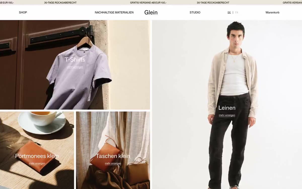
暖亚麻上的工作室造型册:满幅摄影、细线分割、一个低声字重的声音。
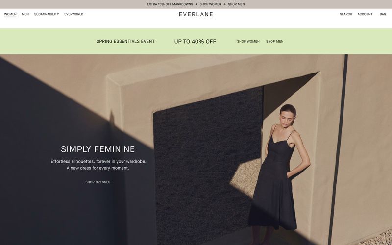

如同原生亚麻上的极简工坊,白墙、裸露建筑,以及唯一鼠尾草绿色光带。
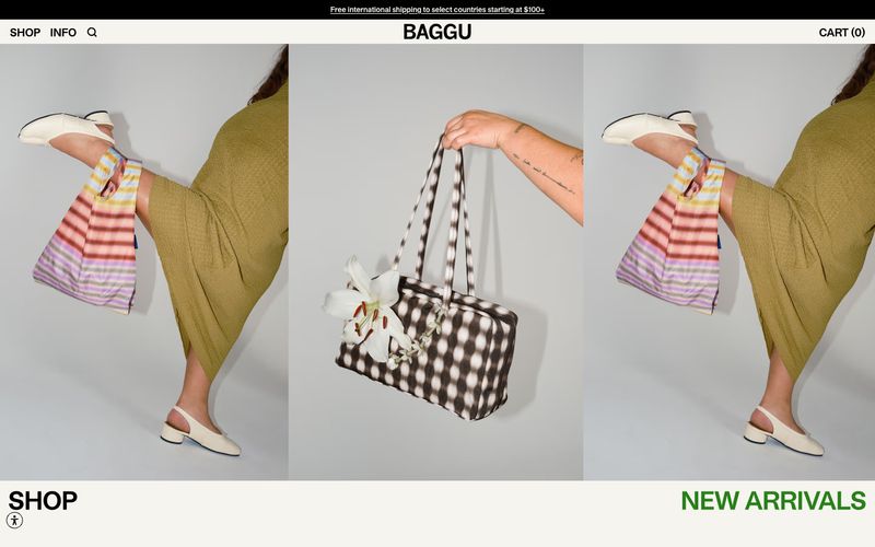

如同阳光照亮的奶油纸印刷目录:唯一温暖米白表面上,黑色文字与产品摄影承担全部表现,唯一绿色轻声说“new”。
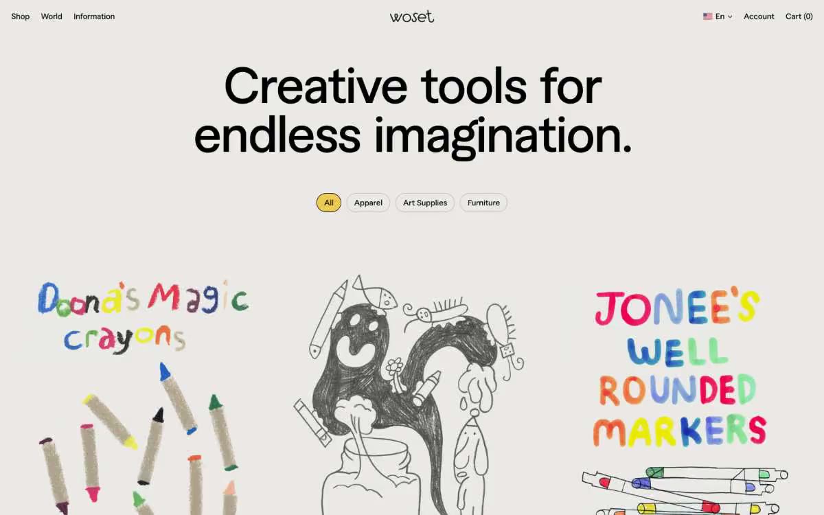

清晨阳光下的画廊——一个安静、暖灰的房间,墙上仅允许一个金色点缀。
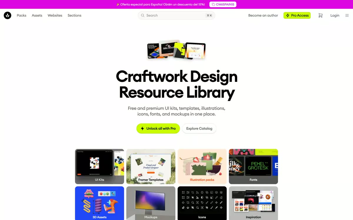

只有一盏酸绿灯的设计师工作室。明亮、如纸面般干净的工作空间,唯一鲜亮青柠强调标记高级货架,其余一切是审慎、画廊般安静的中性色。