# Incommonwith — Style Reference
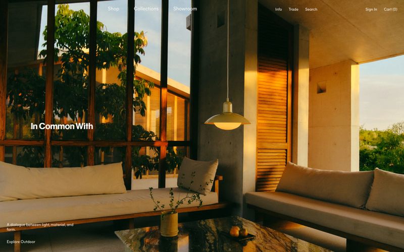
> Editorial atelier in oxblood ink — warm cream pages, sunlit interior photography, and a single deep burgundy ink that carries every word, border, and link like fine letterpress.

**Theme:** light

Source measurements are normalized; roles and recommendations are interpreted. Font summary lists are independent, not paired by position. HTML examples are reconstructions, not source components.

In Common With operates as a printed design quarterly, not a storefront: warm cream-white paper (#fafaf9) is the canvas, full-bleed golden-hour interior photography carries visual weight, and a single deep oxblood ink (#4a0a05) serves as every text element, border, and link. The type system pairs a classical Caslon Ionic serif at 24px for headlines with a neo-grotesque Mier A sans for body, navigation, and UI — a literary tension that recurs across hero overlays, category names, and journal titles. Layout is unhurried: full-bleed hero, sidebar date stamps, horizontal product carousels, and generous negative space let the photography lead. Surfaces are flat, corners are sharp, shadows are absent — depth comes from photography and warm color temperature, never from elevation.