

ElevenLabs
以轻声标题呈现的温暖奶油色编辑设计。一本包豪斯工作室笔记:蛋壳色纸张、黑色油墨,以及仅在产品展示场景中出现的紫色和橙色火花。
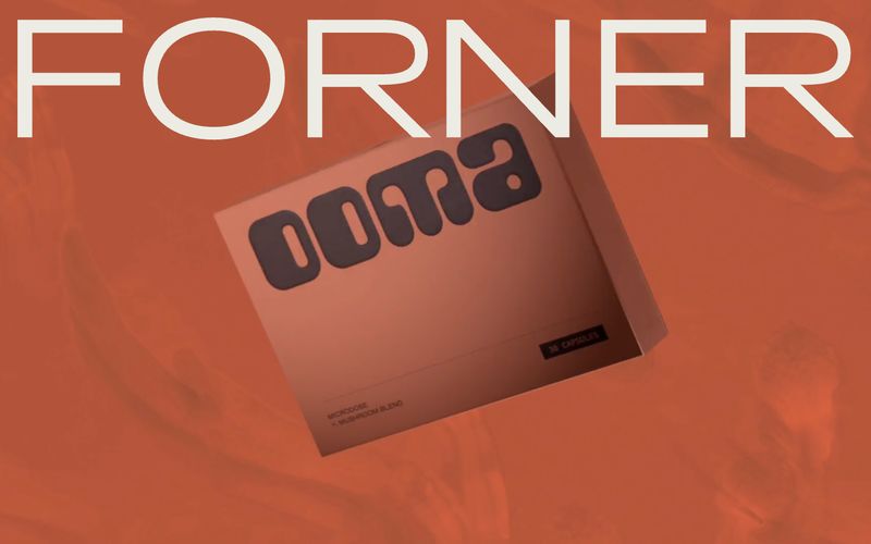

温暖的土质工坊——想象一个黄昏时分的陶艺工作室,每个表面皆为泥土、骨质或烘焙咖啡,唯一的金属感是陶艺师手写便签钉在墙上。
Forner 以阳光烘焙的设计工坊为基调:几乎全为暖土色系,单一定制无衬线字体承载 95% 的表达,字形巨大到舍弃层级而追求氛围感。画布为干奶油色;墨色为深烘棕;所有强调色均处于棕到骨的同色谱中。不存在品牌专属色——温暖本身即是品牌。表面平整,辅以细线边框,角落精确锐利至 4px,留白空间充裕(区块间间距不低于 100px)。定制衬线斜体偶有出现,作为手写注解,与无衬线字体的机械节奏形成微妙对照。
查看原始网站以轻声标题呈现的温暖奶油色编辑设计。一本包豪斯工作室笔记:蛋壳色纸张、黑色油墨,以及仅在产品展示场景中出现的紫色和橙色火花。


带活壁画的策展工作室:暖纸画廊中,插画世界在靛蓝画框旁绽放。


温暖的编辑工坊。奶油色纸张、炭黑色墨水,以及一个琥珀橙色的强调点——这是一处像艺术书页在琥珀光下拍摄的求职平台。
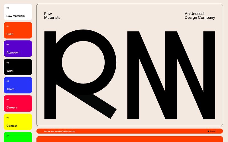

暖奶油上的粗野主义编辑页面。
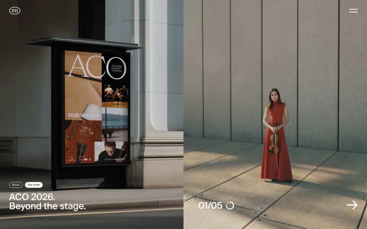

精选画廊于骨白亚麻材质上
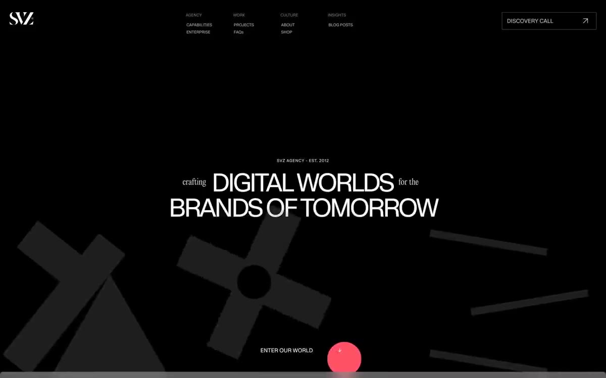

黑色画廊墙面,血红色标点——超大白色显示文字漂浮于类似虚无的深色画布之上,被单个鲜明的红色点缀和戏剧性的装饰性字体打断,整体感觉更像画廊标识而非网页界面。