# Raw Materials — Style Reference
> brutalist editorial on warm cream

**Theme:** light

Source measurements are normalized; roles and recommendations are interpreted. Font summary lists are independent, not paired by position. HTML examples are reconstructions, not source components.

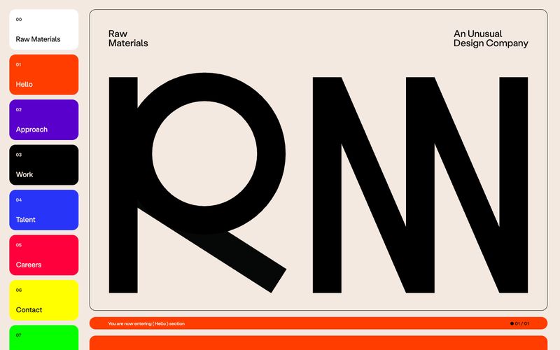
Raw Materials operates as a typographic maximalist system: a warm cream canvas carrying display type that regularly exceeds 200px, with every major surface element given its own vivid color identity. The system abandons a single brand color in favor of seven section-marker hues (orange, violet, ink, cobalt, crimson, yellow, green) that label navigation and content blocks alike, creating a zine-like rhythm where the color tells you which chapter you're in. Surfaces are flat and rounded at 16px — no shadows, no gradients, no elevation. Typography does all the hierarchy work, jumping from 12px captions to 259px display headlines with a cast of four custom typefaces, all sharing the "ss02" stylistic alternate.