# Websmith Studio — Style Reference
> morning light on cream paper

**Theme:** light

Source measurements are normalized; roles and recommendations are interpreted. Font summary lists are independent, not paired by position. HTML examples are reconstructions, not source components.

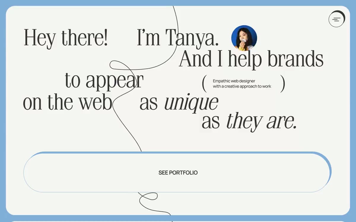
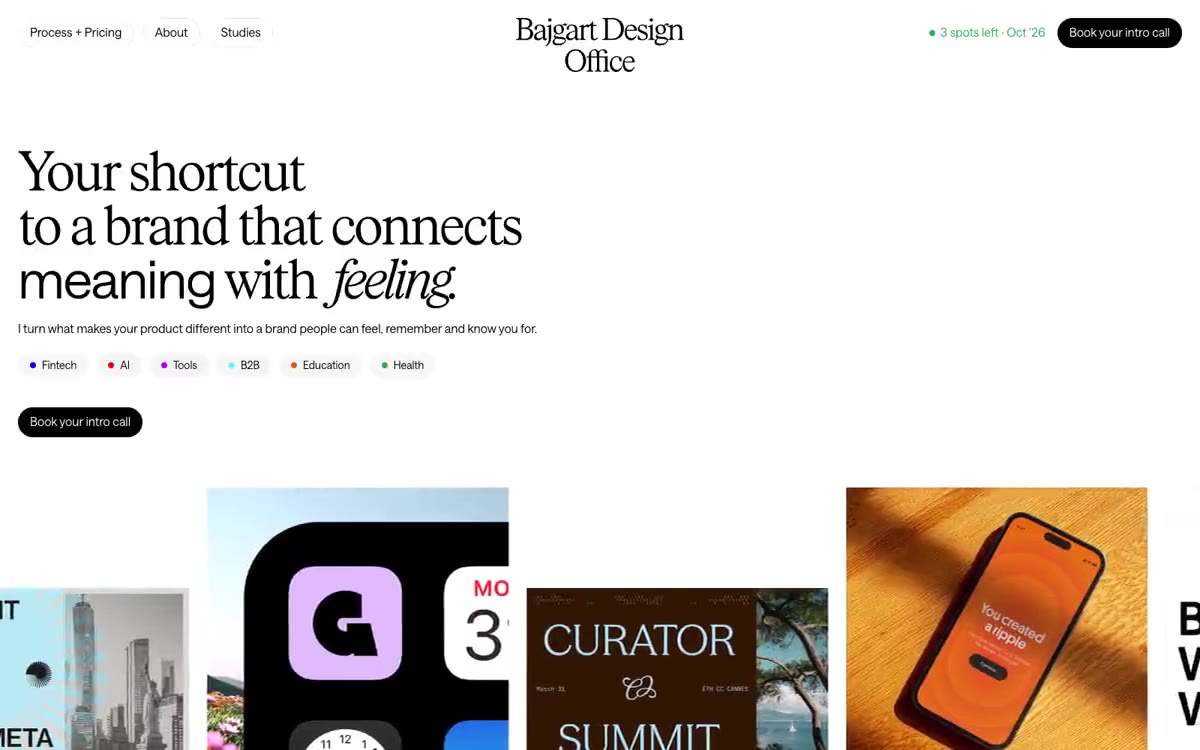
Websmith Studio is a quiet, almost monastic portfolio language built on warm cream paper and one near-black ink. The hero is typographic — a 96px sentence that carries the entire first screen — and everything else retreats to give it room. The interface is 99% achromatic; color appears only as three pastel card surfaces (powder blue, mint, blush) and a single vivid green status dot, used as functional punctuation rather than decoration. Components are flat and borderless, relying on generous whitespace, 12px image radii, and a single dark filled button to create rhythm. The system feels less like a website and more like a printed editorial spread — confident, restrained, and deliberately under-designed.