# Readymag — Style Reference
> Designer's editorial playground — a restrained white shell around bold, magazine-grade color blocks.

**Theme:** light

Source measurements are normalized; roles and recommendations are interpreted. Font summary lists are independent, not paired by position. HTML examples are reconstructions, not source components.

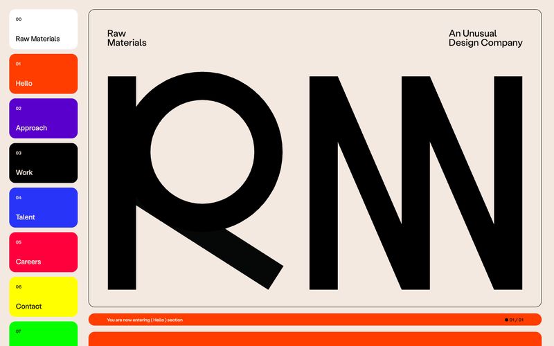
Readymag is a designer's editorial playground: a white-canvas product shell wrapped around an unmistakably bold, magazine-grade visual identity. The interface stays restrained — pure white background, near-black text, hairline borders — so the real work happens in feature blocks painted in saturated solid panels (electric violet, cobalt blue, ember orange, pure black, signal yellow). Typography carries enormous personality: a custom geometric display face at 30–80px with aggressively tight negative tracking does the heavy lifting for headlines, while a quieter workhorse sans handles body and UI. Components feel hand-set rather than templated — pill-shaped CTAs, thick section margins, and card surfaces that confidently fill their panels with color instead of nudging content forward with elevation. The result reads less like SaaS and more like a creative agency's homepage.