# Baggu — Style Reference
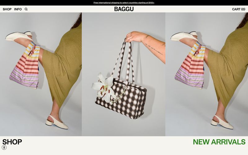
> Sunlit print catalog on cream paper — a single warm off-white surface where black type and product photography do all the work, and a single green whisper says 'new'.

**Theme:** light

Source measurements are normalized; roles and recommendations are interpreted. Font summary lists are independent, not paired by position. HTML examples are reconstructions, not source components.

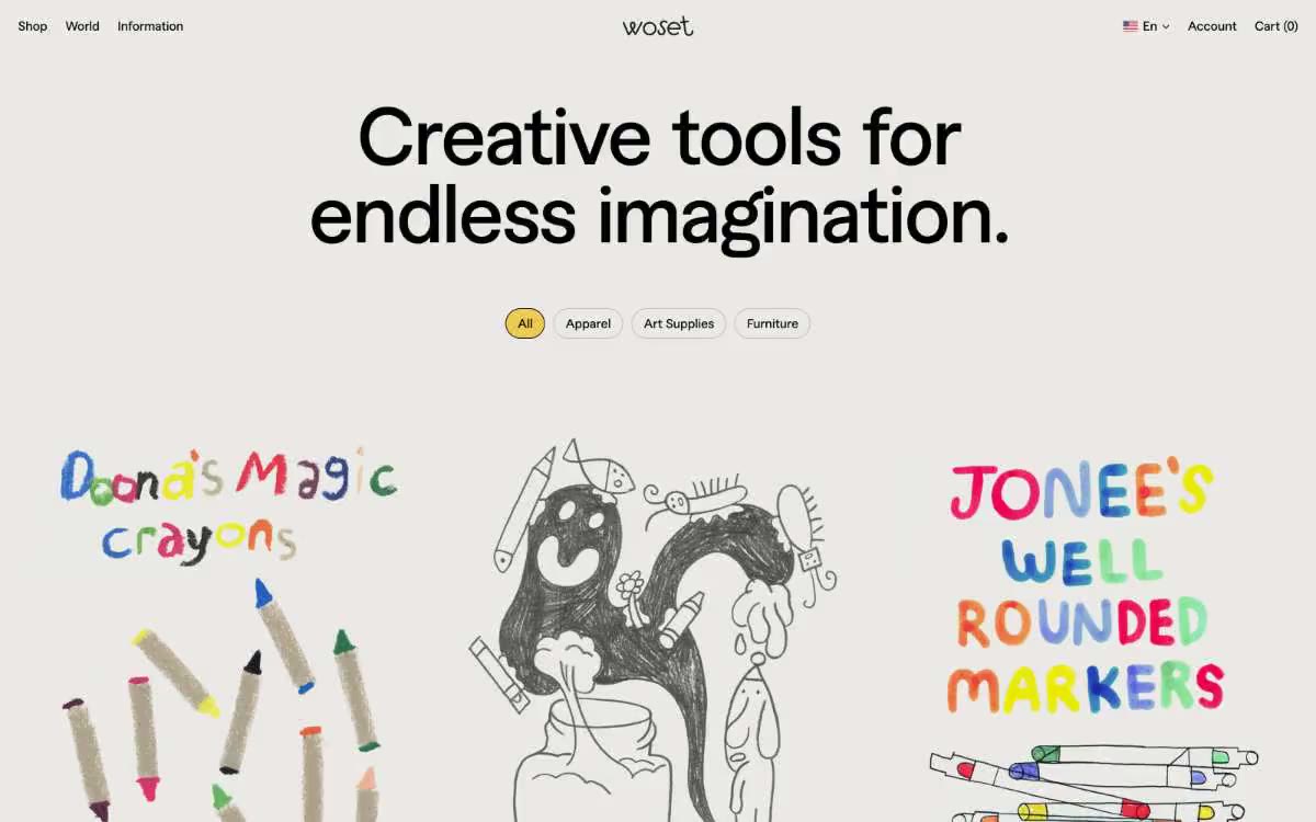
Baggu operates as an editorial product catalog: a single warm cream canvas, black type and hairline borders, and product photography that takes 90% of the viewport. The interface is almost entirely achromatic — one warm off-white surface, one true black, and one muted warm gray for secondary metadata. The only chromatic element is a single medium green reserved for the 'New Arrivals' label and success states, functioning as a quiet signal rather than a brand color. Typography is custom and compact: a neo-grotesque at 12–18px with tight tracking and stylistic alternates enabled, sitting close to the baseline so product cards feel like printed price tags. Layout is image-first, text-second: full-bleed editorial triptychs, 5-up product grids, category tiles with caption labels. Density is tight, but the cream surface gives the whole thing room to breathe.