# Peak Design — Style Reference
> Gallery wall, half lit

**Theme:** light

Source measurements are normalized; roles and recommendations are interpreted. Font summary lists are independent, not paired by position. HTML examples are reconstructions, not source components.

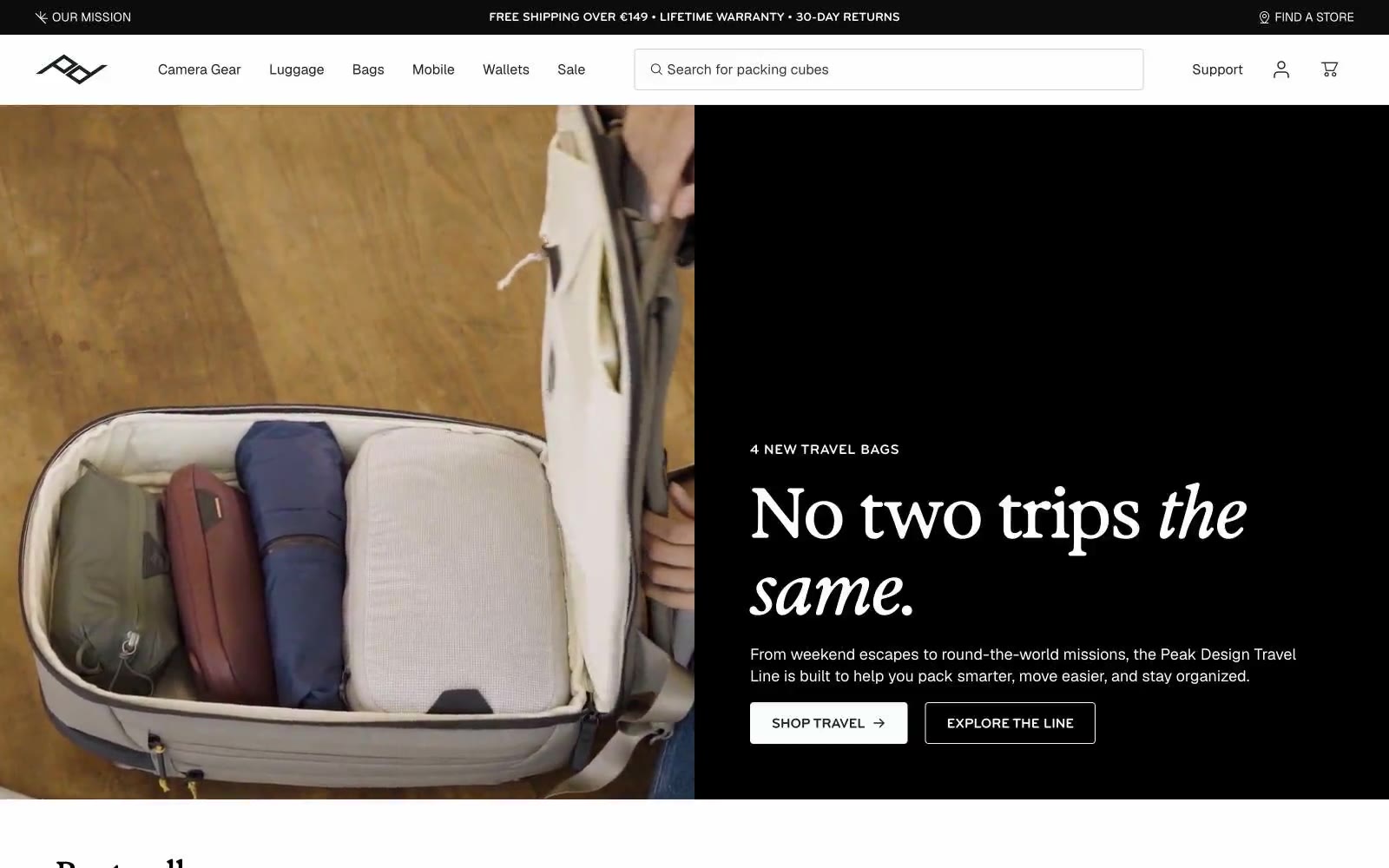
Peak Design is a gallery-grade commerce experience: a near-monochrome canvas where editorial typography and product photography do all the work. The system alternates between crisp white surfaces and deep near-black panels, creating dramatic split layouts where one side carries an italic serif headline and the other a full-bleed product or lifestyle image. Typography is the brand's primary voice — a tall condensed display serif (Exposure-style) for headlines paired with a neutral grotesque (Geist) for UI and an all-caps compressed sans (bryant) for labels, eyebrows, and buttons. The interface stays disciplined: no chromatic UI elements, no decorative gradients, no shadows — just hairline borders, two corner radii (4 and 8), and a single red accent reserved for rare emphasis. Components feel engineered rather than decorated: thin dividers, flat product cards, pill-shaped filter chips, and ghost buttons that read as architectural annotations.