# Laura Monin — Style Reference
> editorial gallery wall, white marble, ink stamp

**Theme:** light

Source measurements are normalized; roles and recommendations are interpreted. Font summary lists are independent, not paired by position. HTML examples are reconstructions, not source components.

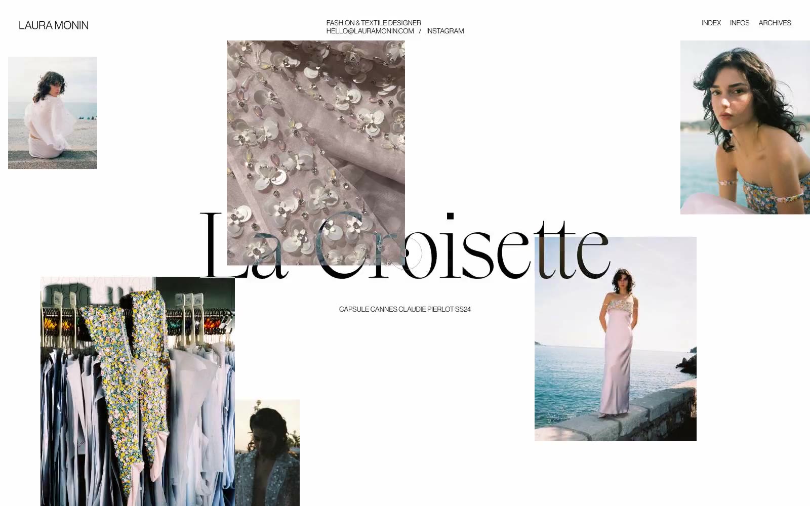
Laura Monin is an editorial fashion portfolio built on absolute chromatic restraint: pure white canvas, black ink, and a single custom display serif that carries the entire brand voice. The layout behaves like a curated mood board — photographs scatter asymmetrically across generous negative space rather than aligning to a conventional grid, with overlay captions functioning as whispered labels rather than navigation. Typography carries all hierarchy: the massive display serif at 58–158px commands the center, while Neue Haas Grotesk at 12–22px serves as quiet scaffolding for navigation, metadata, and supporting text. There are no shadows, no rounded corners, no gradients, no color — the system achieves its luxury through what it removes, not what it adds. Every element should feel like it was placed by hand on a gallery wall: precise, unhurried, and never filling more of the frame than necessary.