# INK — Style Reference
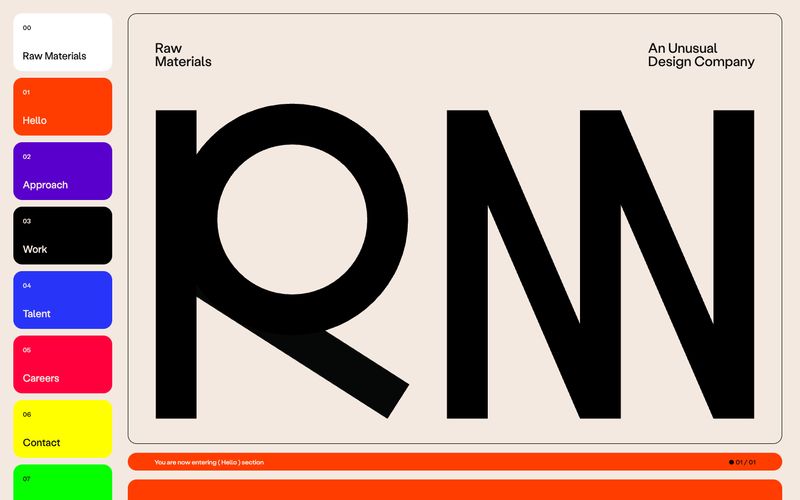
> Editorial spread on warm paper. A single humanist voice, monochrome with a whisper of taupe, interrupted only by full-bleed photography and a slim band of warm orange.

**Theme:** light

Source measurements are normalized; roles and recommendations are interpreted. Font summary lists are independent, not paired by position. HTML examples are reconstructions, not source components.

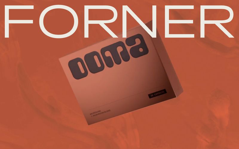
INK is an editorial gallery for a digital studio: warm-white paper, a single weight of a humanist sans, and photography that fills the viewport edge-to-edge. The palette is almost entirely grayscale with one warm taupe (#afa697) doing duty as a 'whispered' secondary voice, while a pair of vivid oranges surfaces only inside decorative bands and illustrations — never inside UI controls. Components are reduced to their quietest form: pill-shaped nav, hairline-thin labels, and image captions that float beneath full-bleed frames. The visual rhythm alternates between vast editorial type passages and cinematic image plates, separated by 160px of negative space.