# Qatchup — Style Reference
> Ink on warm paper, whispered quietly.

**Theme:** light

Source measurements are normalized; roles and recommendations are interpreted. Font summary lists are independent, not paired by position. HTML examples are reconstructions, not source components.

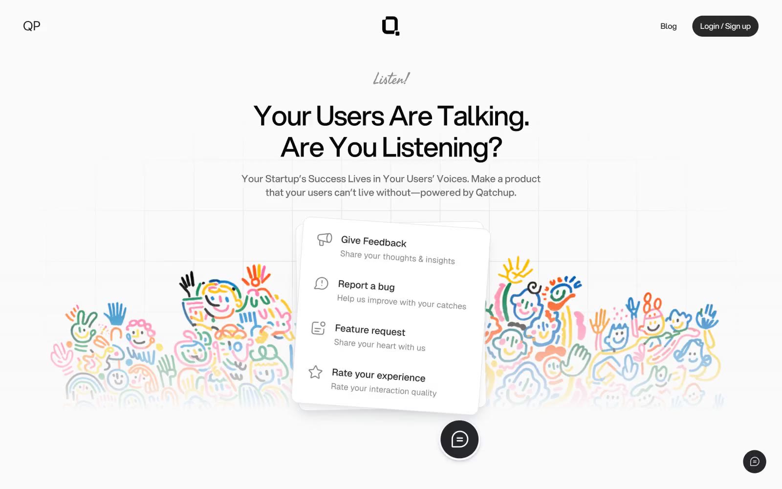
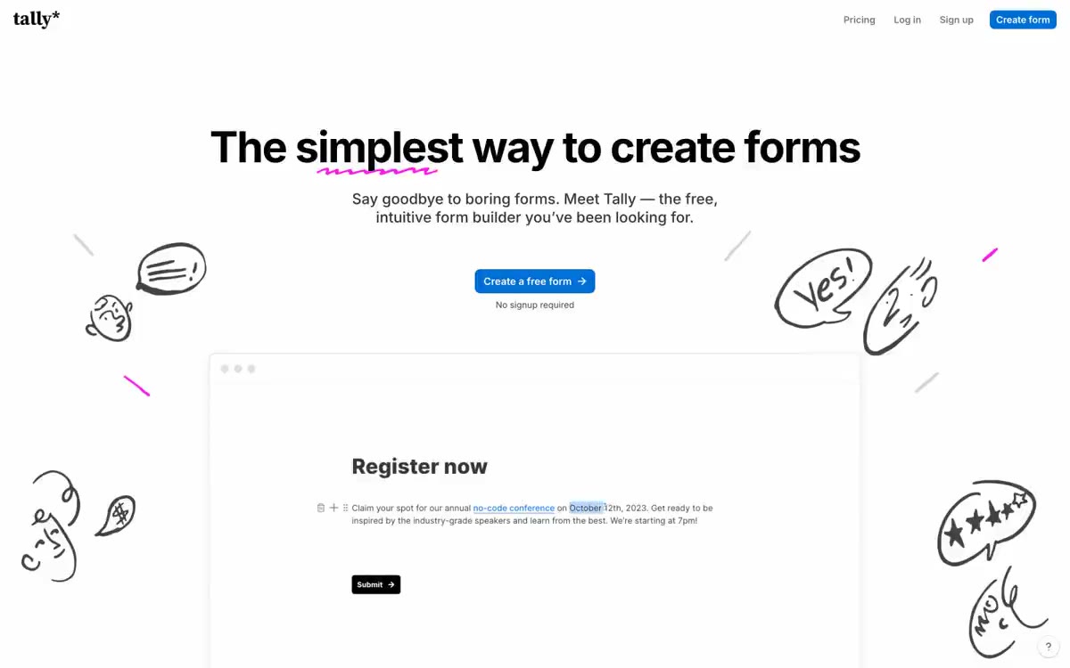
Qatchup uses a near-achromatic canvas where the only color is emotional: a washed-out grid of gray ink on warm white, with the product almost entirely communicated through type, spacing, and a single handwritten accent. The system is defined by restraint — a custom display sans (Aspekta) set tight with negative tracking, pill-shaped controls, and cards that float on layered hairline shadows rather than colored surfaces. Structure is established by border weight and vertical rhythm, not fills or gradients. A single script typeface (Fasthand) appears sparingly as a human signature — the 'Listen!' above the hero, the 'Open Letter' kicker — creating emotional warmth against an otherwise architectural grid. Components are minimal and ghosted: dark pill buttons for primary action, light pill buttons for secondary, bordered cards for content blocks, and thin dividers carrying the layout's load. The colorful hand-drawn illustration is decorative atmosphere, not a UI token system — the interface itself stays quiet and monochrome.