# Ramp — Style Reference
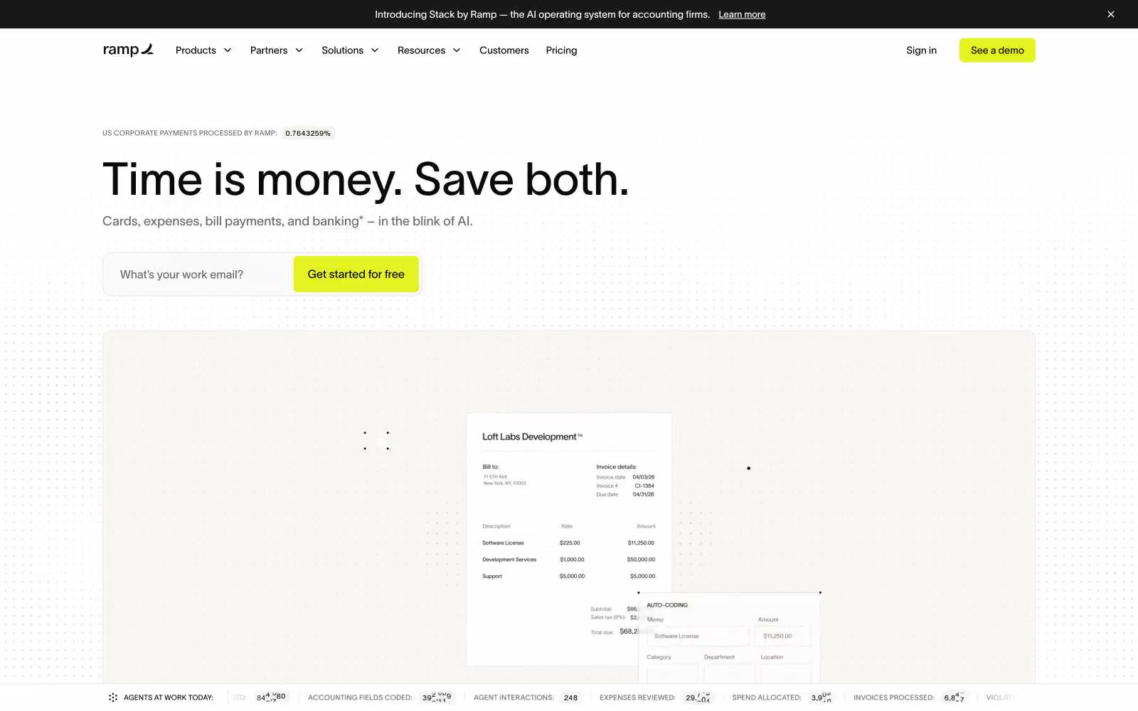
> Editorial finance desk, black-and-white pages with a single neon highlighter. A near-monochrome publication surface where one vivid chartreuse mark turns every interaction into a money signal.

**Theme:** light

Source measurements are normalized; roles and recommendations are interpreted. Font summary lists are independent, not paired by position. HTML examples are reconstructions, not source components.

Ramp operates as a black-and-white editorial system punctuated by a single highlighter-yellow accent — the visual equivalent of a finance journal with a neon Sharpie. The interface stays nearly monochrome: warm off-white canvas, white cards, hairline gray borders, and deep near-black text. That one vivid chartreuse (#e4f222) appears only where money moves — CTAs, live counters, active states — making every action feel switched-on. Typography is a single-weight, neo-grotesque custom face (lausanne) at 400, used at large display sizes with tight leading (lineHeight ~1.0 at 64px) and positive tracking on small uppercase labels. Components are flat, hairline-bordered, and shadow-free: cards rest on borders, not shadows, with 12–16px radii; buttons are 6px-radius rectangles. Density is comfortable, rhythm is 8/12/16/24px, and motion is moderate and utility-focused rather than decorative.