# Composer — Style Reference
> Bauhaus confetti on concrete

**Theme:** light

Source measurements are normalized; roles and recommendations are interpreted. Font summary lists are independent, not paired by position. HTML examples are reconstructions, not source components.

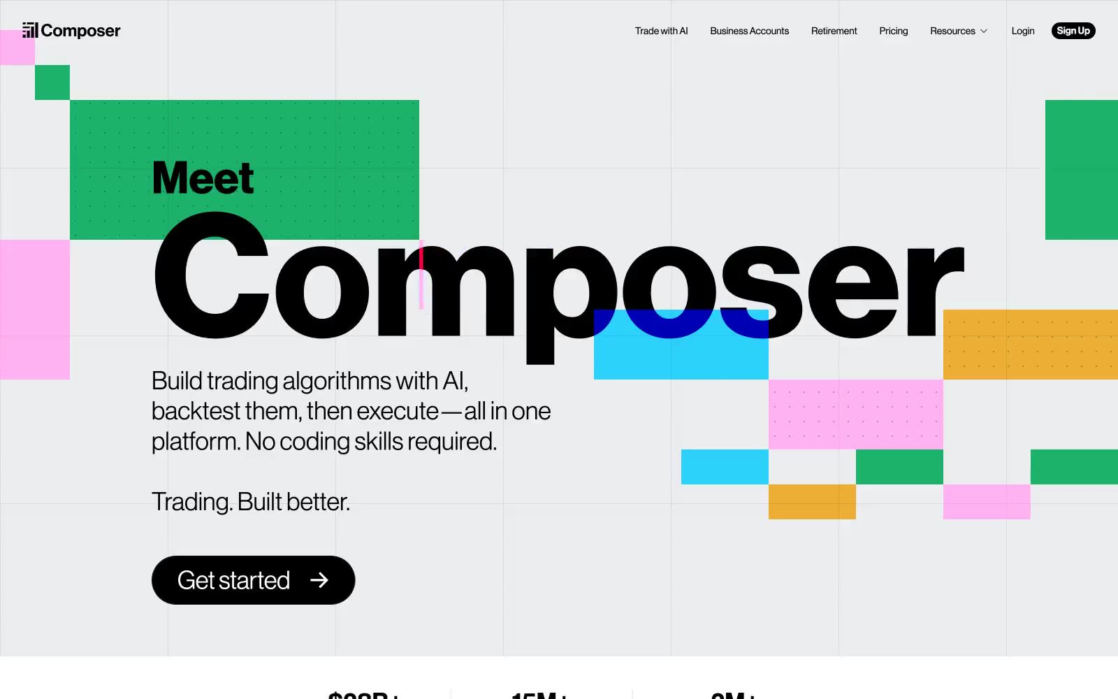
Composer speaks in the language of an editorial trading manifesto: a light ash canvas scattered with Bauhaus confetti — vivid blue, green, pink, and yellow rectangles that read as information shapes, not decoration. The Neue Haas Grotesk Display type stretches to 244px, letting headlines dominate like magazine covers while Inter handles the quiet, compact UI chrome below. The system is confident and maximalist for marketing surfaces but contracts to a clean, functional dashboard for product work — sharp 2px icon edges and pill-shaped 9999px buttons coexist without contradiction, because both serve clarity over softness. Color is deployed as functional punctuation: black text on near-white surfaces, hairline gray borders everywhere, and saturated chromatic blocks that mark emphasis, group information, and create visual rhythm across an otherwise monochrome grid.