# Home — Style Reference
> Swiss broadsheet behind a highlighter pen

**Theme:** light

Source measurements are normalized; roles and recommendations are interpreted. Font summary lists are independent, not paired by position. HTML examples are reconstructions, not source components.

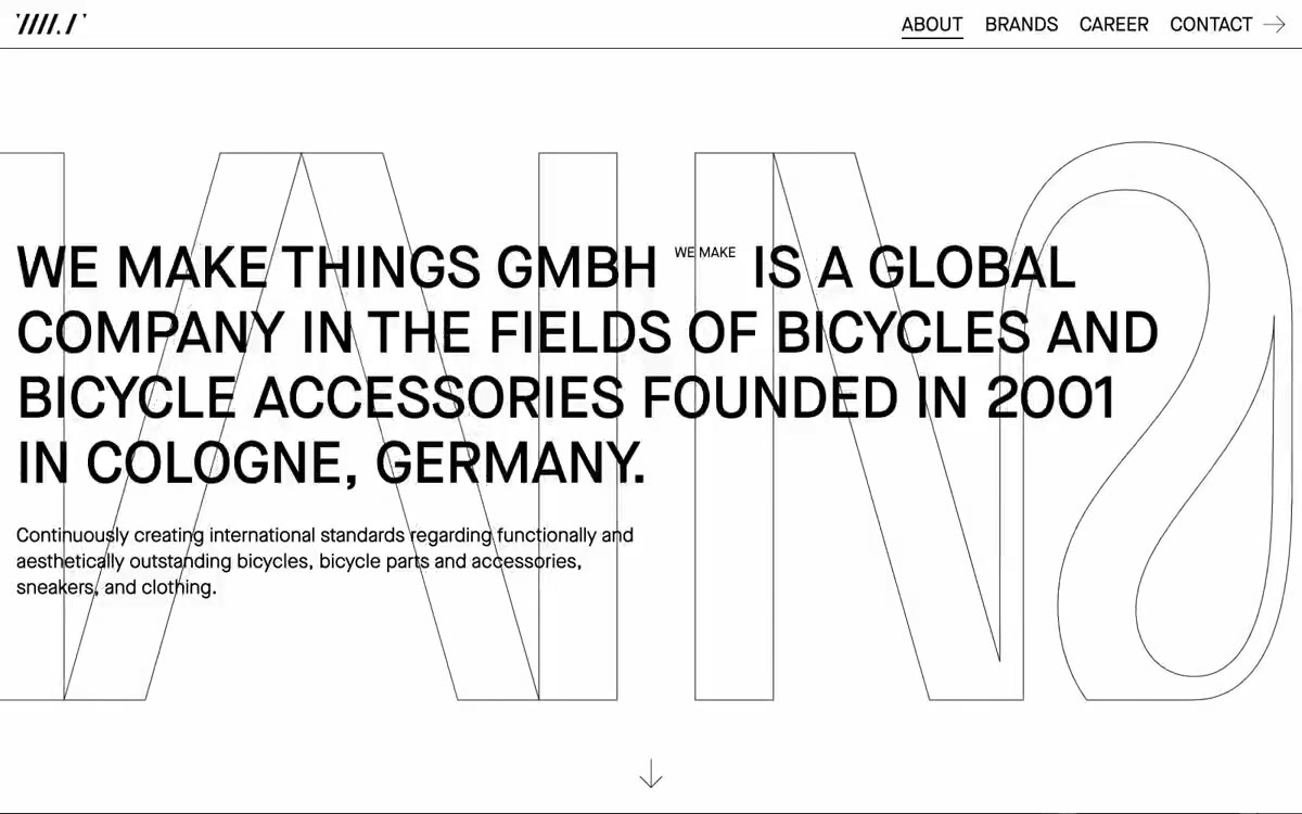
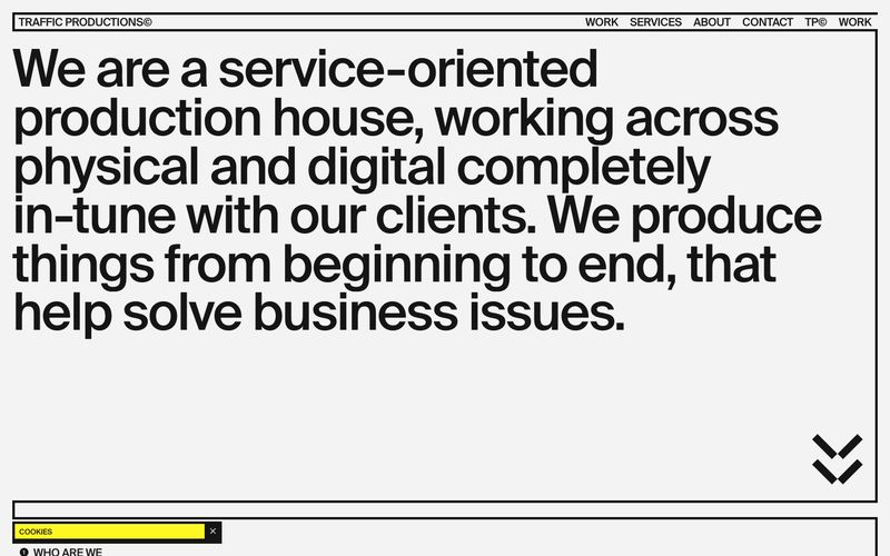
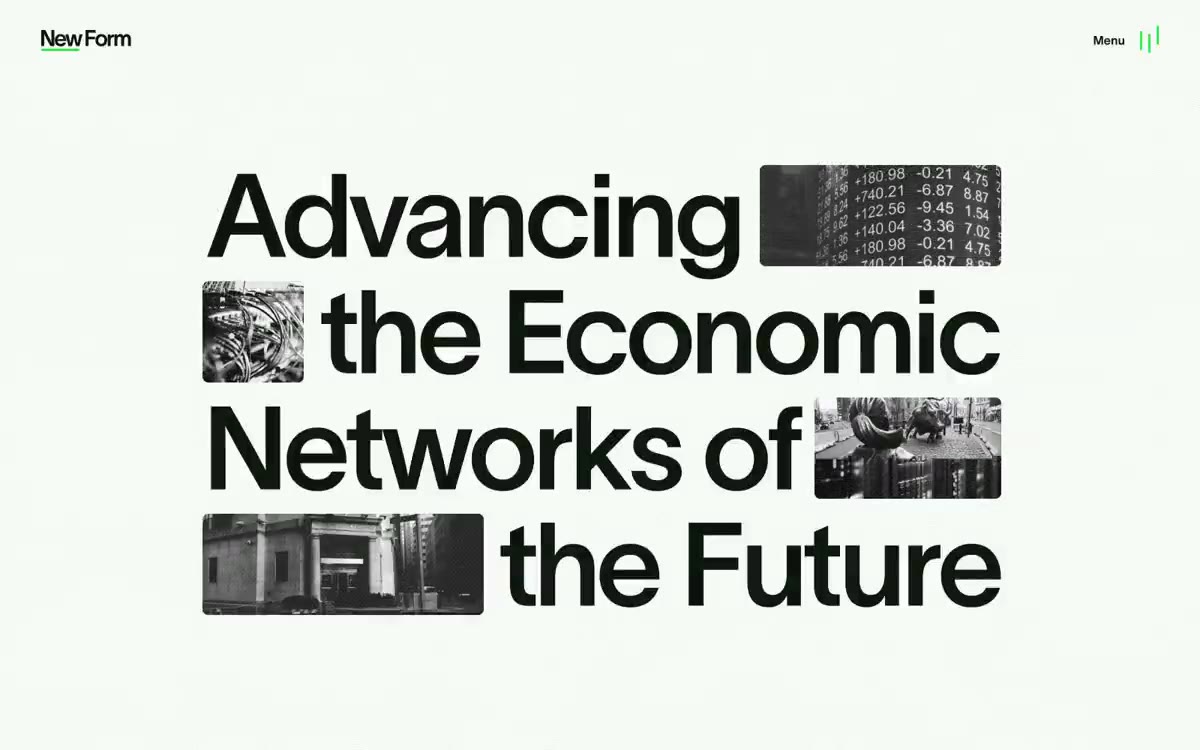
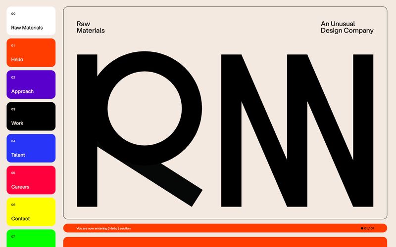
Traffic Productions operates as a typographic poster dragged onto the web: a pale gray canvas framed by hairline black rules, a single fluorescent yellow that behaves like a marker pen, and a single typeface (Suisse) pushed to display sizes of 108px with aggressively negative tracking. The system rejects softness — no shadows, no rounded surfaces (except pill buttons), no gradients, no decorative imagery except monochrome photography treated as raw material. Layout is ruled-grid editorial: content lives inside thin black rectangles like entries in a printed specimen book, and the yellow accent is never decorative — it always labels, highlights, or marks an action. Density is compact, the type scale is extreme, and the overall feel is a Swiss production-house broadsheet that happens to scroll.