# Dash Digital Studio — Style Reference
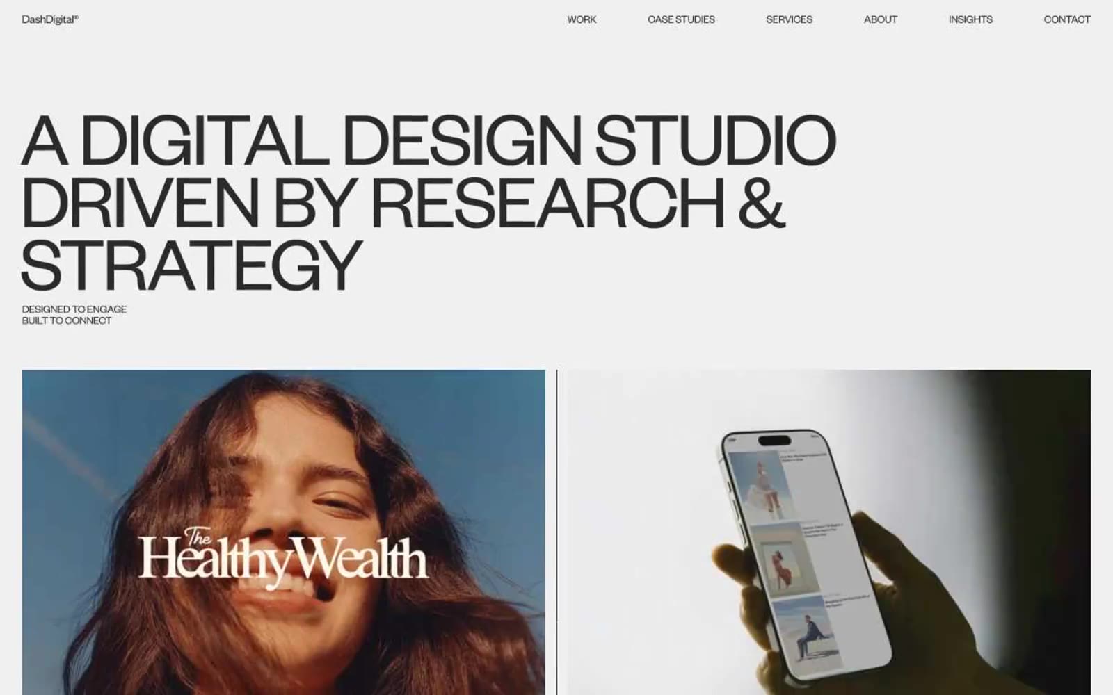
> Editorial museum on warm paper. A gallery where giant whisper-weight typography floats over off-white walls and full-bleed product photography does all the talking.

**Theme:** light

Source measurements are normalized; roles and recommendations are interpreted. Font summary lists are independent, not paired by position. HTML examples are reconstructions, not source components.

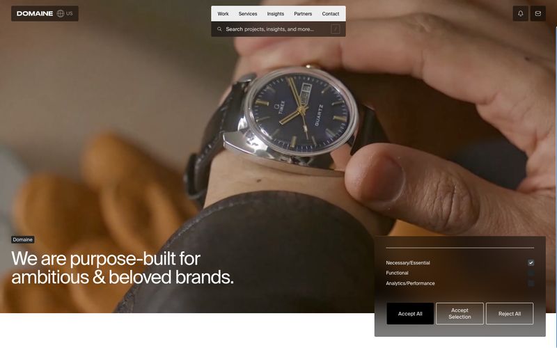
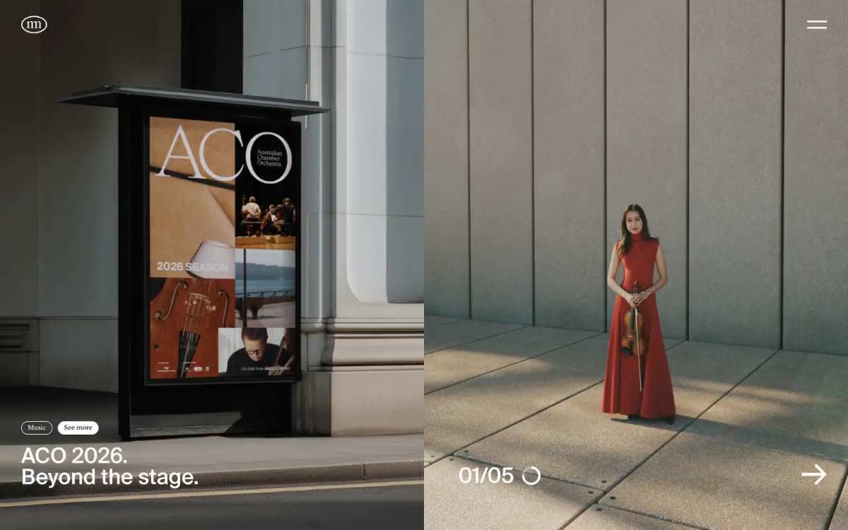
Dash Digital Studio runs a strictly achromatic editorial system — warm off-white canvases, near-black type, and absolutely zero chromatic accent. The entire visual language is carried by two type weights of Founders Grotesk at extreme sizes: whisper-light 300 for monumental display headlines (70–101px) and regular 400 for body and navigation. Letter-spacing tightens aggressively at large sizes (-0.0600em at display) while line-heights compress to 0.80–0.88, making the giant headlines feel architectural and sculptural rather than promotional. Work is presented like a gallery: full-bleed product photography inside 2-up case study frames, minimal UI chrome, pill-shaped dark badges for actions, and hairline rules separating brand lists. The absence of color is the system — every signal (hierarchy, emphasis, interaction) must be built from type weight, scale, spacing, and the tonal shift between #fafafa, #f0f0f0, and #2a2a2a.