# Wemakethings — Style Reference
> Brutalist editorial broadsheet — ink-on-white architecture with type as the only building material.

**Theme:** light

Source measurements are normalized; roles and recommendations are interpreted. Font summary lists are independent, not paired by position. HTML examples are reconstructions, not source components.

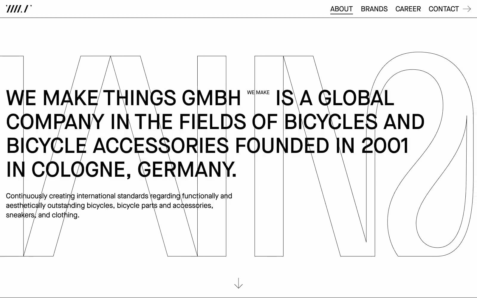
WeMakeThings operates on a brutally reductive editorial logic: pure black ink on a white paper canvas, with nothing but typography and whitespace to carry the entire visual system. The site reads like a design broadsheet — massive outlined display type acts as architectural scaffolding behind bold all-caps headlines, creating depth and scale without any color, shadow, or imagery. Components are stripped to their skeleton: hairline underlines, thin borders, and direct unadorned type. Density is comfortable with generous margins, and the brand grid uses vertical text columns to turn a simple list into a typographic wall. There is no decoration, no warmth, no gradient — just confident restraint where every pixel earns its place.