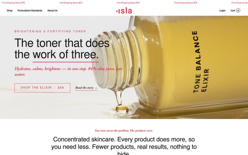

Isla Beauty
奶油色药剂铺,以手术般精确的红色点缀:温暖羊皮纸墙面、琥珀色瓶子,以及每张标签上唯一的红色印章。
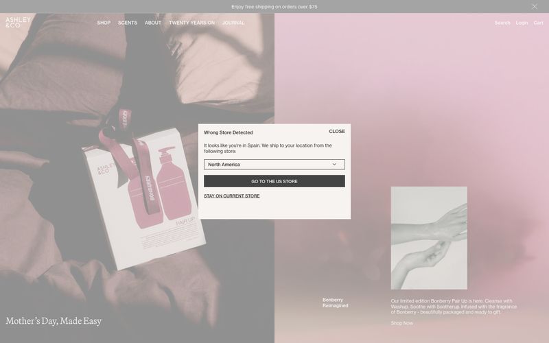

低语般的药房风格编辑——温暖奶油底页,一个衬线标题如香水广告般漂浮,其余元素则退入静默。
Ashley & Co 以静谧美感的编辑风格呈现:温暖奶油底色,近黑色墨水字体,以及以柔和玫瑰与石质水洗效果呈现的摄影。界面几乎完全无色彩——色彩仅存在于影像中,绝不会用于按钮、边框或文字。两种字体承担主要排版任务:一种精致的衬线字体(Martina Plant)用于类似杂志引语的展示场景,另一种无衬线字体(Neue Haas Grotesk Text)用于所有实用内容。组件轻盈无重:细线边框、无阴影、除画布本身外无填充。留白是核心设计元素—— 宽松 80px 区块间距和非网格化错位,营造出翻阅咖啡桌书籍而非浏览店铺的体验。导航采用极细的全大写、字间距调整的字母;行动号召(CTA)为带细下划线的文本链接。整体效果克制、药房式奢华,自信得足以让产品摄影和衬线标题承载整个品牌。
查看原始网站奶油色药剂铺,以手术般精确的红色点缀:温暖羊皮纸墙面、琥珀色瓶子,以及每张标签上唯一的红色印章。
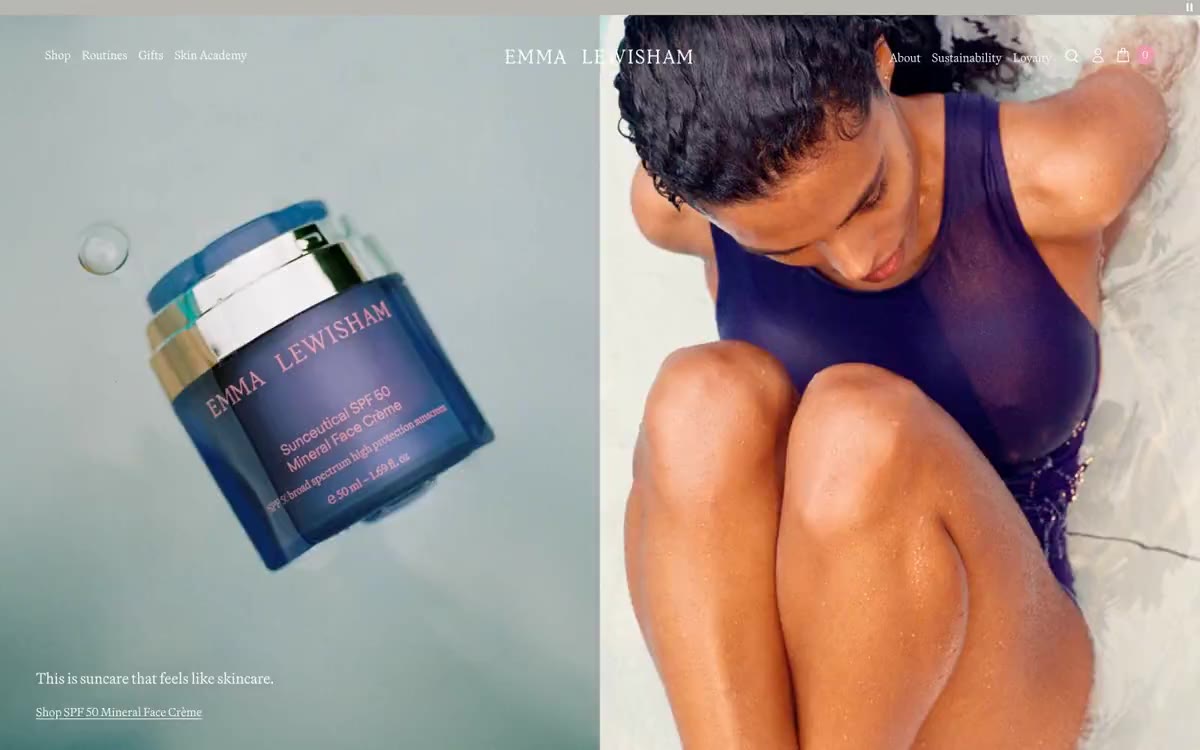

黄金时刻的瓷器药房。暖亚麻表面托着宝石色玻璃器皿,品牌紫在房间描出细线,衬线标签像雕刻药房招牌一样浮在洁净无衬线界面之上。

如同单色编辑式跨页。想象一张时尚杂志跨页,除产品摄影外去掉全部彩色,所有叙事都由文字和留白承担。
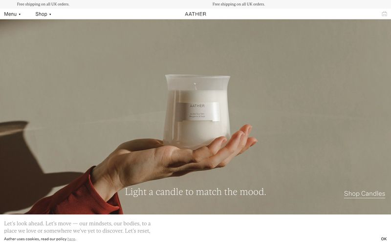

摊开手掌,一缕火焰——静谧奢华藏于静止之中。
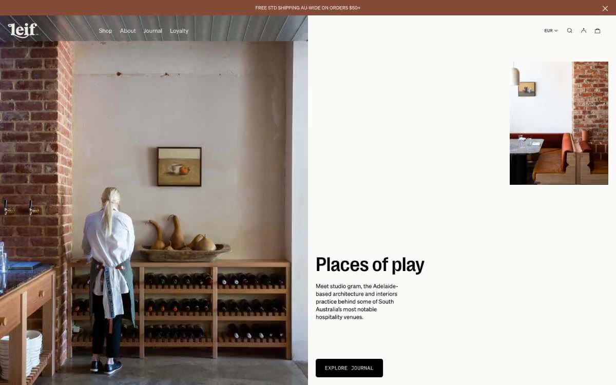

原色亚麻上的药房。温暖、手压印刷的编辑页面,墨黑文字落在骨奶油纸上,旁边是植物产品摄影。
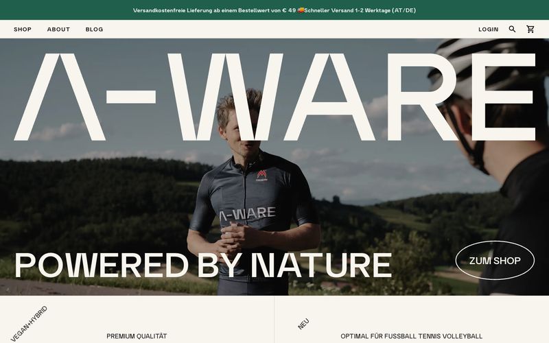
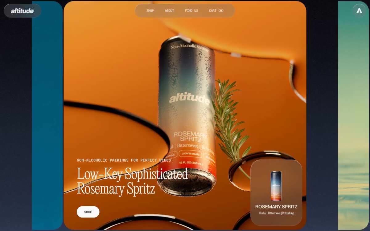
如同温暖羊皮纸上的药剂室编辑式跨页。一张高山运动员的药剂室跨页中,奶油纸、黑色墨迹、唯一青铜印章,以及深色玻璃罐体,悬浮在充裕留白中。