# Figma — Style Reference
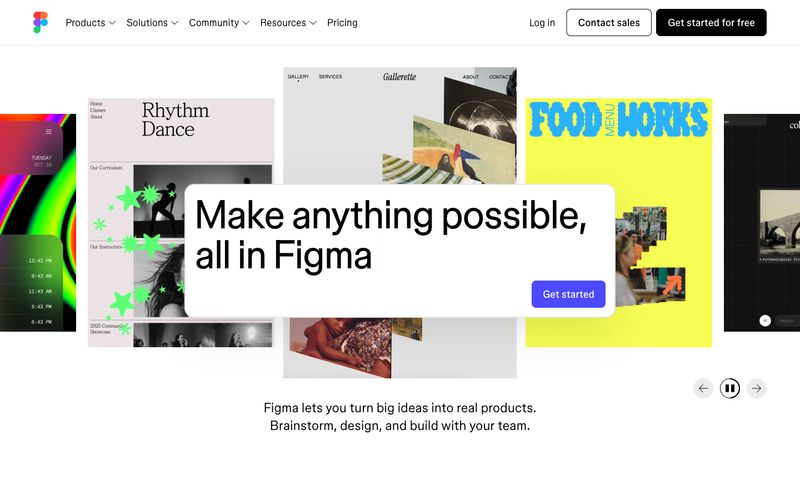
> white gallery wall with a single indigo spotlight.

**Theme:** light

Source measurements are normalized; roles and recommendations are interpreted. Font summary lists are independent, not paired by position. HTML examples are reconstructions, not source components.

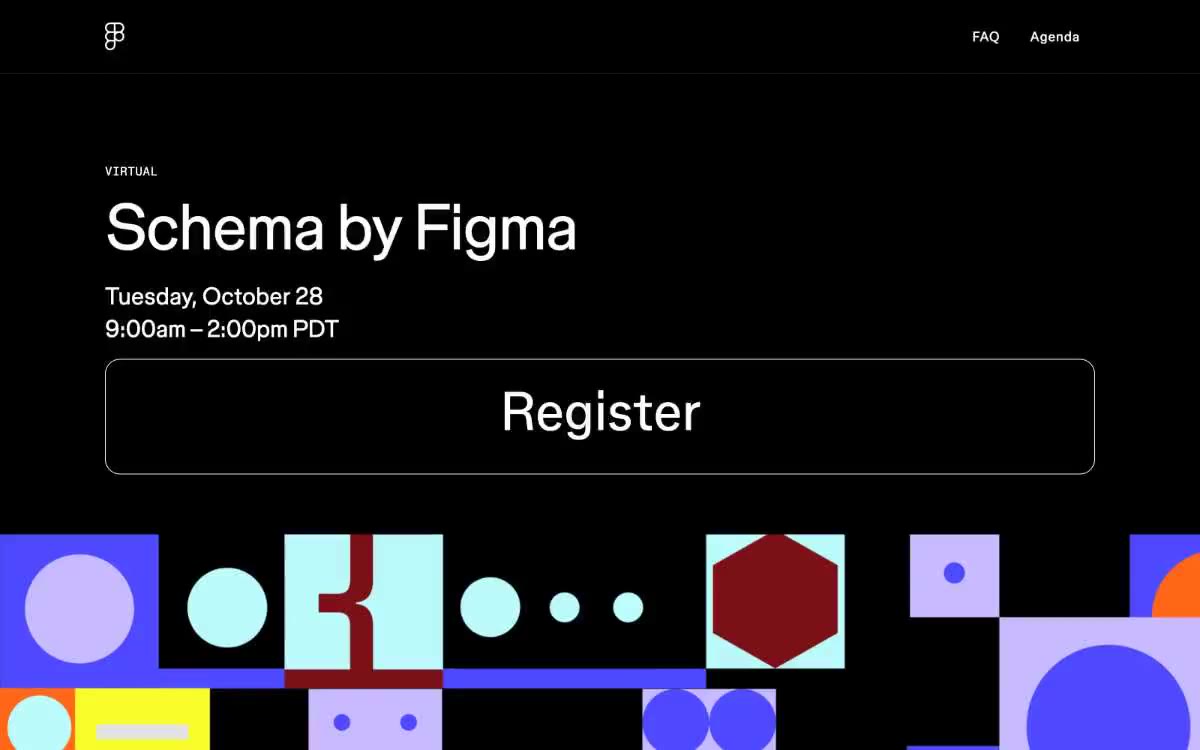
Figma operates as a pure white canvas for creativity: an achromatic interface where black text, white surfaces, and a single electric indigo accent do all the work. The visual system stays out of the way so that user-generated design work can speak — bold display headlines, light weight body text, and pill-shaped controls create a quiet, confident stage. Color appears sparingly as functional punctuation (CTAs, hover states, the Figma logo) while the surrounding page is deliberately blank, almost gallery-like. Elevation is reduced to one soft drop shadow on elevated cards; the rest of the hierarchy is built with whitespace, weight contrast, and scale. The rhythm alternates between vast breathing-room sections and tightly packed card grids, producing a museum-meets-workspace feel.