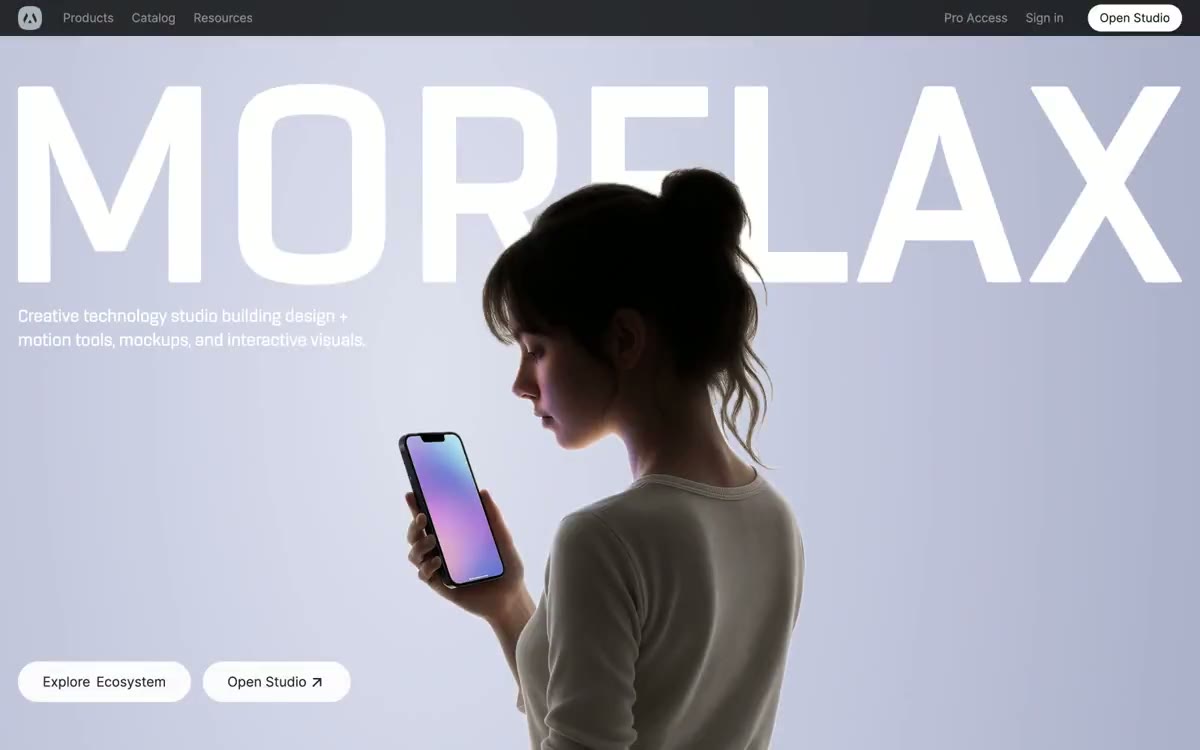

Morflax
如同Porcelain画廊中的唯一蓝色火花,近黑导航栏悬在白色房间上方,房间短暂泛出薰衣草色,其余每个操作与边框保持灰阶,直到唯一钴蓝按钮确认这一时刻。
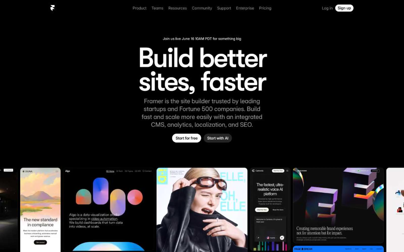

电影感的黑色画廊。纯黑色画布承载白色编辑性文字和一个电蓝色点缀,该点缀仅描边而非填充空间。
Framer 在绝对黑暗中运作:一片纯黑色画布(#000000),其中白色文字和一个电蓝色(#0099ff)点缀承担全部表达。设计语言具有电影感和自信——超大尺寸的压缩显示字体(GT Walsheim 85–110px)锚定每个板块,其余界面则溶解为近乎黑色的表面层。标志性的节奏是极简首屏区域文字与极简网格化客户站点截图交替呈现,均以细线分隔,搭配紧凑的10px字间距。蓝色点缀从不填满按钮;它仅用于描边、卡片轮廓,以及文本选择、链接悬停等微交互中——克制,从不装饰。组件轻盈:胶囊形控件、细边框,以及几乎可忽略的抬升,让摄影与编辑性文字承担主要表现力。
查看原始网站如同Porcelain画廊中的唯一蓝色火花,近黑导航栏悬在白色房间上方,房间短暂泛出薰衣草色,其余每个操作与边框保持灰阶,直到唯一钴蓝按钮确认这一时刻。


温暖的奶油纸工作空间搭配石墨点缀——一个浮于亚麻结构之上的工作室,其中哑光黑色墨点漂浮其上。
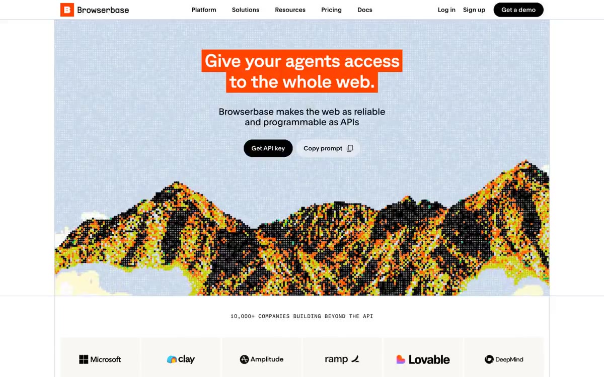

如同编辑式大幅报纸与数据终端相遇:在超大GT Planar标题、柔和粉彩卡片表面和微型等宽元数据构成的近乎单色区域中,唯一热橘色作标点。
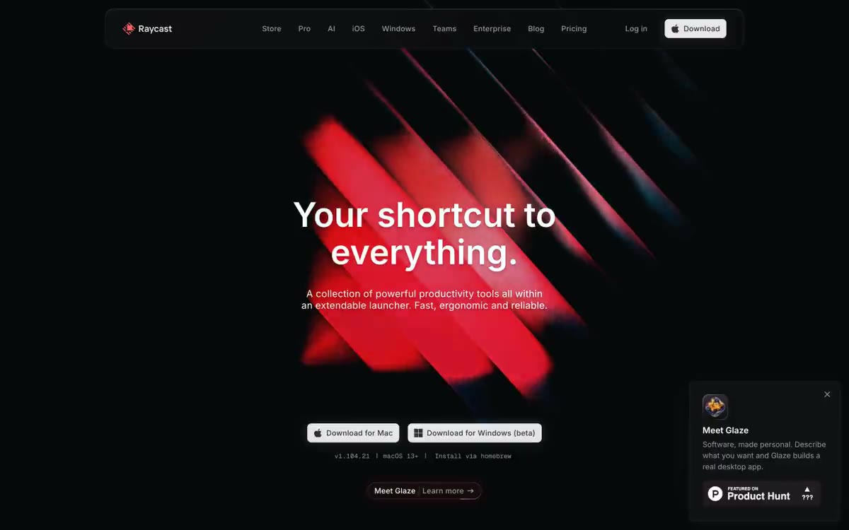

午夜指挥中心,珊瑚霓虹
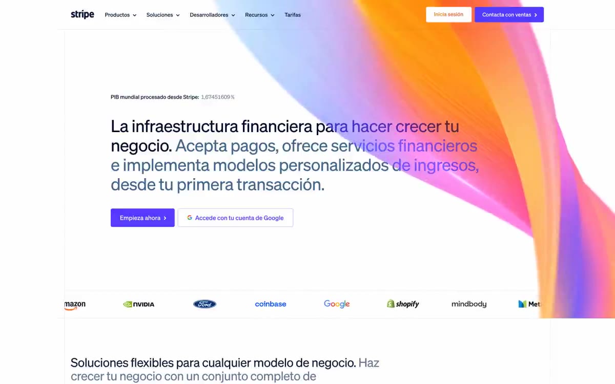

靛蓝墨水账本置于磨砂玻璃上
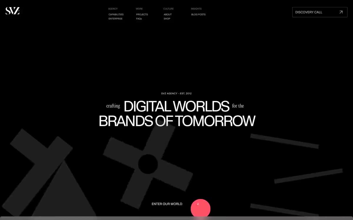

黑色画廊墙面,血红色标点——超大白色显示文字漂浮于类似虚无的深色画布之上,被单个鲜明的红色点缀和戏剧性的装饰性字体打断,整体感觉更像画廊标识而非网页界面。