# Morflax — Style Reference
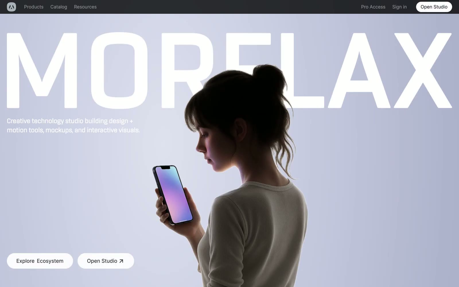
> Porcelain gallery, one blue spark — a near-black nav bar hovers above a white room that briefly blushes lavender, while every action and border stays in grayscale until a single cobalt button confirms the moment.

**Theme:** light

Source measurements are normalized; roles and recommendations are interpreted. Font summary lists are independent, not paired by position. HTML examples are reconstructions, not source components.

Morflax reads as a monochrome showroom with a single blue beacon: a near-black navigation bar floats above a porcelain-white canvas that is briefly washed in soft lavender at the hero, then returns to a crisp neutral white for every content section. Color is rationed — vivid blue (#298ef5) earns its presence on exactly one filled action, while everything else (borders, body text, surfaces) is graded grays from #e5e7eb hairlines through #171718 ink. The typography pairs Inter's clinical neutrality at 400/500/600 with a wide-tracked display treatment (0.05em) reserved for the brand wordmark, and the hero exploits oversized type that bleeds off-canvas. Components are quiet and rounded: pill buttons, 16–24px card radii, soft 25px-blur shadows — the only visual noise comes from the 3D-rendered product cards, which carry the chromatic energy the interface refuses to.