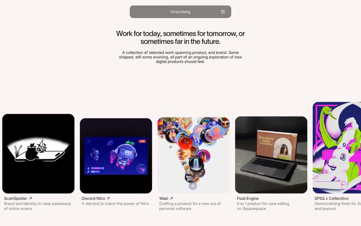

David Kirschberg
午夜画廊墙面:昏暗房间里,聚光照亮的作品是唯一彩色,周围框架有意不可见。
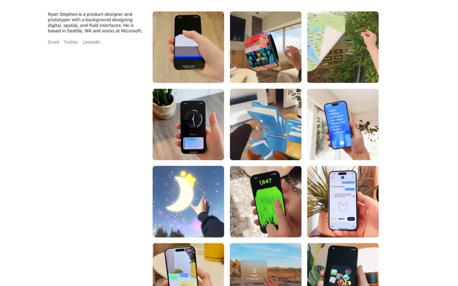

白色灰泥上的安静画廊墙面:作品集就是产品,界面隐入背景。
Ryan Stephen 的作品集像白色灰泥上的安静画廊墙面:几乎只有黑白,一种暖灰承担辅助文字和链接边框的职责。布局以内容为先、图像为主:左侧一个简介块,右侧一个 3-column 照片网格;没有多余界面框架、装饰或与作品竞争的品牌色。视觉体系刻意简朴:系统字体、单一的 10px 图像圆角、充裕留白,没有阴影或渐变。每个界面元素都被精简至功能本身,让摄影承载页面。
查看原始网站午夜画廊墙面:昏暗房间里,聚光照亮的作品是唯一彩色,周围框架有意不可见。


清晨的光线洒在奶油色纸张上
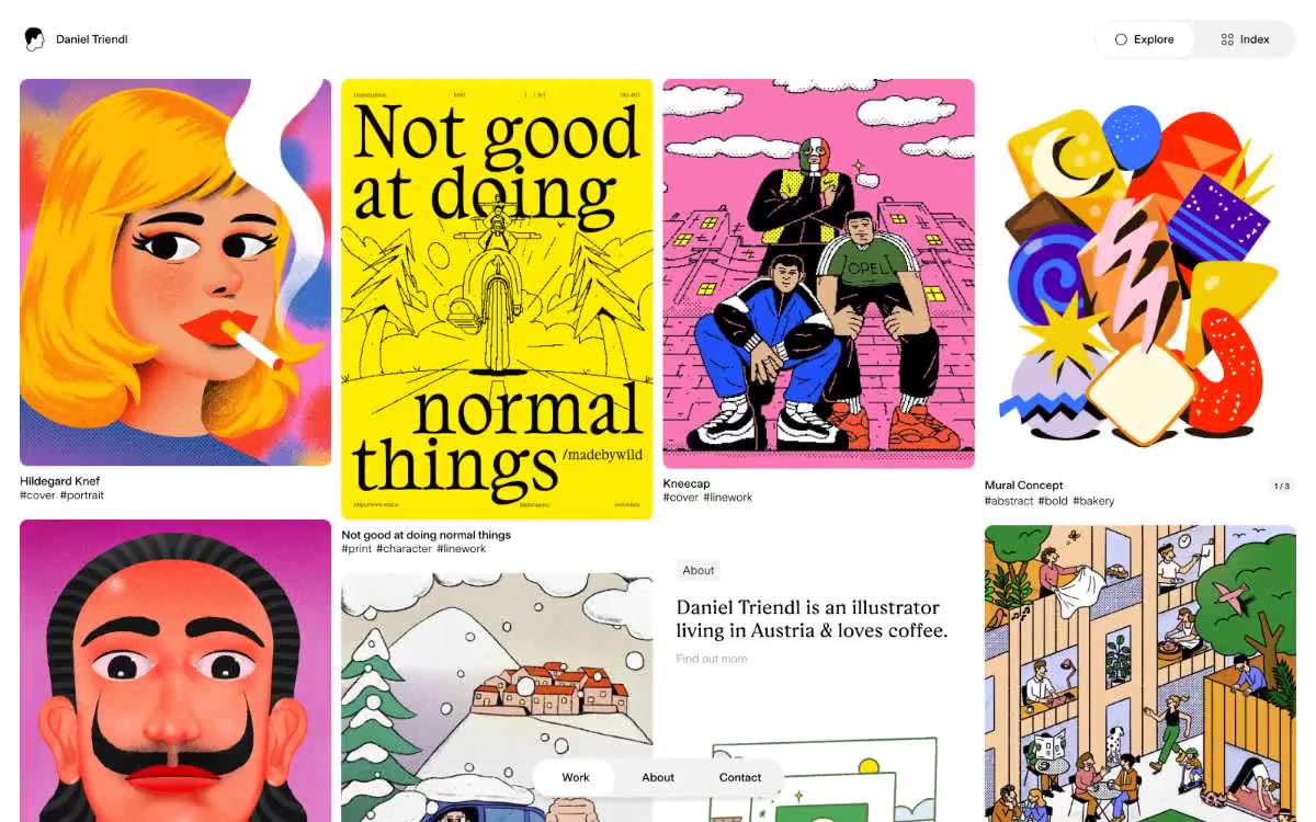

纯白画廊墙用于表现强烈视觉的艺术作品
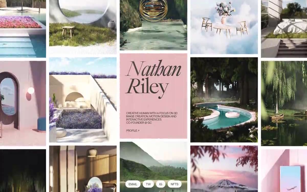

黑色虚空中的画廊墙。单色作品集里,氛围渲染网格是唯一色彩,唯一超大衬线姓名卡锚定中央,像漂浮在作品上的杂志封面。
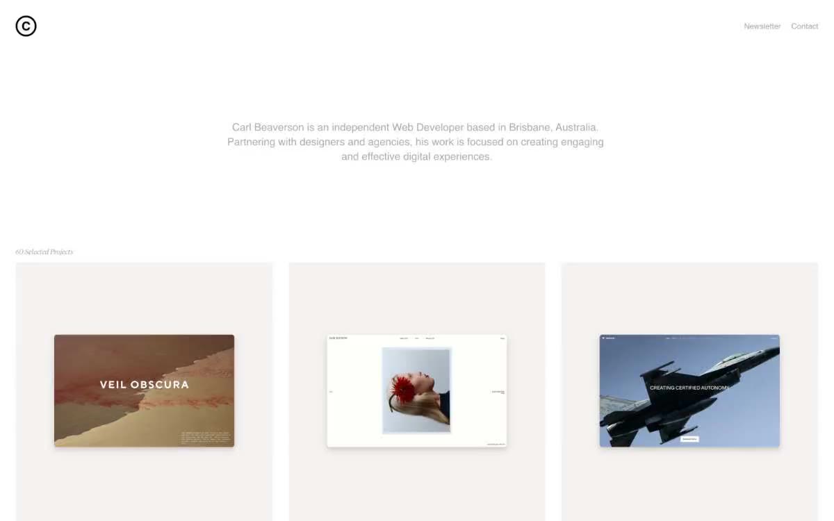

冬日光线下的画廊墙。一个无色彩、宽敞的作品集,以温暖的骨白画布为底,每个项目卡片由柔和的棕色调阴影框出,并以极细的展示字体标注。


安静的白色画廊:珊瑚粉的低语漂浮在经过斟酌的大片宁静中,仅由胶囊形导航和紧凑字间距文字定义边界。