# Nathan Riley — Style Reference
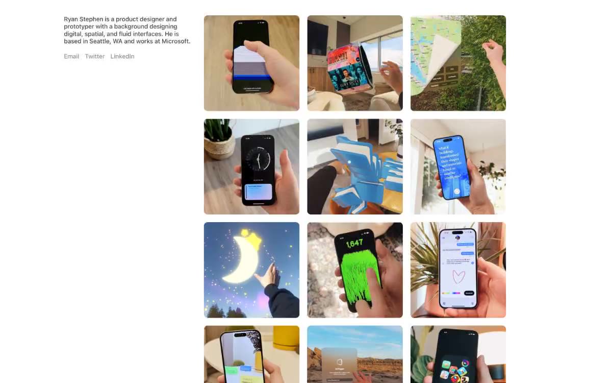
> Gallery wall in a black void. A monochrome portfolio where the grid of atmospheric renders is the only color, and a single oversized serif name card anchors the center like a magazine cover floating over the work.

**Theme:** light

Source measurements are normalized; roles and recommendations are interpreted. Font summary lists are independent, not paired by position. HTML examples are reconstructions, not source components.

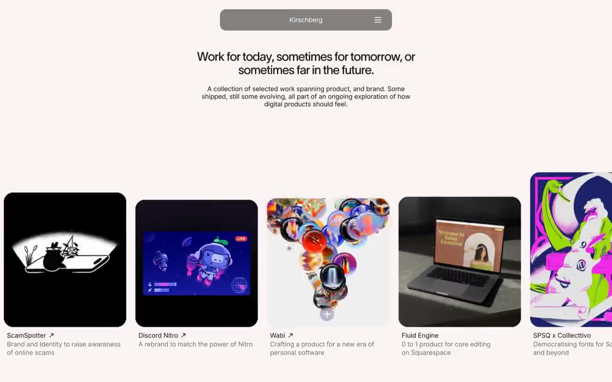
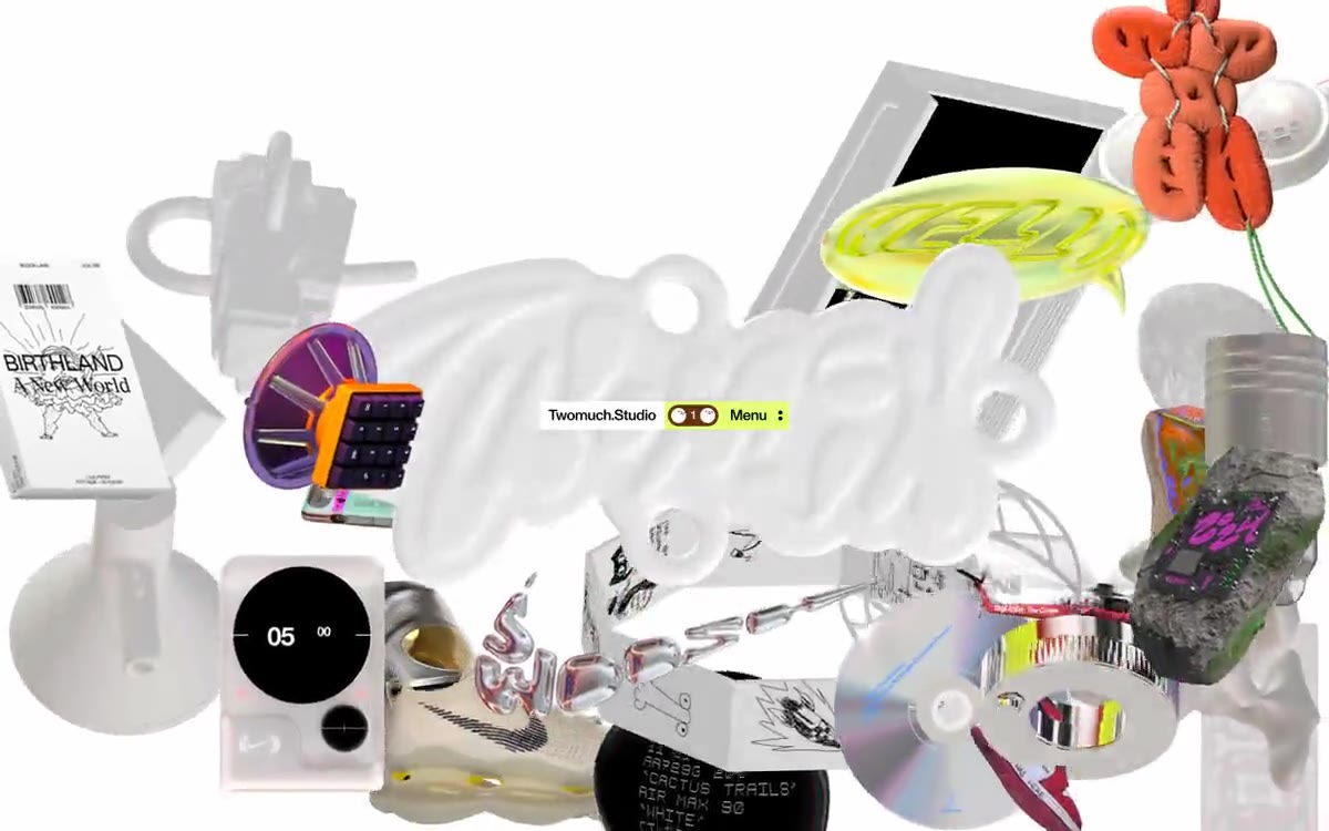
Nathan Riley's portfolio is a monochrome art gallery rendered as a full-bleed image mosaic — a tight grid of atmospheric 3D renders that fills every pixel, with the artist's name floating in a single pale-rose card at the center. The palette is ruthlessly reduced to three values: pure black, pure white, and a warm dark gray, so all visual energy comes from the imagery itself rather than color. Typography is custom-serif, ultra-light at display weight, and stretched to a 238px hero that dominates the center card like a magazine masthead. The system has no rounded corners, no shadows, no gradients, and no button fills — navigation is a row of small pill-shaped text chips at the bottom, and the overall feel is that of a curated exhibition catalog printed on white paper with one large editorial title.