# Jakub Reis — Style Reference
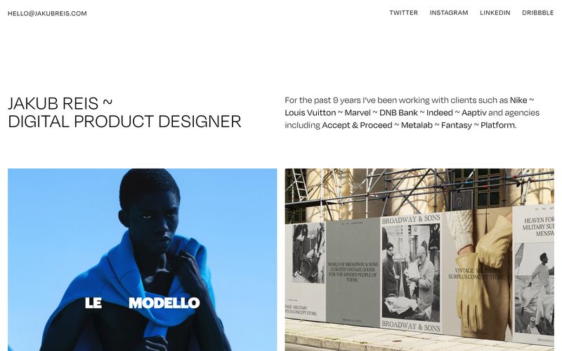
> gallery wall on bone paper — every screen is a quiet white room where only typography and photography exist

**Theme:** light

Source measurements are normalized; roles and recommendations are interpreted. Font summary lists are independent, not paired by position. HTML examples are reconstructions, not source components.

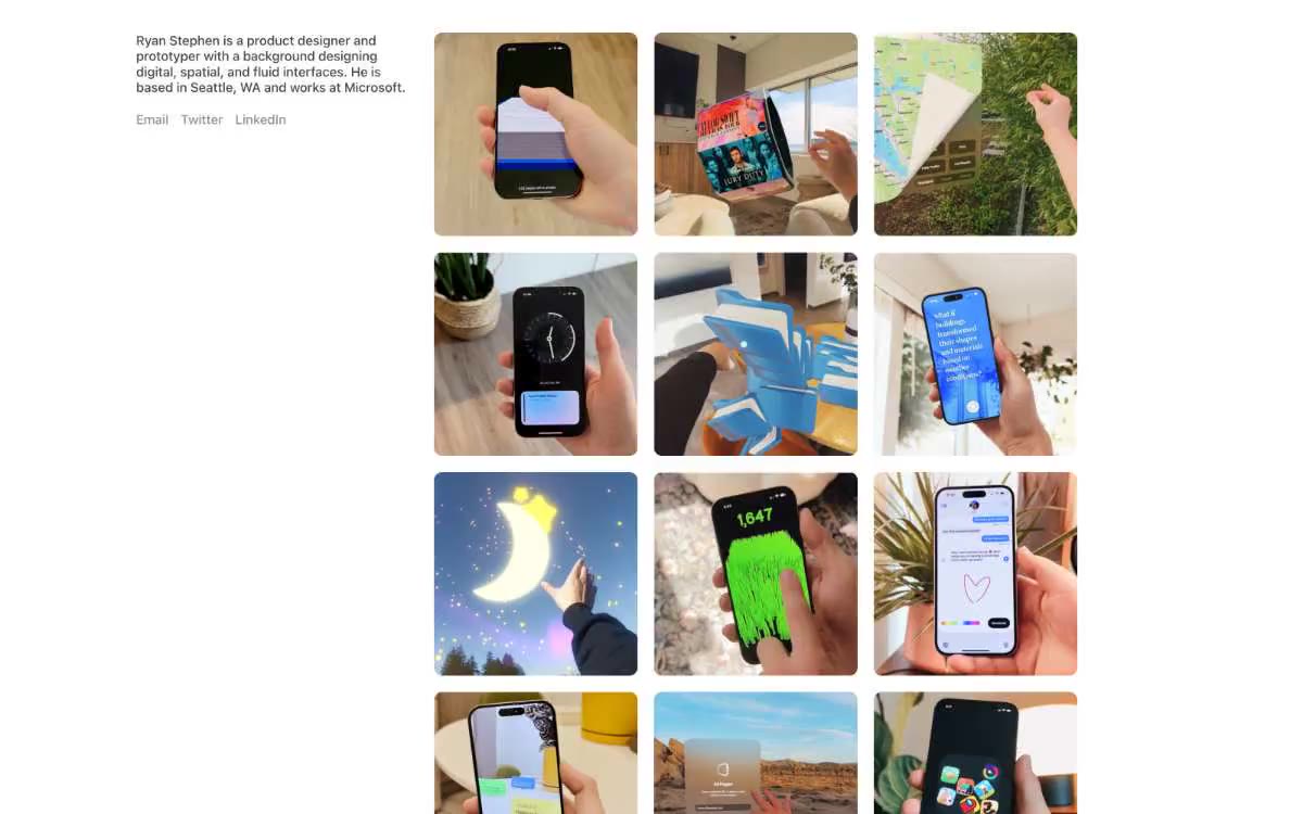
Jakub Reis is a type-driven portfolio: a bone-white canvas, a single custom sans-serif at whisper weights, and photographs that carry every drop of color the system refuses to supply. The site reads like a printed exhibition catalog — a name, a discipline, a grid of framed works, and nothing else. Hierarchy is built entirely from size, weight (300 vs 400 only), and the generous negative space between blocks; there are no buttons, no badges, no borders, no shadows, no gradients. The signature is restraint: even the separator between client names in the intro paragraph is a tilde (~) instead of a dot, pipe, or comma — a typographic personality choice that the entire UI leans into. Components are essentially text labels attached to full-bleed images; the design system exists to disappear so the work can speak.