# Brisbane Web Developer — Style Reference
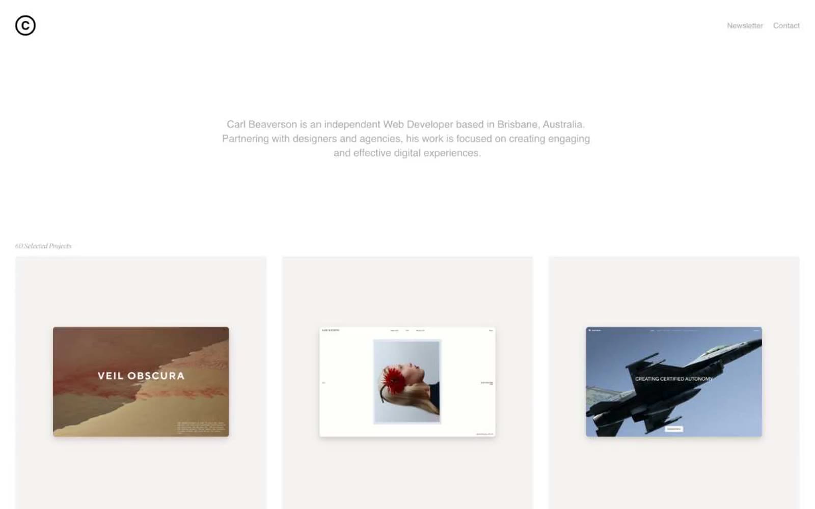
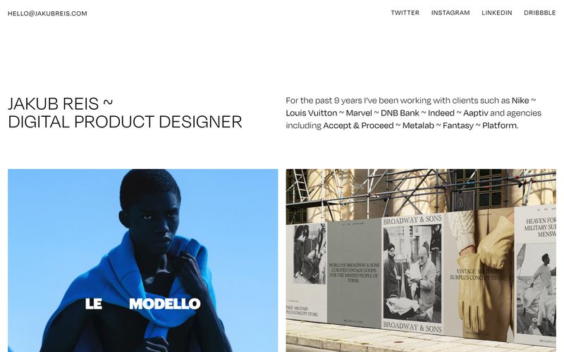
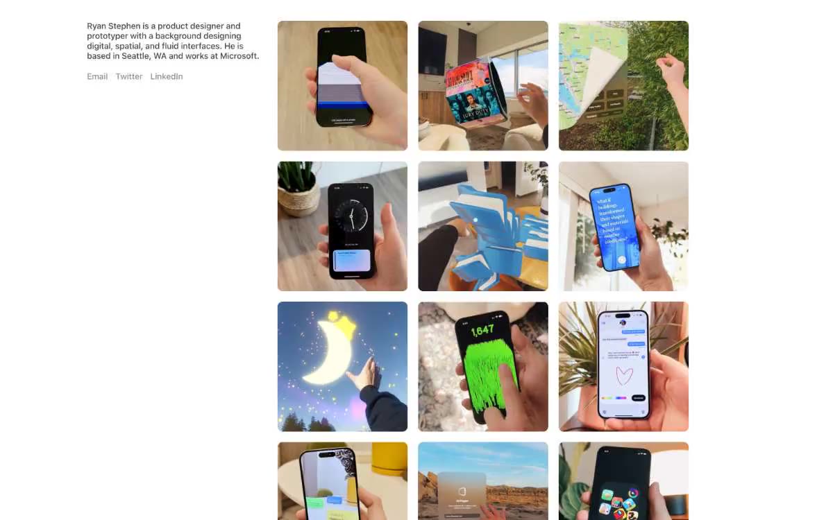
> gallery wall in winter light. An achromatic, spacious portfolio on a warm bone-white canvas, with each project tile framed by soft brown-toned shadows and labeled in a whisper-thin display face.

**Theme:** light

Source measurements are normalized; roles and recommendations are interpreted. Font summary lists are independent, not paired by position. HTML examples are reconstructions, not source components.

Carl Beaverson's portfolio operates on radical restraint: a warm off-white canvas, exclusively neutral tones, and a single accent typeface (Suisse Works) reserved for the smallest typographic moments. The entire system is achromatic — no brand color, no chromatic accent, no semantic hues. Hierarchy is built through scale jumps, tracking, and generous negative space rather than color or weight. Components float on warm-tinted brown shadows that subtly warm an otherwise cold minimalist grid. The reading order is content-first: three-up project tiles, tiny attribution text, and large section gutters that let each piece breathe independently.