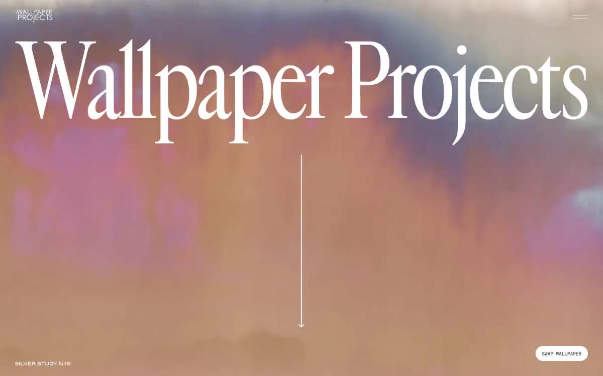

Wallpaper Projects
温暖纸张上的展览式布局——源自一本12×16艺术单行本的页面,奶油色纸张、接近黑色的墨水,以及一个巨大的衬线字体共同完成表达。
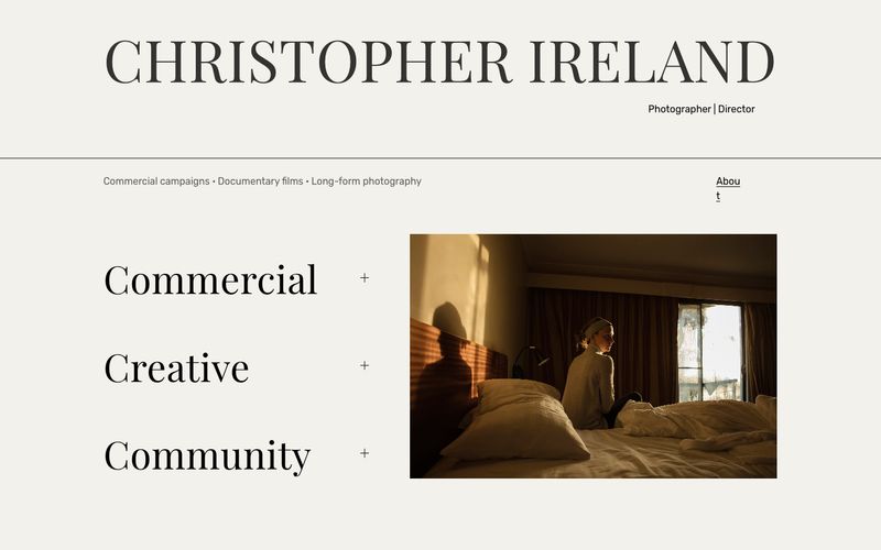

晨光中的骨白画廊墙面,一本编辑式专著。
这位摄影师的作品集像一页安静的编辑跨页:暖骨色画布上,只有一组字体搭配,当代衬线字体用于展示,几何无衬线字体用于实用信息,不设任何彩色强调。视觉系统完全让位于摄影;文字只是类别标签构成的纤细脚手架,加上少数像杂志摘引一样的超大衬线标题。感觉更接近印刷专著,而不是网站:大块呼吸空间、不对称的左右分栏,文字在左、图像在右,并且所有文字均为字重 400。衬线字体从不加厚,无衬线字体也从不压窄,因此层级来自字号和字间距,而非强调。
查看原始网站温暖纸张上的展览式布局——源自一本12×16艺术单行本的页面,奶油色纸张、接近黑色的墨水,以及一个巨大的衬线字体共同完成表达。


单色编辑画廊——一个纯净的画廊墙面,其中超大尺寸的黑色文字与满幅摄影存在,无装饰、无色彩、无 UI 干扰。

建筑版画风格,使用灰白纸张。专著式美学,其中一段强烈的靛蓝区块打破原本温暖、极繁风格的网格布局。
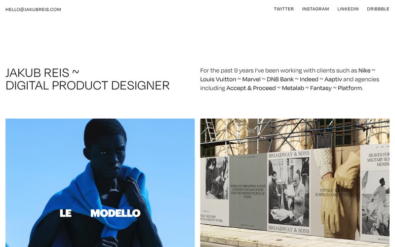

如同骨白纸上的画廊墙,每个屏幕都是安静白房间,只存在文字与摄影。
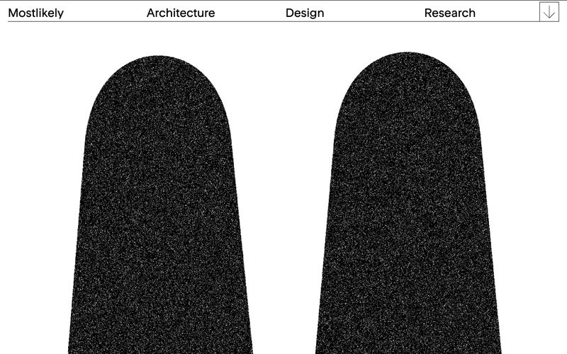

骨白羊皮纸上墨色拱门

精选画廊于骨白亚麻材质上