# Wallpaper Projects — Style Reference
> Editorial gallery on warm paper — a spread from a 12×16 art monograph where cream stock, near-black ink, and one enormous serif do all the talking.

**Theme:** light

Source measurements are normalized; roles and recommendations are interpreted. Font summary lists are independent, not paired by position. HTML examples are reconstructions, not source components.

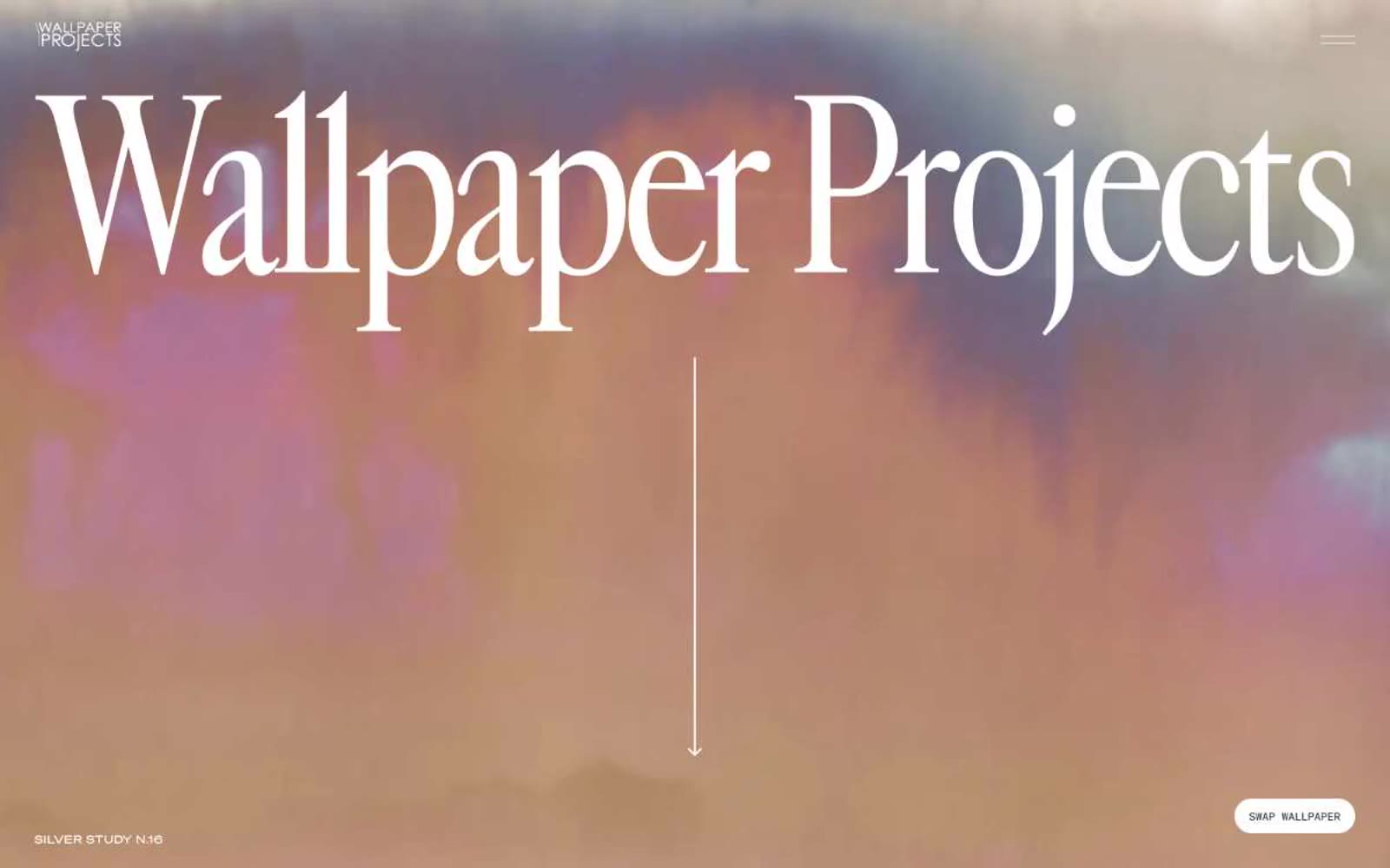
Wallpaper Projects reads like a high-end art book spread printed on warm cream stock: massive editorial serif type (Cardinal Fruit) set against quiet, paper-warm surfaces, with a single near-black ink doing all the work. The palette is rigorously monochrome — no chromatic accents, no decorative gradients, no shadows — letting the photography and the typographic scale do the heavy lifting. Layout is asymmetric and gallery-paced: full-bleed atmospheric heroes give way to split text+image compositions on cream, with generous negative space acting as the primary structural device. Every interactive element is reduced to a dark pill on warm paper, and the entire system whispers 'considered, expensive, restrained' rather than shouting.