# Itsnicethat — Style Reference
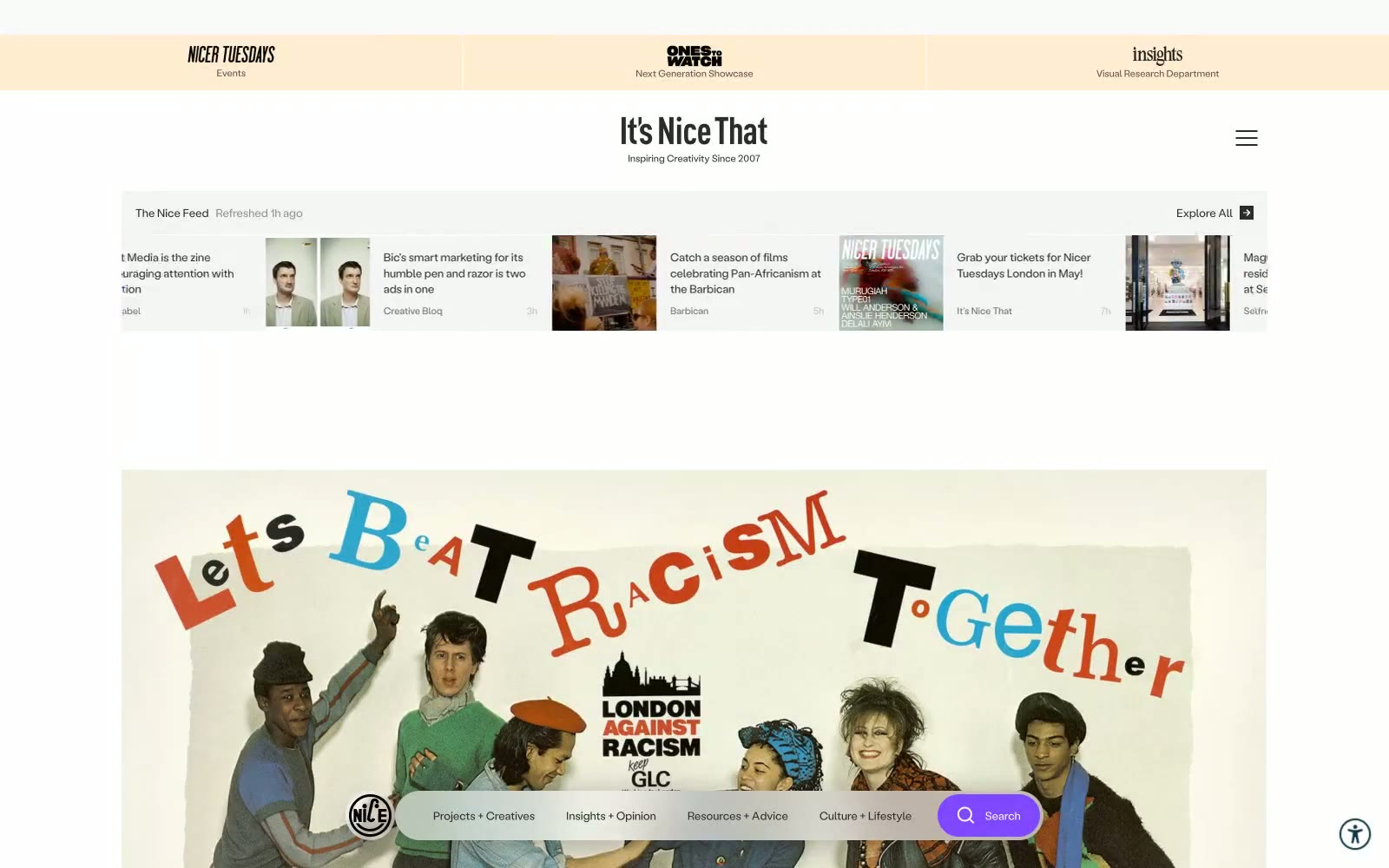
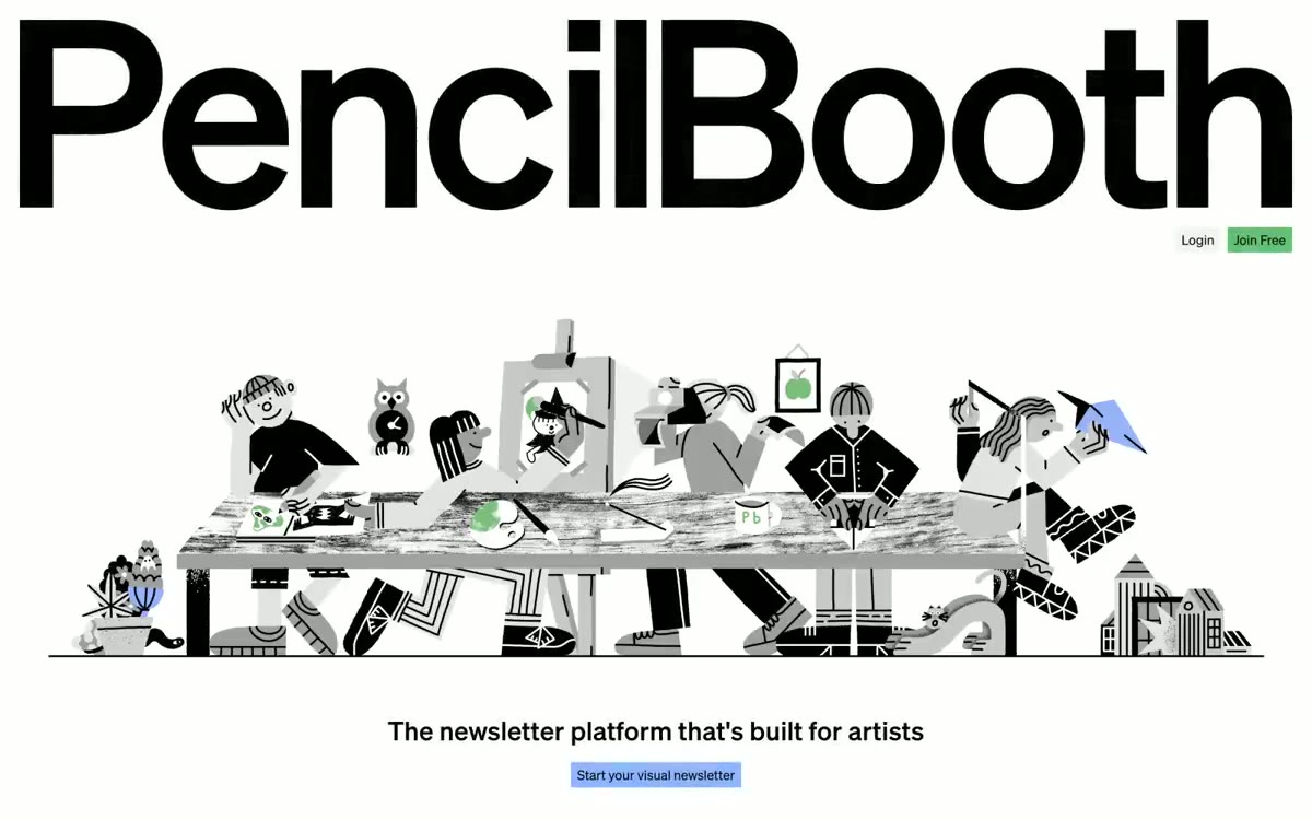
> Art-school broadsheet on a desk. A near-white page dressed in monochrome type, with one violet accent for navigation and vivid Risograph prints exploding through the grid.

**Theme:** light

Source measurements are normalized; roles and recommendations are interpreted. Font summary lists are independent, not paired by position. HTML examples are reconstructions, not source components.

It's Nice That operates as a quiet editorial newsroom: a near-white canvas with a single violet pulse. Almost every surface is achromatic — warm off-white, pure white, near-black text — and color is rationed like ink, appearing only as functional punctuation on the search button, on hover, or in full-bleed editorial photography. Typography does the heavy lifting: a wide-tracked display face (LabilVariable) floats generous air around every headline and label, creating a magazine-like cadence, while Bradford sets compact body and UI text tight to the grid. Components are deliberately flat and compact — no shadows, pill-shaped controls at 75px radius, tight 10–20px padding — so the colorful illustration and photography content always reads as the hero. The result feels like flipping through a printed art-school broadsheet: restrained chrome, loud art.