# Dovetail — Style Reference
> Cream-paper editorial magazine on a sunlit table

**Theme:** light

Source measurements are normalized; roles and recommendations are interpreted. Font summary lists are independent, not paired by position. HTML examples are reconstructions, not source components.

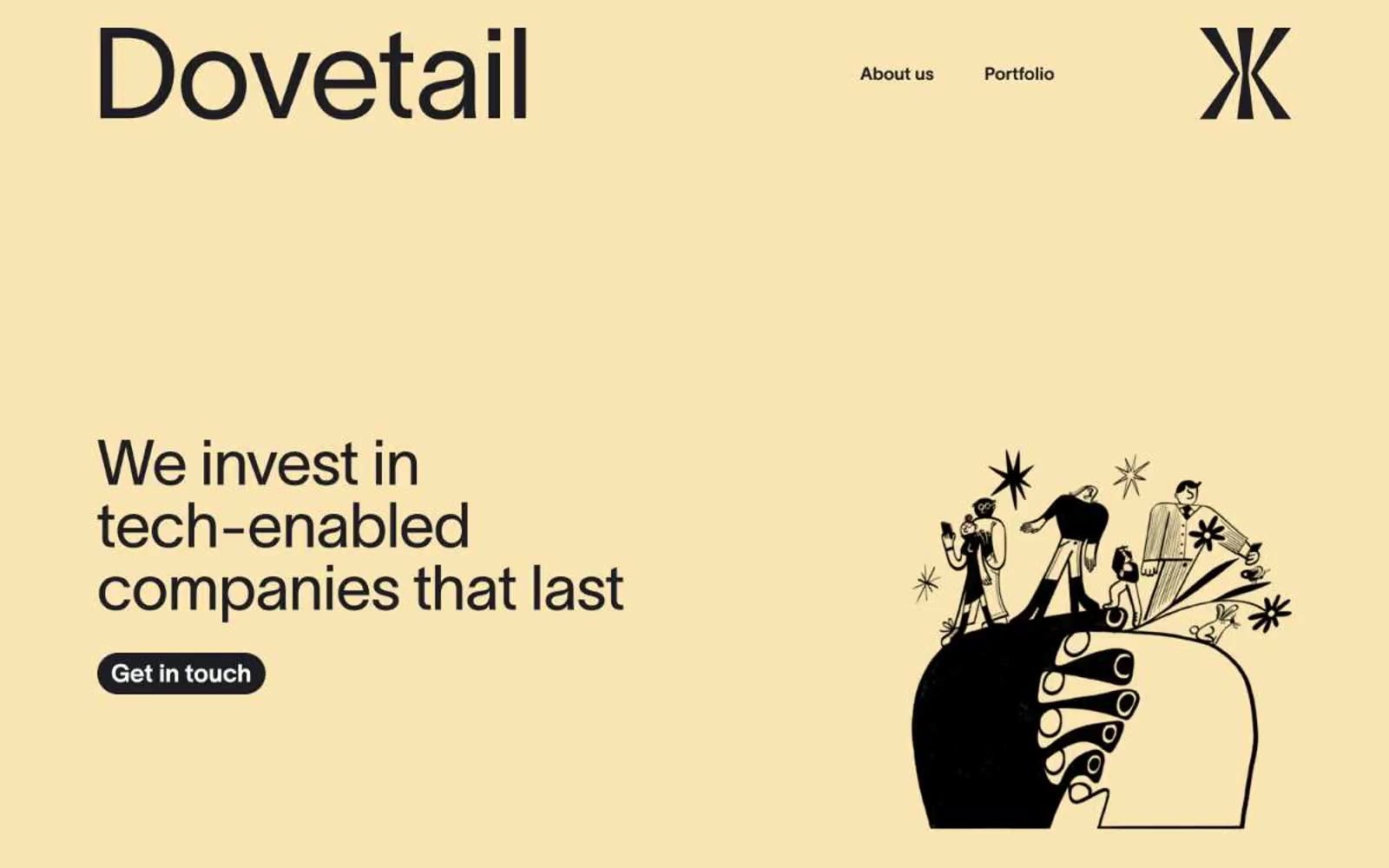
Dovetail reads like a printed editorial spread digitized — warm cream canvases, near-black ink, and a single buttery yellow accent that functions as a mood rather than a brand color. Typography is confidently oversized (72px display headlines) yet tightly tracked, giving the site a literary weight without heaviness. The signature visual device is the pill-shaped capability tag (91px radius), used as a stacking motif on the right rail. Components are flat: filled near-black buttons, ghost text links, and 16px-radius photo cards. Imagery alternates between detailed monochrome editorial illustration and full-color photography, with no shadows, gradients, or decorative effects — separation happens through whitespace and hairline borders.