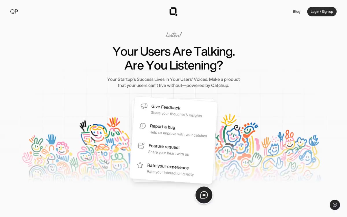
Qatchup
暖纸上的墨迹,安静低语。
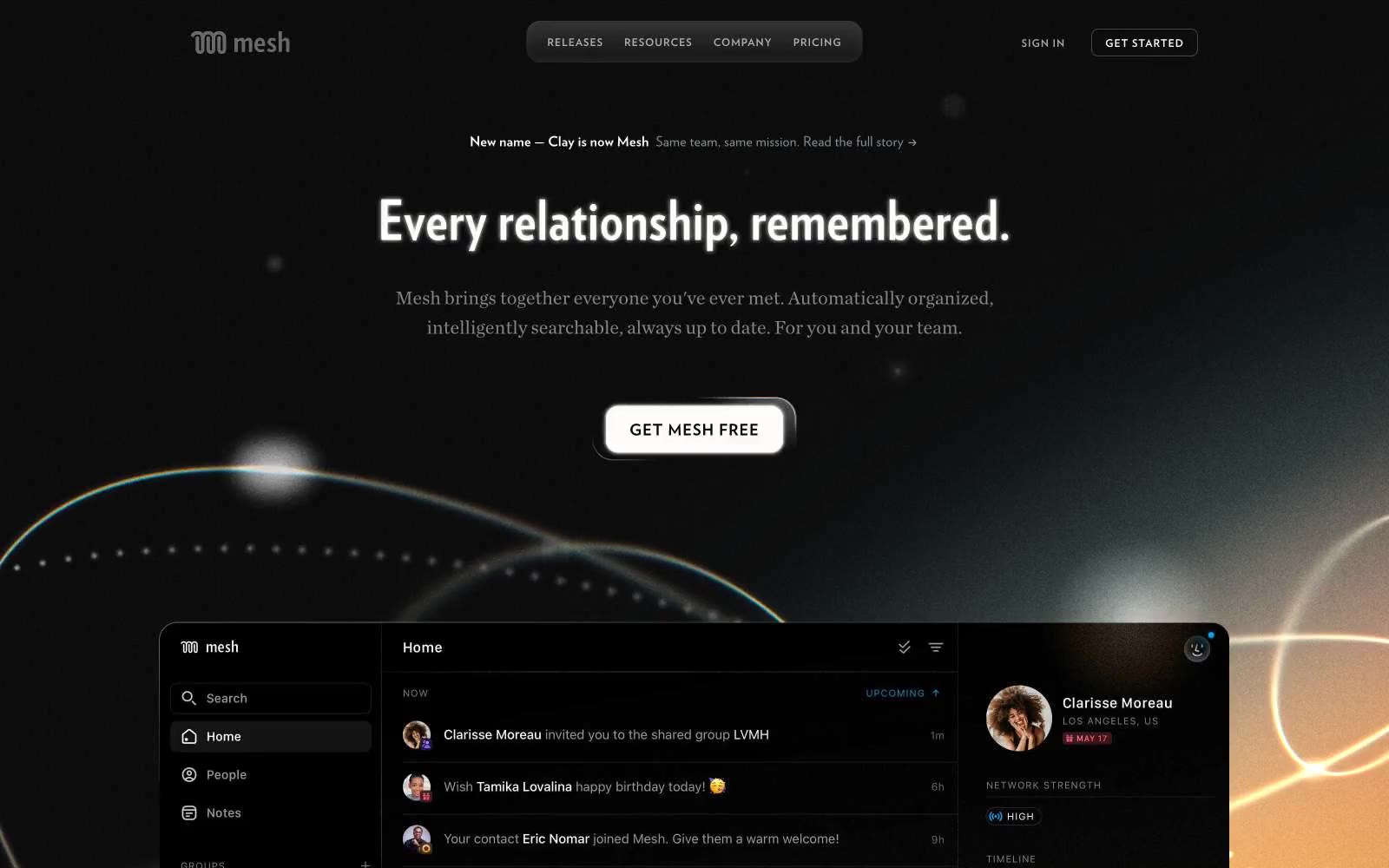

午夜纸上用青铜墨水书写。一个深色的编辑版面,温暖的琥珀色规则与无衬线细体字引导视线,穿越一个密集而从容的布局。
Mesh 呈现一个夜间的编辑工作空间:近黑色画布,温暖的琥珀色光晕从下部视口溢出,清晰的白色文字读起来像杂志版面,而非SaaS仪表盘。语气自信却沉静——简洁、信息密集,文字承担主要表达,色彩仅作为语义强调。唯一的色彩点缀是温暖的铜色(#f2b98b),以轮廓和线规则出现,而非填充,因此操作感被邀请而非被强加。界面借鉴了印刷排版:大行高的全大写标签(0.1–0.17em)、紧凑的显示字体用于首屏标题,正文部分采用宽松的行高。表面为平面,边框为细线,唯一的阴影极为微妙——深度来自分层与发光,而非投影阴影。
查看原始网站暖纸上的墨迹,安静低语。


温暖的编辑工坊。奶油色纸张、炭黑色墨水,以及一个琥珀橙色的强调点——这是一处像艺术书页在琥珀光下拍摄的求职平台。


温暖的奶油纸工作空间搭配石墨点缀——一个浮于亚麻结构之上的工作室,其中哑光黑色墨点漂浮其上。
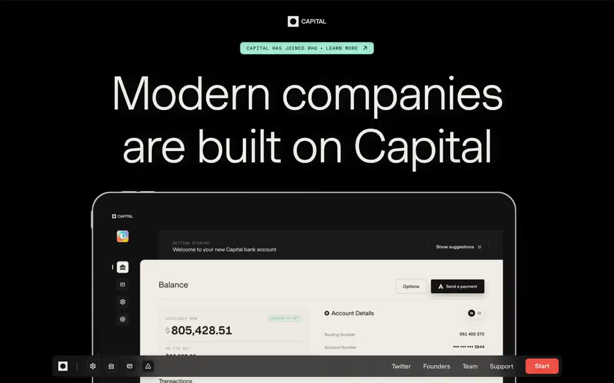
午夜的编辑画廊,配以余烬强调。纯黑房间如画廊墙面般宽大,巨大字重 300、带衬线感的无衬线文字漂浮在负空间中;唯一暖红按钮像小火焰,在哑光黑前发光。
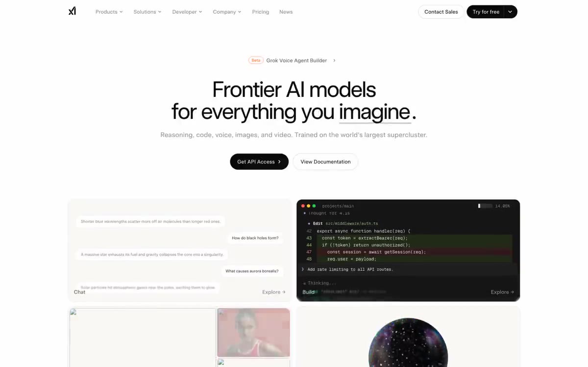

温暖奶油色实验室中的一颗黑色药丸
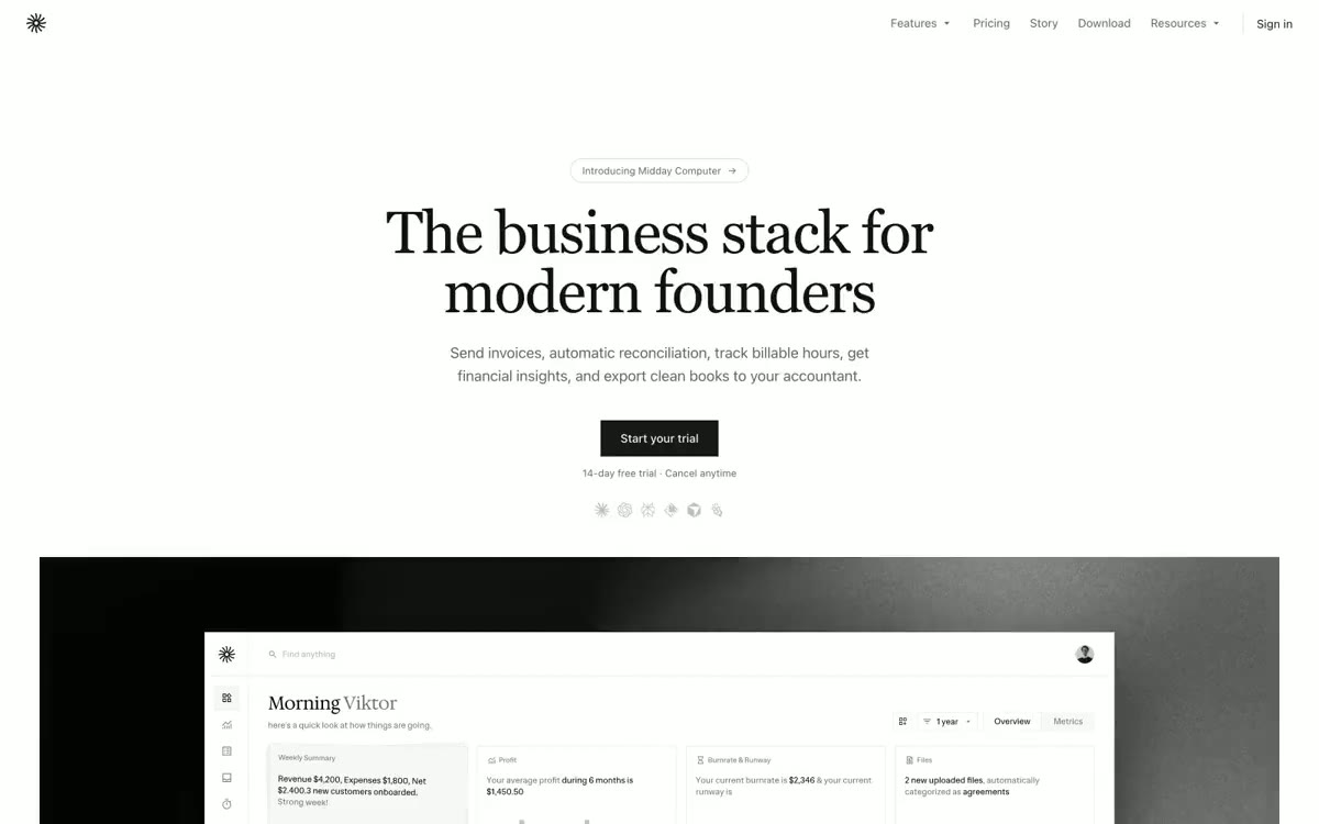

报刊风格的羊皮纸质感——72px 的衬线体标题置于温暖的石质底色上,搭配带有字间距的无衬线体正文,胶囊形控件,无任何阴影。