# Midday — Style Reference
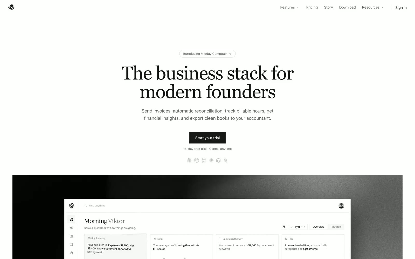
> Editorial broadsheet on parchment — a 72px serif headline over warm stone, spaced sans-serif body text, pill-shaped controls, zero shadows.

**Theme:** light

Source measurements are normalized; roles and recommendations are interpreted. Font summary lists are independent, not paired by position. HTML examples are reconstructions, not source components.

Midday reads like an editorial broadsheet translated to software: a warm parchment canvas, a spaced sans-serif body voice, and a serif display face that announces sections like magazine pull-quotes. The system is monochrome to the point of austerity — surfaces stack in warm off-whites, borders are hairline-thin, and chromatic color appears only as functional punctuation for financial data (a single moss green) and the dark filled CTA. Every interactive element is pill-shaped; nothing is squared off. The design is completely flat — no shadows, no gradients, no decorative depth. Spacing is compact and rhythmic on a 4px grid, keeping dense ledger data legible without breathing room.