# Evernote — Style Reference
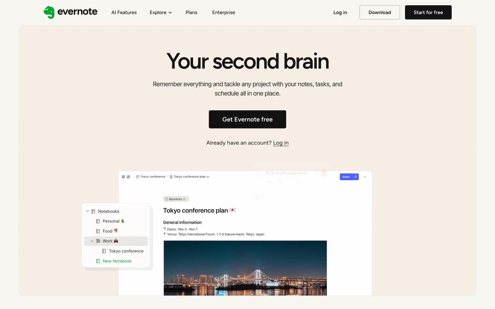
> Afternoon sun on cream paper — a warm, lived-in notebook where white cards float on beige, dark text breathes, and one lime-green highlighter marks the important things.

**Theme:** light

Source measurements are normalized; roles and recommendations are interpreted. Font summary lists are independent, not paired by position. HTML examples are reconstructions, not source components.

Evernote is a warm-paper productivity workspace: a cream canvas (#f9f6f2) replaces the typical white SaaS background, giving every screen the feel of a sunlit notebook page. The interface stays nearly monochrome — charcoal text, white elevated cards, hairline gray borders — with one vivid lime green (#94e130) acting as the singular energy accent for CTAs, icons, and highlights. Display headlines use Figtree at 300 weight with tight tracking, reading as editorial and airy rather than corporate. The visual rhythm is calm: centered hero stacks, generous section gaps, card carousels with small colored category squares, and a single dark contrast band (black with organic gradient blobs) that breaks the cream monotony for high-energy moments.