# Nornorm — Style Reference
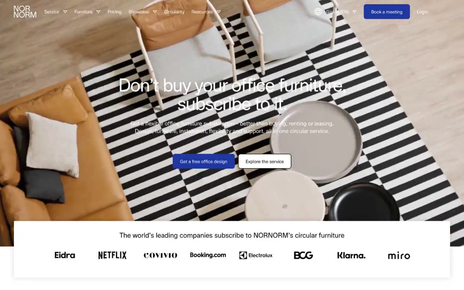
> Scandinavian showroom, cobalt punctuation — a white-walled furniture gallery where one deep blue stroke cuts through warm bone and ink.

**Theme:** light

Source measurements are normalized; roles and recommendations are interpreted. Font summary lists are independent, not paired by position. HTML examples are reconstructions, not source components.

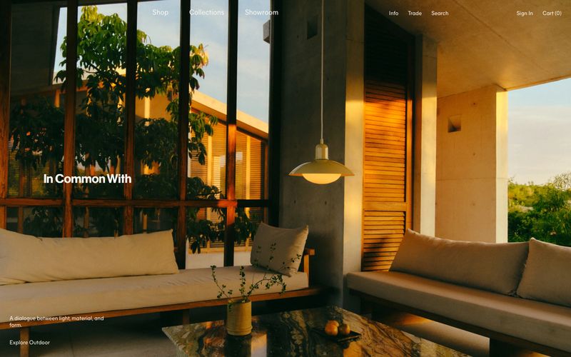
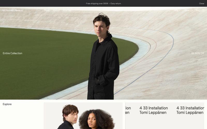
Nornorm's visual system is a near-monochromatic Scandinavian showroom: a white canvas warmed by a bone surface, a single deep cobalt as the only chromatic voice, and a custom geometric typeface (Lunar) tracked tight at -0.03em across every size. The discipline is rationed color — the cobalt appears only on the logo, the primary CTA, and the active state, everything else lives in grayscale. Photography carries the brand's emotional weight: full-bleed editorial interiors, warm leather textures, sculptural paper-craft vignettes, and living office scenes do the storytelling so the interface can stay quiet. Components are flat, pill-shaped, and borderless — a cobalt-filled button next to a dark ghost button, no shadows, no gradients, no decoration beyond generous whitespace and a single accent.